A
number of people have commented on
a recent paper showing an increase in heterozygosity in human populations over time, presumably due to increased outbreeding (though Dienekes
suggests some of this effect may be due to more homozygous individuals living longer, my feeling is that the results associating homozygosity and lifespan are more likely to be artifacts due to increased outbreeding over time, rather than vice versa).
This is an interesting result, and seems plausible, but
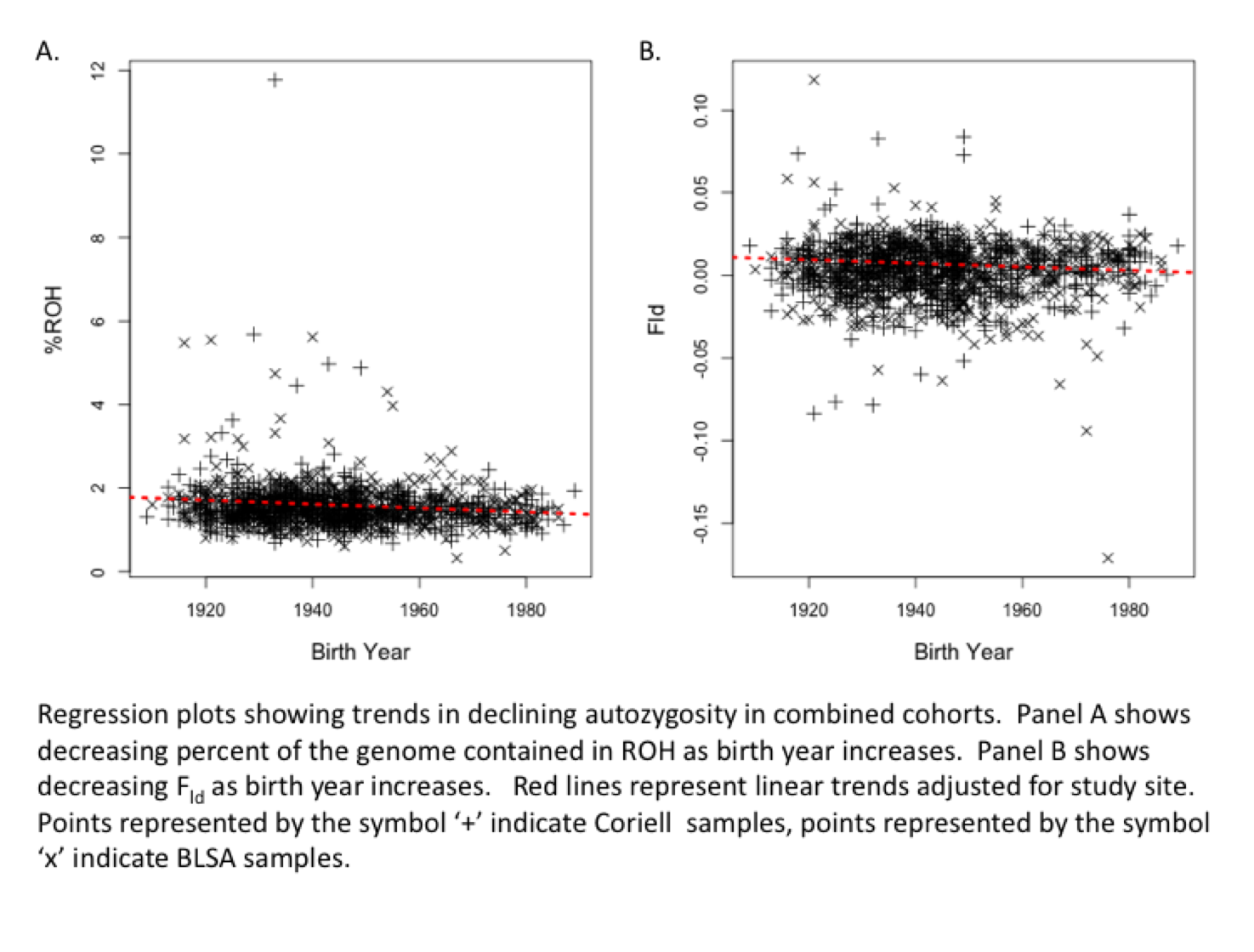
the figure in the paper is difficult to judge--I wondered why the authors chose not to show their actual data, but rather only the fitted regression line. The answer is that
the data itself looks much less impressive than the pretty lines in the main text (see right).
This isn't to say that the result isn't correct (I assume the authors made sure their results are robust to the few outliers in that plot), but the relationship between homozygosity and time is certainly more noisy than implied by the figure.
Labels: Genetics