|
Wednesday, January 27, 2010
The New York Times has a new article, After Long Decline, Teenage Pregnancy Rate Rises. The graphic is OK, but it focuses on aggregate teen pregnancy rates (age group 15-19) instead of splitting it out so as to show births and abortions. The original report is chock full of tables, but not the charts I was looking for. So I decided to go ahead and create them. All the "teen" data is for the 15-19 age range. The trends are a bit difference from that in the chart because I split up births and abortions, and also added in "abortion ratio," which simply illustrates the proportion of pregnancies which result in abortions excluding miscarriage and stillbirths. The other rates are per 1,000 of females of the given age range. First, the overall trends by time, broken out by race & ethnicity. White = Non-Hispanic white in all that follows.
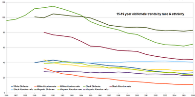 Since Latinos have high birthrates, so surprise that their abortion rate is higher than whites. On the other hand, the relatively low abortion ratio vis-a-vis white teens points to some cultural expectations among this group which we'd expect from Roman Catholics (though more generally Catholics don't differ much from Protestants in the United States in regards to abortion, so I think that this is less causal than correlated). There is also state level data, though it is spotty in regards to abortions. I decided to see if the different groups tracked each other in regards to rates. Here's what I found:
And the scatterplots, as well as some dot plots which show the ratio of the rates of two minority groups, as a function of geography. 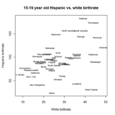 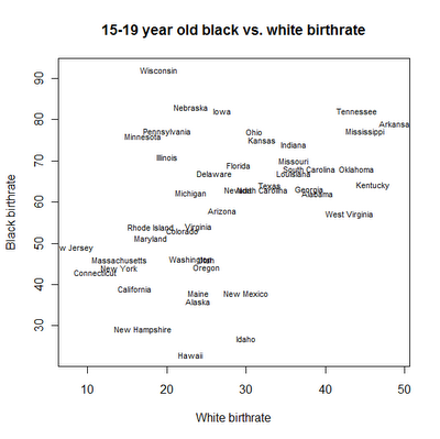  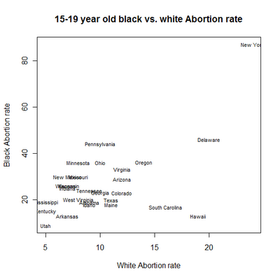  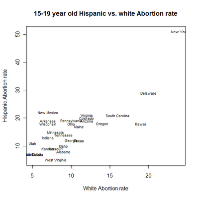 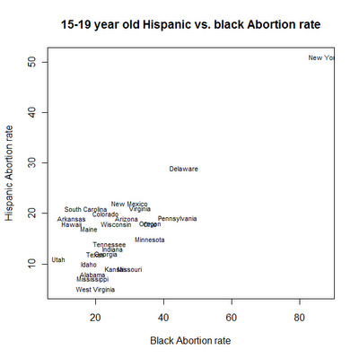 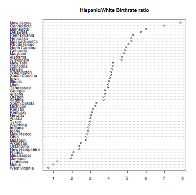 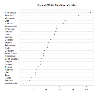 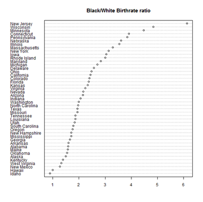 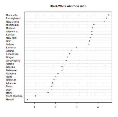 Looking closely at the data it seems that that local state law/and/or/culture matters a lot for teen abortion ratios. Vermont for example has a very high abortion ratio. Might look at it later.... Note: I excluded DC from the state level analysis because it's a bizarre outlier. White teen birthrates of 1 per 1,000, black & Hispanic above 100. Labels: Teen Pregnancy |


