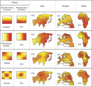
The caption:
The first column shows the theoretical expected PC maps for a class of models in which genetic similarity decays with geographic distance (see text for details). The second column shows PC maps for population genetic data simulated with no range expansions, but constant homogeneous migration rate, in a two-dimensional habitat. The columns marked Asia, Europe and Africa are redrawn from the originals of ref. 3 [this reference is to Cavalli-Sforza's The History and Geography of Human Genes]. Each map is marked by which PC it represents. The order of maps in each of the last three columns was chosen to correspond with the shapes in the first two columns.
What does this mean? The authors say it best in
the abstract:
Nearly 30 years ago, Cavalli-Sforza et al. pioneered the use of principal component analysis (PCA) in population genetics and used PCA to produce maps summarizing human genetic variation across continental regions. They interpreted gradient and wave patterns in these maps as signatures of specific migration events. These interpretations have been controversial, but influential, and the use of PCA has become widespread in analysis of population genetics data. However, the behavior of PCA for genetic data showing continuous spatial variation, such as might exist within human continental groups, has been less well characterized. Here, we find that gradients and waves observed in Cavalli-Sforza et al.'s maps resemble sinusoidal mathematical artifacts that arise generally when PCA is applied to spatial data, implying that the patterns do not necessarily reflect specific migration events.
Labels: Population genetics


