
|
Sunday, November 29, 2009
Are over-leveraged counties seeing an increase in food stamp usage?
posted by
Razib @ 11/29/2009 11:33:00 AM
Since The New York Times put up the csv file which they used to generate their maps of food stamp usage, I thought I'd look at the data a little closer. In particular, look at this graphic of change in food stamp usage by county (dark equals more usage):
 I was curious about this part from the story below:: While use is greatest where poverty runs deep, the growth has been especially swift in once-prosperous places hit by the housing bust. There are about 50 small counties and a dozen sizable ones where the rolls have doubled in the last two years. In another 205 counties, they have risen by at least two-thirds. These places with soaring rolls include populous Riverside County, Calif., most of greater Phoenix and Las Vegas, a ring of affluent Atlanta suburbs, and a 150-mile stretch of southwest Florida from Bradenton to the Everglades. Thanks to the Census I happen to have 2007 housing value and household income data. Also though it would be interesting to compare with obesity and diabetes rates. Scatterplots & correlations (r) below. 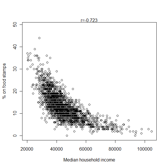 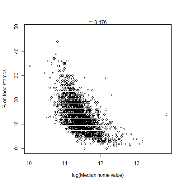  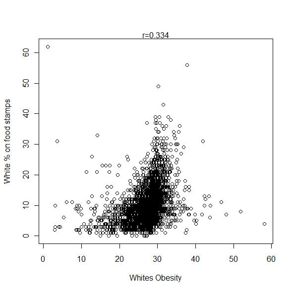 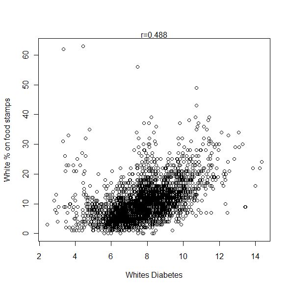 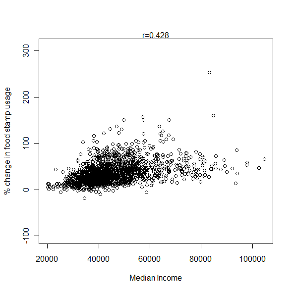  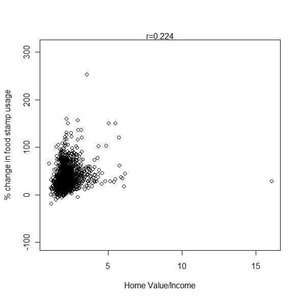 It does indeed seem that food stamp usage has been increasing in higher income and property value counties. The Census data I used above were collected between 2005-2007, during the height of the late great property bubble. But when I took the ratio of property value by income as a rough proxy for being over-leveraged it didn't seem to add much. When I took the partial correlation of home value and increase in food stamp usage controlling for income, it was only 0.11. Here are some other correlations controlling for income: % on food stamps - obesity = 0.33 % on food stamps - diabetes = 0.44 % of whites on food stamps - white diabetes rates = 0.36 % of whites on food stamps - white obesity rates = -0.05 There's an obvious correlation between black proportion in a county and food stamp utilization. r = 0.43. So using proportion of blacks as a control: % on food stamps - obesity = 0.43 % on food stamps - diabetes = 0.51 % on food stamps - white diabetes rates = 0.43 % on food stamps - white obesity rates = 0.06 % on food stamps - median household income = -0.71 It does seem to be correct though that food stamp utilization has been shooting up in more affluent communities. But if it is true that well over 90% of those eligible in places like Missouri are already using food stamps, while only 50% of those eligible in California are, it makes a bit more sense. In wealthier communities likely more people go in and out of eligibility and so never need to make recourse. In contrast, in regions where people are immobile and poverty is chronic there isn't as much scope to increase the program because most people who are eligible are already on it. That probably explains the triangular geometry of the scatterplot, very low on the affluence latter social services seem to have soaked up all eligible individuals, leaving little room for increase with the recession. Note: Estimates are white obesity are based on state level variation. Estimates of white diabetes rates are based on national level variation. These two variables need to be appropriately down-weighted in terms of confidence of their accuracy, especially the second. Update: By coincidence, a reader noted this similarity of maps this morning: 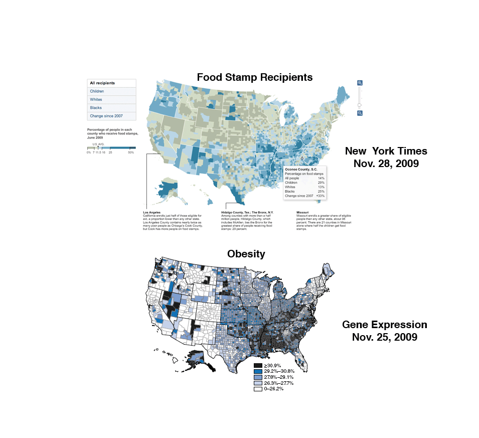 Labels: data, Diabetes, Food stamps, Obesity
Friday, November 27, 2009
Update: I made a major error in the algebra of estimating "white diabetes rates" per county. So the last set of correlations was junk. I think fixed the issue. Thanks to "bayesian" who noted that something was off with them.
The CDC provides data on diabetes by county as well as obesity. Some Correlations: Diabetes-Obesity = 0.72 Diabetes-Black = 0.65 Diabetes-Latino = -0.14 What's going on with the last? Latinos, in particular Mexican Americans, are more susceptible to diabetes than whites. So it must be that in counties where there are many Mexican Americans, white have particularly low prevalence of diabetes. Other correlations: Diabetes-Obama Vote = -0.01 Diabetes-College Educated = -0.46 Diabetes-Median Household Income = -0.45 Diabetes-Median Home Value = -0.42 I'm struck by the fact that the correlations are higher than for obesity (if you think about it in terms of r-squared, the square of the correlation explaining the variance of Y by X, it's even more striking). Probably has to do with the fact that only a subset of the obese are diabetic, as diabetes is a more extreme manifestation of morbidity. Let's control for the % black in a county with partial correlations: Diabetes-Obesity = 0.63 Diabetes-Obama Vote = -0.28 Diabetes-College Educated = -0.52 Diabetes-Median Household Income = -0.41 Diabetes-Median Home Value = -0.43 Not much change in the correlations really. Also, now there is a modest correlation between political liberalism and lower levels of diabetes now that the black proportion is controlled (the correlation with black proportion controlled for obesity and Obama vote is -0.24, same magnitude and direction). I also tried to estimate white diabetes prevalence by county. The national data suggest that blacks are 1.7 times more likely to be diabetic, and Latinos 2 times more likely. Obviously there's going to be some variance for these two groups, so I don't know how useful this estimate for whites is going to be. But, it should put into stark relief the negative correlation between the proportion of Latinos and white diabetic rates (note: again, Latinos seem to vary quite a bit and there are many counties along the Mexican-American border, as well as on the East Coast, where Latinos are so far deviated from the aggregate risk that I had to dump the data). Here are some correlations (again, white county proportions are estimates): White diabetic proportion-White obesity rate (estimate from previous post) = 0.47 White diabetic proportion-College Educated = -0.46 White diabetic proportion-Obama Vote = -0.18 White diabetic proportion-Median Household Income = -0.39 White diabetic proportion-Median Home Value = -0.44 OK, enough with correlations. Maps. Diabetes for all groups:  Now, my estimates for whites:  I think the assumption of an invariant relationship between white and non-white rates (i.e., blacks = 1.7 X whites) is causing problems. The white areas underneath the median suspiciously concentrated in the Black Belt. So let's just focus on counties which are 85% or more white: 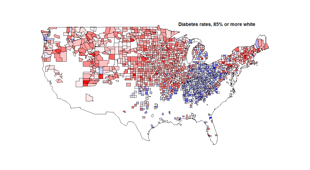 Labels: Diabetes
Thursday, February 15, 2007
Keeping with the diabetes theme, the first genome-wide association study of Type II diabetes has been published, and it's extraordinarily promising. Besides picking up the oft-replicated TCF7L2 gene mentioned before, they pick up three other loci, including finding a non-synonymous mutations in a zinc transporter. That's notable because 1. non-synonymous mutations clearly can have phenotypic effects (there's no wondering, could this really do something?), and 2. drug targeting of zinc transport is feasible (TCF7L2 is a transcription factor, and when you start playing with transcription factors you risk messing with a lot of pathways). The news article accompanying this study has some good perspective:
In 1918, Ronald Aylmer Fisher, an evolutionary biologist and pioneer of modern statistics, published a paper on the genetic causes of disease that brought together two rival factions. Geneticists promoted a paradigm in which diseases worked a lot like Mendel's pea plants, with just one or two genes responsible for each condition. Biometricians, however, advocated a continuous distribution of phenotypes. Fisher suggested that many mendelian traits could result in the continuous distribution of a disease. In doing so, he established the conceptual basis for the search for complex disease genes that continues today. Labels: Association, Diabetes, disease, Genetics
Speaking of the thrifty genotype hypothesis, a new paper from the cats at deCODE Genetics takes an in depth look at one of the loci consistently implicated in Type II diabetes. According to the authors, the succeptibility allele is ancestral, and the other, non-ancestral allele shows signs of being under recent positive selection in all the populations studied. Even more interestingly, the protective allele is associated with decreases in levels of circulating ghrelin (a hormone that increases appetite) and increases in levels of circulating leptin (a hormone that decreases appetite). This would seem, by my reckoning, to be consistent with the thrifty genotype hypothesis. In addition,
We obtained rough age estimates for HapA [the protective allele] based on its recombination history: 11,933, 8,401 and 4,051 years for the CEU, East Asian and YRI HapMap groups, respectively. Although tentative, these ages coincide broadly with the onset of agriculture in the three geographic regions represented by the HapMap groups. On the other hand, the succeptibility allele is associated with decreased BMI after controlling for diabetic status, though I'm not sure that has any bearing on the hypothesis. The authors conclude, bizarrely, "we note our findings contradict a key prediction of the thrifty-genotype hypothesis, insofar as HapBT2D, a major risk factor for type 2 diabetes, is negatively associated with BMI and is not the variant that contributed to adaptive evolution in the recent past." Huh? I can only conclude, based on that statement, that the authors aren't really clear on what the thrifty genotype hypothesis is. The original Neel paper (which is cited in this paper, so the authors have hopefully read it) makes a few simple claims, the most important of which is that the "diabetic genotype" was favorable up until the transition from the hunter-gatherer lifestyle to agriculture. It certainly does not claim that a diabetes-causing allele should be under recent positive selection, nor am I sure how anyone could get that impression. I'm inclined to take the exact opposite conclusion from this paper than the authors--that is, this data seems to support, rather than contradict, a key prediction of the thrifty genotype hypothesis, insofar as the ancestral allele leads to succeptibility, and the derived allele, which arose at about the time of agriculture, mat be associated with reduced appetite. Labels: Association, Diabetes, disease, Genetics |
  Razib's Home Page GNXP Archives Interviews Blogroll Principles of Population Genetics Genetics of Populations Molecular Evolution Quantitative Genetics Evolutionary Quantitative Genetics Evolutionary Genetics Evolution Molecular Markers, Natural History, and Evolution The Genetics of Human Populations Genetics and Analysis of Quantitative Traits Epistasis and Evolutionary Process Evolutionary Human Genetics Biometry Mathematical Models in Biology Speciation Evolutionary Genetics: Case Studies and Concepts Narrow Roads of Gene Land 1 Narrow Roads of Gene Land 2 Narrow Roads of Gene Land 3 Statistical Methods in Molecular Evolution The History and Geography of Human Genes Population Genetics and Microevolutionary Theory Population Genetics, Molecular Evolution, and the Neutral Theory Genetical Theory of Natural Selection Evolution and the Genetics of Populations Genetics and Origins of Species Tempo and Mode in Evolution Causes of Evolution Evolution The Great Human Diasporas Bones, Stones and Molecules Natural Selection and Social Theory Journey of Man Mapping Human History The Seven Daughters of Eve Evolution for Everyone Why Sex Matters Mother Nature Grooming, Gossip, and the Evolution of Language Genome R.A. Fisher, the Life of a Scientist Sewall Wright and Evolutionary Biology Origins of Theoretical Population Genetics A Reason for Everything The Ancestor's Tale Dragon Bone Hill Endless Forms Most Beautiful The Selfish Gene Adaptation and Natural Selection Nature via Nurture The Symbolic Species The Imitation Factor The Red Queen Out of Thin Air Mutants Evolutionary Dynamics The Origin of Species The Descent of Man Age of Abundance The Darwin Wars The Evolutionists The Creationists Of Moths and Men The Language Instinct How We Decide Predictably Irrational The Black Swan Fooled By Randomness Descartes' Baby Religion Explained In Gods We Trust Darwin's Cathedral A Theory of Religion The Meme Machine Synaptic Self The Mating Mind A Separate Creation The Number Sense The 10,000 Year Explosion The Math Gene Explaining Culture Origin and Evolution of Cultures Dawn of Human Culture The Origins of Virtue Prehistory of the Mind The Nurture Assumption The Moral Animal Born That Way No Two Alike Sociobiology Survival of the Prettiest The Blank Slate The g Factor The Origin Of The Mind Unto Others Defenders of the Truth The Cultural Origins of Human Cognition Before the Dawn Behavioral Genetics in the Postgenomic Era The Essential Difference Geography of Thought The Classical World The Fall of the Roman Empire The Fall of Rome History of Rome How Rome Fell The Making of a Christian Aristoracy The Rise of Western Christendom Keepers of the Keys of Heaven A History of the Byzantine State and Society Europe After Rome The Germanization of Early Medieval Christianity The Barbarian Conversion A History of Christianity God's War Infidels Fourth Crusade and the Sack of Constantinople The Sacred Chain Divided by the Faith Europe The Reformation Pursuit of Glory Albion's Seed 1848 Postwar From Plato to Nato China: A New History China in World History Genghis Khan and the Making of the Modern World Children of the Revolution When Baghdad Ruled the Muslim World The Great Arab Conquests After Tamerlane A History of Iran The Horse, the Wheel, and Language A World History Guns, Germs, and Steel The Human Web Plagues and Peoples 1491 A Concise Economic History of the World Power and Plenty A Splendid Exchange Contours of the World Economy 1-2030 AD Knowledge and the Wealth of Nations A Farewell to Alms The Ascent of Money The Great Divergence Clash of Extremes War and Peace and War Historical Dynamics The Age of Lincoln The Great Upheaval What Hath God Wrought Freedom Just Around the Corner Throes of Democracy Grand New Party A Beautiful Math When Genius Failed Catholicism and Freedom American Judaism
Archives
July 2005 August 2005 September 2005 October 2005 November 2005 December 2005 January 2006 February 2006 March 2006 April 2006 May 2006 June 2006 July 2006 August 2006 September 2006 October 2006 November 2006 December 2006 January 2007 February 2007 March 2007 April 2007 May 2007 June 2007 July 2007 August 2007 September 2007 October 2007 November 2007 December 2007 January 2008 February 2008 March 2008 April 2008 May 2008 June 2008 July 2008 August 2008 September 2008 October 2008 November 2008 December 2008 January 2009 February 2009 March 2009 April 2009 May 2009 June 2009 July 2009 August 2009 September 2009 October 2009 November 2009 December 2009 January 2010 February 2010 Hello Movable Type archives August 11,2002 August 18,2002 August 25,2002 September 01,2002 September 15,2002 October 20,2002 December 08,2002 December 22,2002 December 29,2002 January 05,2003 January 12,2003 January 19,2003 January 26,2003 February 02,2003 February 09,2003 February 16,2003 February 23,2003 March 02,2003 March 09,2003 March 16,2003 March 23,2003 March 30,2003 April 06,2003 April 13,2003 April 20,2003 April 27,2003 May 04,2003 May 11,2003 May 18,2003 May 25,2003 June 01,2003 June 08,2003 June 15,2003 June 22,2003 June 29,2003 July 06,2003 July 13,2003 July 20,2003 July 27,2003 August 03,2003 August 10,2003 August 17,2003 August 24,2003 August 31,2003 September 07,2003 September 14,2003 September 21,2003 September 28,2003 October 05,2003 October 12,2003 October 19,2003 October 26,2003 November 02,2003 November 09,2003 November 16,2003 November 23,2003 November 30,2003 December 07,2003 December 14,2003 December 21,2003 December 28,2003 January 04,2004 January 11,2004 January 18,2004 January 25,2004 February 01,2004 February 08,2004 February 15,2004 February 22,2004 February 29,2004 March 07,2004 March 14,2004 March 21,2004 March 28,2004 April 04,2004 April 11,2004 April 18,2004 April 25,2004 May 02,2004 May 09,2004 May 16,2004 May 23,2004 May 30,2004 June 06,2004 June 13,2004 June 20,2004 June 27,2004 July 04,2004 July 11,2004 July 18,2004 July 25,2004 August 01,2004 August 08,2004 August 15,2004 August 22,2004 August 29,2004 September 05,2004 September 12,2004 September 19,2004 September 26,2004 October 03,2004 October 10,2004 October 17,2004 October 24,2004 October 31,2004 November 07,2004 November 14,2004 November 21,2004 November 28,2004 December 05,2004 December 12,2004 December 19,2004 December 26,2004 January 02,2005 January 09,2005 January 16,2005 January 23,2005 January 30,2005 February 06,2005 February 13,2005 February 20,2005 February 27,2005 March 06,2005 March 13,2005 March 20,2005 March 27,2005 April 03,2005 April 10,2005 April 17,2005 April 24,2005 May 01,2005 May 08,2005 May 15,2005 May 22,2005 May 29,2005 June 05,2005 June 12,2005 June 19,2005 June 26,2005 July 03,2005 July 17,2005 August 07,2005 Blogspot archives June 2002 July 2002 August 2002 September 2002 October 2002 November 2002 December 2002
10 questions for....
Parag Khanna James Flynn Jon Entine Gregory Clark György Buzsáki Heather Mac Donald Bruce Lahn A.W.F. Edwards Luigi Luca Cavalli-Sforza Joseph LeDoux Matthew Stewart Charles Murray James F. Crow Adam K. Webb Justin L. Barrett David Haig Judith Rich Harris Ken Miller Dan Sperber Warren Treadgold Armand M. Leroi John Derbyshire
Blogs
The GiveWell Blog Your Religion Is False Colby Cosh Steve Hsu Audacious Epigone Catallaxy Files Inductivist 2 Blowhards Genetic Future Agnostic Steve Sailer Dienekes Derek Lowe Razib Khan Razib at Comment is Free Secular Right Glenn Reynolds Jim Miller Kevin McGrew John Hawks Peter Fost Randall Parker Less Wrong Charles Murray Carl Zimmer EconLog Marginal Revolution
Principles of Population Genetics
Genetics of Populations Molecular Evolution Quantitative Genetics Evolutionary Quantitative Genetics Evolutionary Genetics Evolution Molecular Markers, Natural History, and Evolution The Genetics of Human Populations Genetics and Analysis of Quantitative Traits Epistasis and Evolutionary Process Evolutionary Human Genetics Biometry Mathematical Models in Biology Speciation Evolutionary Genetics: Case Studies and Concepts Narrow Roads of Gene Land 1 Narrow Roads of Gene Land 2 Narrow Roads of Gene Land 3 Statistical Methods in Molecular Evolution The History and Geography of Human Genes Population Genetics and Microevolutionary Theory Population Genetics, Molecular Evolution, and the Neutral Theory Genetical Theory of Natural Selection Evolution and the Genetics of Populations Genetics and Origins of Species Tempo and Mode in Evolution Causes of Evolution Evolution The Great Human Diasporas Bones, Stones and Molecules Natural Selection and Social Theory Journey of Man Mapping Human History The Seven Daughters of Eve Evolution for Everyone Why Sex Matters Mother Nature Grooming, Gossip, and the Evolution of Language Genome R.A. Fisher, the Life of a Scientist Sewall Wright and Evolutionary Biology Origins of Theoretical Population Genetics A Reason for Everything The Ancestor's Tale Dragon Bone Hill Endless Forms Most Beautiful The Selfish Gene Adaptation and Natural Selection Nature via Nurture The Symbolic Species The Imitation Factor The Red Queen Out of Thin Air Mutants Evolutionary Dynamics The Origin of Species The Descent of Man Age of Abundance The Darwin Wars The Evolutionists The Creationists Of Moths and Men The Language Instinct How We Decide Predictably Irrational The Black Swan Fooled By Randomness Descartes' Baby Religion Explained In Gods We Trust Darwin's Cathedral A Theory of Religion The Meme Machine Synaptic Self The Mating Mind A Separate Creation The Number Sense The 10,000 Year Explosion The Math Gene Explaining Culture Origin and Evolution of Cultures Dawn of Human Culture The Origins of Virtue Prehistory of the Mind The Nurture Assumption The Moral Animal Born That Way No Two Alike Sociobiology Survival of the Prettiest The Blank Slate The g Factor The Origin Of The Mind Unto Others Defenders of the Truth The Cultural Origins of Human Cognition Before the Dawn Behavioral Genetics in the Postgenomic Era The Essential Difference Geography of Thought The Classical World The Fall of the Roman Empire The Fall of Rome History of Rome How Rome Fell The Making of a Christian Aristoracy The Rise of Western Christendom Keepers of the Keys of Heaven A History of the Byzantine State and Society Europe After Rome The Germanization of Early Medieval Christianity The Barbarian Conversion A History of Christianity God's War Infidels Fourth Crusade and the Sack of Constantinople The Sacred Chain Divided by the Faith Europe The Reformation Pursuit of Glory Albion's Seed 1848 Postwar From Plato to Nato China: A New History China in World History Genghis Khan and the Making of the Modern World Children of the Revolution When Baghdad Ruled the Muslim World The Great Arab Conquests After Tamerlane A History of Iran The Horse, the Wheel, and Language A World History Guns, Germs, and Steel The Human Web Plagues and Peoples 1491 A Concise Economic History of the World Power and Plenty A Splendid Exchange Contours of the World Economy 1-2030 AD Knowledge and the Wealth of Nations A Farewell to Alms The Ascent of Money The Great Divergence Clash of Extremes War and Peace and War Historical Dynamics The Age of Lincoln The Great Upheaval What Hath God Wrought Freedom Just Around the Corner Throes of Democracy Grand New Party A Beautiful Math When Genius Failed Catholicism and Freedom American Judaism   Policies Terms of use © http://www.gnxp.com Razib's total feed: |