
|
Friday, November 27, 2009
Since it's after Thanksgiving and I'm feeling bloated, I figure a follow up to the post on obesity and diabetes might be apropos. I want to focus on obesity. I have the raw county-by-county data, but obviously it isn't broken down by race. But, I do have the proportions for reach race by county, and, the CDC provides state-by-state breakdowns of the proportion of obese by race. So I decided to "estimate" the proportion of whites obese by county.
1) By "white," I mean "Non-Hispanic white." I'm going to say "white" from now on exclusive of Hispanics. 2) Some states, such as Vermont, do not have a large enough sample to estimate the obesity proportion of blacks. I just used a neighboring state to fill in the numbers. This guesstimate is really not much of an issue because the proportion of blacks is so low in the states I had to estimate that the estimate of obesity for whites and estimate of obesity for all races is the same in these counties anyhow. 3) Simple algebra. Total Obesity Percent In County = (Obesity Percent Whites) X (Percent Whites) + (Obesity Percent Blacks) X (Percent Blacks) + (Obesity Percent Latinos) X (Percent Latinos) For the obesity percent of blacks and Latinos I only have state level data, so this is going to be a rough estimate. And it's going to result in the variation exhibiting state-to-state discontinuities, since the county variable is dependent on a state level variable. Also, I discarded some counties where the usage of state level data caused really big distortions. Along the Mexican border Latinos are not nearly as obese as they are further into the United States, so I end up with numbers where whites have negative obesity percentages to make the math work out. These are counties which are 90% or more Latino with relatively low obesity numbers. I did the map shading the way I normally do. Blue is above the median value, and red below the median value, with the scale being set to their max and mins respectively. Unfortunately this causes a problem in the scaling in terms of an asymmetry because one side of the distribution will tend to have a more extreme outlier (usually the above median is where the skew is). Here's the map with all the populations: 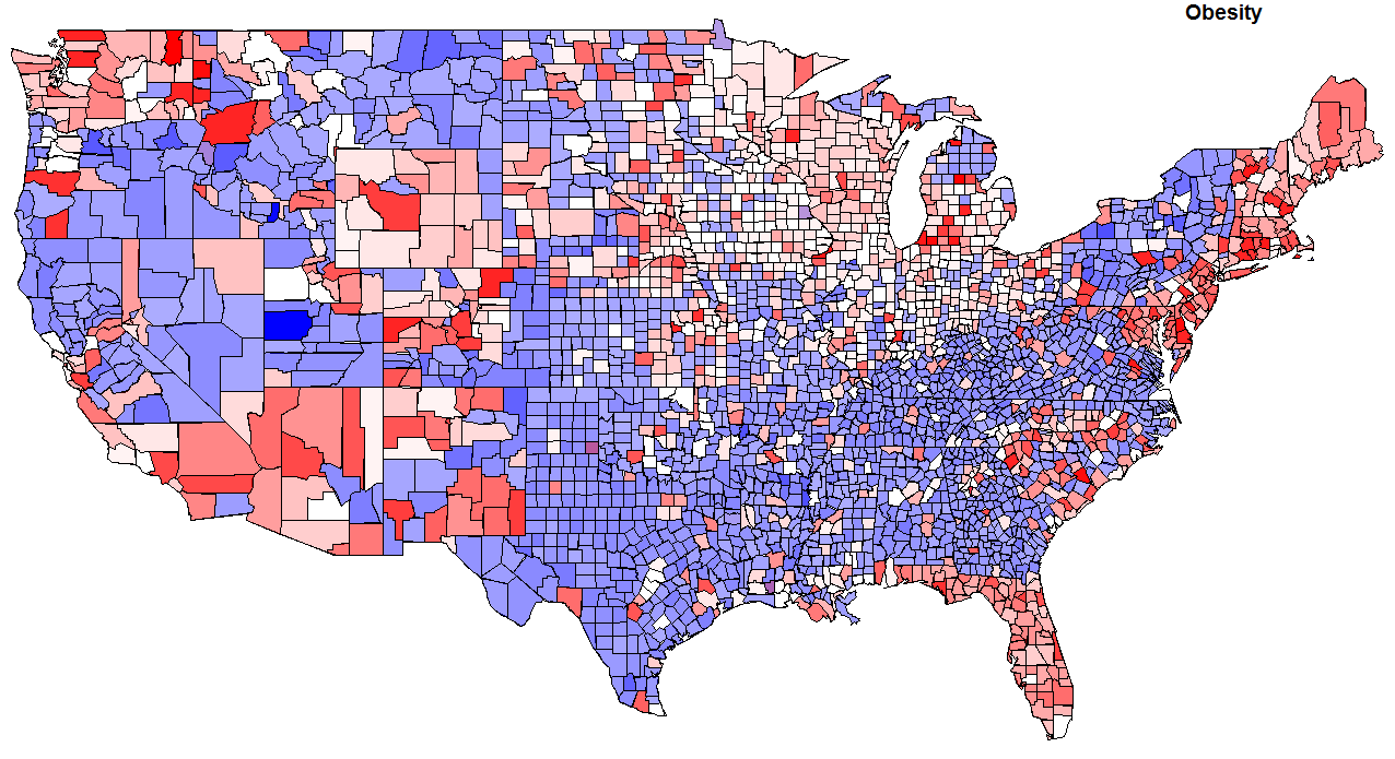 This is basically the earlier map except shaded differently. Here are the summary statistics for obesity by county: min = 12.40 1st quartile = 26.60 median = 28.40 mean = 28.25 3rd quartile = 30.20 max = 43.70 Now for my estimate of whites only: 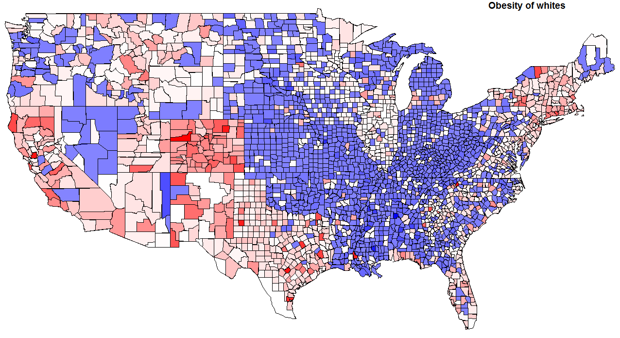 As you can see, the use of state level is causing some distortions. Also, you see something peculiar in the summary statistics: 1st quartile = 25.54 median = 27.62 mean = 26.71 3rd quartile = 29.47 max = 58.11 These averages don't align with the CDC values aggregated. But that's because I'm looking at county level data, and not weighting by population. Lots of low density counties with few people have many obese people. Instead of looking at national averages, we're looking at regional variations. On the estimates, Texas probably jumps out at you. To my surprise it turns out that whites in Texas are a touch lighter than the national average for whites! For me the big thing that sticks out is that Appalachia seems to be split in two, along the Appalachian Trail (I feel funny mentioning the Appalachian Trail....). Some areas, such as New England, Colorado and California do not surprise in terms of whites who are below the national median. But again there is a pattern of some pockets in the Upper Midwest being relatively under the norm in the proportion of obesity. Some of you might be surprised by the Pacific Northwest, but this region is characterized by urban-rural polarization. What are the correlations by ethnicity? Here are the correlations with white obesity in terms of ancestral proportion (the proportion of ethnicity X as a proportion of whites): English = -0.17 German = -0.02 American = 0.07 Scots Irish = -0.13 Irish = -0.19 These are very modest correlations. Probably mostly explained by geography. How about voting? Obama vote = -0.21 Again, modest. Median Family Income? Only -0.14! That surprised me. Interestingly, Median Home Value had a -0.26 correlation with obesity. Of course the "Dirt Gap" tracks this; in places where people are thinner property values are higher, and rose higher in the past decade. The proportion who have a college degree is like home value, a correlation of -0.25. None of this is really surprising, on the aggregate level you know that wealthier and more educated people are thinner. So I might as well do something that's not totally predictable. Most of the variance of obesity on the county level isn't predicated by educational levels, but a non-trivial fraction is. I decided to fit a loess curve to the plot of obesity (white) who are college educated. Then I simply took the residuals above and below the line and shaded them blue and red respectively. In other words, blue areas have a lot of fat people for the number of college graduates, while red areas have relatively few fat people for the number of college graduates.  Labels: data, Health, Medicine
Friday, October 09, 2009
The New York Times has a piece, The Divided States of Health Care:
Those who lack health insurance now are far more likely to live in states that usually vote Republican — the states whose senators and representatives are least likely to support a law to extend coverage.  This is not a surprising finding. Some of the most Democratic districts due to variables of race & income are in "Red States." The text alludes to more granular analysis, but it doesn't show up in the graphics, which is focused on the state level. But the county level data is freely available from the Census. To the left is a map of uninsured (those 18-64) by county. It does seem to me that state regulations or policies have some influence, look at the Pennsylvania-Ohio border with Kentucky and West Virginia, and Pennsylvania's border with New York. Culturally the Appalachian areas of Pennsylvania are extensions of West Virginia. Or look at the Missouri-Iowa border. But we can do more than just look at maps. Let's compare the county-by-county variation against other metrics. For example, how about voting for this year's Nobel Peace Prize recipient in the fall of 2008. What's the correlation? This is not a surprising finding. Some of the most Democratic districts due to variables of race & income are in "Red States." The text alludes to more granular analysis, but it doesn't show up in the graphics, which is focused on the state level. But the county level data is freely available from the Census. To the left is a map of uninsured (those 18-64) by county. It does seem to me that state regulations or policies have some influence, look at the Pennsylvania-Ohio border with Kentucky and West Virginia, and Pennsylvania's border with New York. Culturally the Appalachian areas of Pennsylvania are extensions of West Virginia. Or look at the Missouri-Iowa border. But we can do more than just look at maps. Let's compare the county-by-county variation against other metrics. For example, how about voting for this year's Nobel Peace Prize recipient in the fall of 2008. What's the correlation?I was a little surprised when I got a correlation of -0.33. That is, a negative correlation for voting for Barack Obama and proportion of uninsured on the county level. This assumes a level of linearity which really isn't there when you look more closely. You can see in the scatterplots at the bottom of this post, but let's just go with the linear for the moment so I can stick to correlations; you can correct by looking at the loess curves later on. Here are some other correlations with the proportion uninsured in each county (most of the dta are from the American Community Survey 2005-2007 of the Census, the "Foreign Born Males" data are for males over the age of 18): -.36 - White (not Latino) 0.07 - Black (not Latino) 0.48 - Latino 0.43 - Foreign Born Males -.29 - Age -.24 - Median Household Income (2006) -.15 - Median Home Value (2006) I was a little curious about the lack of correlation with health insurance for blacks, but this from the Census clears it up: At 89.4 percent, non-Hispanic Whites were more likely to have health insurance coverage than any other racial group. Those reporting 'some other race' were the least likely to have coverage, 66.0 percent [most of 'some other race' are probably Latino -Razib]. The health insurance coverage rates for the remaining single-race groups fell in that range - 85.5 percent for Asians, 83.8 percent for Native Hawaiians and Other Pacific Islanders, 82.0 for Blacks, and 68.4 percent for American Indians and Alaska Natives. The health insurance coverage rate for Hispanics was 68.5 percent. This includes both private health insurance and public health insurance (Medicaid) for those under 65. Look at the map for those at or below 200% of the poverty rate. It looks like Medicaid is covering many people in the Black Belt, while regions in Appalachia which aren't quite as destitute in northern Alabama and Mississippi are relatively underinsured. The Census also reports that those ages 18-24, and 25-34, have coverage rates of 71.4 and 73.3 respectively, before jumping up to nearly 81% in the 35-44 range. For non-citizens the rate is around 50%. How about limiting the data set to those counties where 90% of the population is white, not hispanic. That leaves 1477 counties in the data set. -.48 - Obama -.30 - Income -.12 - Home Value As you can see, in very white counties the inverse relationship between proportion uninsured and proportion voting for Barack Obama holds. I played around with limiting geographically. In New England and Tennessee there's no correlation between voting for Obama and insurance rates. But New England had really uniform voting. Tennessee might be a special case where lower insurance coverage rates among blacks are at play. In California and Texas the lack of insurance among Latinos positive correlations between voting for Obama and underinsurance, but only on the order of ~0.10. I'm a little confused by these results. You can get the original data as a csv and see if I switched the sign or did something wrong. I wouldn't be surprised. My general model though is that this is a case of: 1) The Dems tending to get high and low socioeconomic status groups (not necessarily the super-rich, but the middle and upper-middle class college-educated). 2) The poor get insurance through Medicaid. And public sector workers and small business people of approximately same incomes are likely to differ in their insurance rates (public sector workers are overwhelmingly insured from what I know). 3) Democratic leaning states have more robust insurance systems for the poor. Take a close look at some of the inter-state differences on the borders; rather stark. In a lot of data county level variation doesn't give you a sense of state borders, especially those dictated by latitude or longitude. Not so here. Here are the some plots. 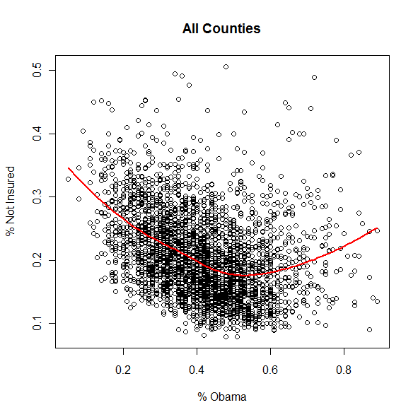 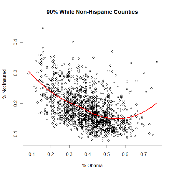 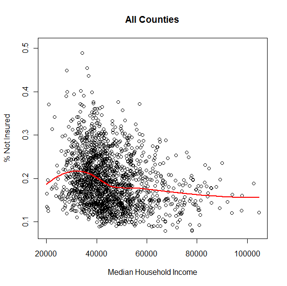  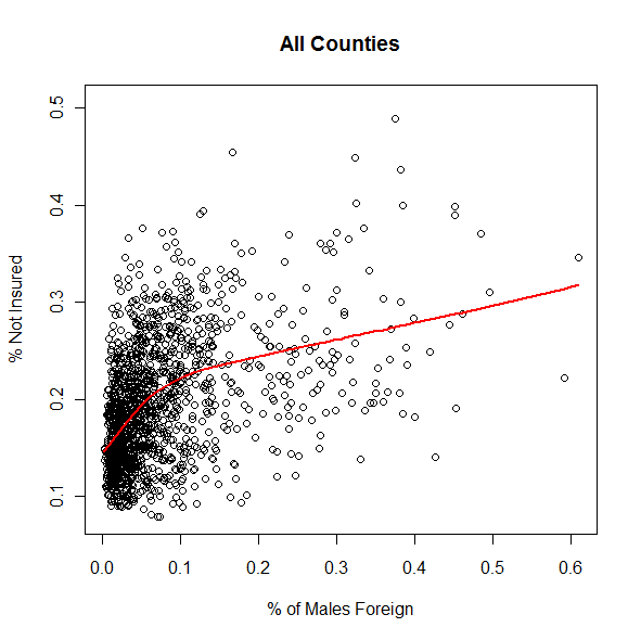 
Monday, August 31, 2009
 The effect of economic recession on population health: The effect of economic recession on population health:Economic recessions have paradoxical effects on the mortality trends of populations in rich countries. Contrary to what might have been expected, economic downturns during the 20th century were associated with declines in mortality rates. In terms of business cycles, mortality is procyclical, meaning it goes up with economic expansions and down with contractions, and not countercyclical (the opposite), as expected. So while most nations enjoyed sustained declines in mortality during the last century, the pace of the decline has been slower during economic booms and greater during so-called busts. The first rigorous studies demonstrating this trend have appeared only in the past 9 years, although the concept is not new. In contrast, for poor countries, shared economic growth appears to improve health by providing the means to meet essential needs such as food, clean water and shelter, as well access to basic health care services. But after a country reaches $5000 to $10 000 gross national product (GNP) per capita (or gross domestic product or gross national income per capita, all of which are similar for our purposes here), few health benefits arise from further economic growth...Health trends in Sweden illustrate this effect. Greg Cochran told me about this phenomenon in regards to the Great Depression last year.
Saturday, August 29, 2009
Anyone know of scientific literature on the biologically rooted psychological changes which might occur due to changes in body mass? I always assumed that weight loss or gain induced personality changes because of differences in the social acceptability of an individual's weight, but am wondering about the possible shifts in the body's biochemical pathways due to change in the amount of body fact. I began to wonder about this because of the average increases in body mass over the past generation, and what social and cultural ramifications it might have besides those of health.
Labels: Health
Tuesday, June 30, 2009
Some readers here may already follow the food-related stuff I write about at my personal blog. Well, to allow myself to write more about diet, nutrition, and food in general, I've started a new blog called Low Carb Art and Science. Lord knows there are already lots of blogs that deal with the topic, but this one will have lots more data and a stronger emphasis on evolution. But there will be plenty of less serious stuff and easy recipes too. Plus I'll take an occasional interdisciplinary approach, as with an earlier post I wrote about the late Medieval shift away from carbs and toward meat.
The first post up is about the changing American diet and poorer health -- except that the graphs show that the changing American diet has been one that's rigidly adhered to what the health experts tell us to eat. The data weren't hard to find, analyze, and present, but I've never seen them before, let alone in a clear-to-see visual format. If you doubted whether the anti-meat, pro-grain message was being followed or not, and if so, whether it was making us healthier -- this will be a real eye-opener. Take-home lesson: eat more saturated fat and cholesterol, and less carbohydrates. Comments closed here; comment over at Low Carb Art and Science.
Wednesday, June 10, 2009
 Slate has a good explanation for why stores might be cutting back on plus sizes despite the fact that Americans are getting fatter. In part it has to the do with the fact that the distribution of weights is skewed to the right. The costs of production result in a focus toward the modal body size, not the mean or median. The lower limit is bounded in a way the upper is not.... Slate has a good explanation for why stores might be cutting back on plus sizes despite the fact that Americans are getting fatter. In part it has to the do with the fact that the distribution of weights is skewed to the right. The costs of production result in a focus toward the modal body size, not the mean or median. The lower limit is bounded in a way the upper is not....Labels: Health
Friday, December 12, 2008
Steve has a modestly titled post up, Height and Weight, where he analyzes data from Anthropometric Reference Data for Children and Adults: 2003-2005 (PDF). This is government data on American men, women and children who are Non-Hispanic White, Non-Hispanic Black and Mexican American. I invite readers to peruse the raw data themselves. Steve did a little comparison of various parameters for males and females of the three populations. I thought it would be illustrative to plot the distributions of some the metrics so as to illustrate more intuitively the variation within the populations (the X axis are percentiles). Half Sigma pointed to Steve's post, and the discussion is unsurprisingly vibrant. I think it's safe to assume there is "structure" in something like weight within these populations due to geography and SES. You can see this even in New York City, just start from Bergdorf Goodman (especially around the Holidays) and walk north and east into the Upper East Side. Mean BMI starts dropping. In any case, like Steve I thought focusing on the 20-39 demographic was convenient, in part due to the nature of the readership of this weblog. Here's the CDC's BMI Calculator.
        The data I used is here. Labels: anthropometry, Health, height, human biodiversity |
  Razib's Home Page GNXP Archives Interviews Blogroll Principles of Population Genetics Genetics of Populations Molecular Evolution Quantitative Genetics Evolutionary Quantitative Genetics Evolutionary Genetics Evolution Molecular Markers, Natural History, and Evolution The Genetics of Human Populations Genetics and Analysis of Quantitative Traits Epistasis and Evolutionary Process Evolutionary Human Genetics Biometry Mathematical Models in Biology Speciation Evolutionary Genetics: Case Studies and Concepts Narrow Roads of Gene Land 1 Narrow Roads of Gene Land 2 Narrow Roads of Gene Land 3 Statistical Methods in Molecular Evolution The History and Geography of Human Genes Population Genetics and Microevolutionary Theory Population Genetics, Molecular Evolution, and the Neutral Theory Genetical Theory of Natural Selection Evolution and the Genetics of Populations Genetics and Origins of Species Tempo and Mode in Evolution Causes of Evolution Evolution The Great Human Diasporas Bones, Stones and Molecules Natural Selection and Social Theory Journey of Man Mapping Human History The Seven Daughters of Eve Evolution for Everyone Why Sex Matters Mother Nature Grooming, Gossip, and the Evolution of Language Genome R.A. Fisher, the Life of a Scientist Sewall Wright and Evolutionary Biology Origins of Theoretical Population Genetics A Reason for Everything The Ancestor's Tale Dragon Bone Hill Endless Forms Most Beautiful The Selfish Gene Adaptation and Natural Selection Nature via Nurture The Symbolic Species The Imitation Factor The Red Queen Out of Thin Air Mutants Evolutionary Dynamics The Origin of Species The Descent of Man Age of Abundance The Darwin Wars The Evolutionists The Creationists Of Moths and Men The Language Instinct How We Decide Predictably Irrational The Black Swan Fooled By Randomness Descartes' Baby Religion Explained In Gods We Trust Darwin's Cathedral A Theory of Religion The Meme Machine Synaptic Self The Mating Mind A Separate Creation The Number Sense The 10,000 Year Explosion The Math Gene Explaining Culture Origin and Evolution of Cultures Dawn of Human Culture The Origins of Virtue Prehistory of the Mind The Nurture Assumption The Moral Animal Born That Way No Two Alike Sociobiology Survival of the Prettiest The Blank Slate The g Factor The Origin Of The Mind Unto Others Defenders of the Truth The Cultural Origins of Human Cognition Before the Dawn Behavioral Genetics in the Postgenomic Era The Essential Difference Geography of Thought The Classical World The Fall of the Roman Empire The Fall of Rome History of Rome How Rome Fell The Making of a Christian Aristoracy The Rise of Western Christendom Keepers of the Keys of Heaven A History of the Byzantine State and Society Europe After Rome The Germanization of Early Medieval Christianity The Barbarian Conversion A History of Christianity God's War Infidels Fourth Crusade and the Sack of Constantinople The Sacred Chain Divided by the Faith Europe The Reformation Pursuit of Glory Albion's Seed 1848 Postwar From Plato to Nato China: A New History China in World History Genghis Khan and the Making of the Modern World Children of the Revolution When Baghdad Ruled the Muslim World The Great Arab Conquests After Tamerlane A History of Iran The Horse, the Wheel, and Language A World History Guns, Germs, and Steel The Human Web Plagues and Peoples 1491 A Concise Economic History of the World Power and Plenty A Splendid Exchange Contours of the World Economy 1-2030 AD Knowledge and the Wealth of Nations A Farewell to Alms The Ascent of Money The Great Divergence Clash of Extremes War and Peace and War Historical Dynamics The Age of Lincoln The Great Upheaval What Hath God Wrought Freedom Just Around the Corner Throes of Democracy Grand New Party A Beautiful Math When Genius Failed Catholicism and Freedom American Judaism
Archives
July 2005 August 2005 September 2005 October 2005 November 2005 December 2005 January 2006 February 2006 March 2006 April 2006 May 2006 June 2006 July 2006 August 2006 September 2006 October 2006 November 2006 December 2006 January 2007 February 2007 March 2007 April 2007 May 2007 June 2007 July 2007 August 2007 September 2007 October 2007 November 2007 December 2007 January 2008 February 2008 March 2008 April 2008 May 2008 June 2008 July 2008 August 2008 September 2008 October 2008 November 2008 December 2008 January 2009 February 2009 March 2009 April 2009 May 2009 June 2009 July 2009 August 2009 September 2009 October 2009 November 2009 December 2009 January 2010 February 2010 Hello Movable Type archives August 11,2002 August 18,2002 August 25,2002 September 01,2002 September 15,2002 October 20,2002 December 08,2002 December 22,2002 December 29,2002 January 05,2003 January 12,2003 January 19,2003 January 26,2003 February 02,2003 February 09,2003 February 16,2003 February 23,2003 March 02,2003 March 09,2003 March 16,2003 March 23,2003 March 30,2003 April 06,2003 April 13,2003 April 20,2003 April 27,2003 May 04,2003 May 11,2003 May 18,2003 May 25,2003 June 01,2003 June 08,2003 June 15,2003 June 22,2003 June 29,2003 July 06,2003 July 13,2003 July 20,2003 July 27,2003 August 03,2003 August 10,2003 August 17,2003 August 24,2003 August 31,2003 September 07,2003 September 14,2003 September 21,2003 September 28,2003 October 05,2003 October 12,2003 October 19,2003 October 26,2003 November 02,2003 November 09,2003 November 16,2003 November 23,2003 November 30,2003 December 07,2003 December 14,2003 December 21,2003 December 28,2003 January 04,2004 January 11,2004 January 18,2004 January 25,2004 February 01,2004 February 08,2004 February 15,2004 February 22,2004 February 29,2004 March 07,2004 March 14,2004 March 21,2004 March 28,2004 April 04,2004 April 11,2004 April 18,2004 April 25,2004 May 02,2004 May 09,2004 May 16,2004 May 23,2004 May 30,2004 June 06,2004 June 13,2004 June 20,2004 June 27,2004 July 04,2004 July 11,2004 July 18,2004 July 25,2004 August 01,2004 August 08,2004 August 15,2004 August 22,2004 August 29,2004 September 05,2004 September 12,2004 September 19,2004 September 26,2004 October 03,2004 October 10,2004 October 17,2004 October 24,2004 October 31,2004 November 07,2004 November 14,2004 November 21,2004 November 28,2004 December 05,2004 December 12,2004 December 19,2004 December 26,2004 January 02,2005 January 09,2005 January 16,2005 January 23,2005 January 30,2005 February 06,2005 February 13,2005 February 20,2005 February 27,2005 March 06,2005 March 13,2005 March 20,2005 March 27,2005 April 03,2005 April 10,2005 April 17,2005 April 24,2005 May 01,2005 May 08,2005 May 15,2005 May 22,2005 May 29,2005 June 05,2005 June 12,2005 June 19,2005 June 26,2005 July 03,2005 July 17,2005 August 07,2005 Blogspot archives June 2002 July 2002 August 2002 September 2002 October 2002 November 2002 December 2002
10 questions for....
Parag Khanna James Flynn Jon Entine Gregory Clark György Buzsáki Heather Mac Donald Bruce Lahn A.W.F. Edwards Luigi Luca Cavalli-Sforza Joseph LeDoux Matthew Stewart Charles Murray James F. Crow Adam K. Webb Justin L. Barrett David Haig Judith Rich Harris Ken Miller Dan Sperber Warren Treadgold Armand M. Leroi John Derbyshire
Blogs
The GiveWell Blog Your Religion Is False Colby Cosh Steve Hsu Audacious Epigone Catallaxy Files Inductivist 2 Blowhards Genetic Future Agnostic Steve Sailer Dienekes Derek Lowe Razib Khan Razib at Comment is Free Secular Right Glenn Reynolds Jim Miller Kevin McGrew John Hawks Peter Fost Randall Parker Less Wrong Charles Murray Carl Zimmer EconLog Marginal Revolution
Principles of Population Genetics
Genetics of Populations Molecular Evolution Quantitative Genetics Evolutionary Quantitative Genetics Evolutionary Genetics Evolution Molecular Markers, Natural History, and Evolution The Genetics of Human Populations Genetics and Analysis of Quantitative Traits Epistasis and Evolutionary Process Evolutionary Human Genetics Biometry Mathematical Models in Biology Speciation Evolutionary Genetics: Case Studies and Concepts Narrow Roads of Gene Land 1 Narrow Roads of Gene Land 2 Narrow Roads of Gene Land 3 Statistical Methods in Molecular Evolution The History and Geography of Human Genes Population Genetics and Microevolutionary Theory Population Genetics, Molecular Evolution, and the Neutral Theory Genetical Theory of Natural Selection Evolution and the Genetics of Populations Genetics and Origins of Species Tempo and Mode in Evolution Causes of Evolution Evolution The Great Human Diasporas Bones, Stones and Molecules Natural Selection and Social Theory Journey of Man Mapping Human History The Seven Daughters of Eve Evolution for Everyone Why Sex Matters Mother Nature Grooming, Gossip, and the Evolution of Language Genome R.A. Fisher, the Life of a Scientist Sewall Wright and Evolutionary Biology Origins of Theoretical Population Genetics A Reason for Everything The Ancestor's Tale Dragon Bone Hill Endless Forms Most Beautiful The Selfish Gene Adaptation and Natural Selection Nature via Nurture The Symbolic Species The Imitation Factor The Red Queen Out of Thin Air Mutants Evolutionary Dynamics The Origin of Species The Descent of Man Age of Abundance The Darwin Wars The Evolutionists The Creationists Of Moths and Men The Language Instinct How We Decide Predictably Irrational The Black Swan Fooled By Randomness Descartes' Baby Religion Explained In Gods We Trust Darwin's Cathedral A Theory of Religion The Meme Machine Synaptic Self The Mating Mind A Separate Creation The Number Sense The 10,000 Year Explosion The Math Gene Explaining Culture Origin and Evolution of Cultures Dawn of Human Culture The Origins of Virtue Prehistory of the Mind The Nurture Assumption The Moral Animal Born That Way No Two Alike Sociobiology Survival of the Prettiest The Blank Slate The g Factor The Origin Of The Mind Unto Others Defenders of the Truth The Cultural Origins of Human Cognition Before the Dawn Behavioral Genetics in the Postgenomic Era The Essential Difference Geography of Thought The Classical World The Fall of the Roman Empire The Fall of Rome History of Rome How Rome Fell The Making of a Christian Aristoracy The Rise of Western Christendom Keepers of the Keys of Heaven A History of the Byzantine State and Society Europe After Rome The Germanization of Early Medieval Christianity The Barbarian Conversion A History of Christianity God's War Infidels Fourth Crusade and the Sack of Constantinople The Sacred Chain Divided by the Faith Europe The Reformation Pursuit of Glory Albion's Seed 1848 Postwar From Plato to Nato China: A New History China in World History Genghis Khan and the Making of the Modern World Children of the Revolution When Baghdad Ruled the Muslim World The Great Arab Conquests After Tamerlane A History of Iran The Horse, the Wheel, and Language A World History Guns, Germs, and Steel The Human Web Plagues and Peoples 1491 A Concise Economic History of the World Power and Plenty A Splendid Exchange Contours of the World Economy 1-2030 AD Knowledge and the Wealth of Nations A Farewell to Alms The Ascent of Money The Great Divergence Clash of Extremes War and Peace and War Historical Dynamics The Age of Lincoln The Great Upheaval What Hath God Wrought Freedom Just Around the Corner Throes of Democracy Grand New Party A Beautiful Math When Genius Failed Catholicism and Freedom American Judaism   Policies Terms of use © http://www.gnxp.com Razib's total feed: |