Short memories

Several people have pointed me to the articles which quote a nationalist Japanese minister as stating, to the effect, that Arabs won’t trust blonde & blue-eyed Westerners, but have no historical aversion to East Asians. I found this kind of funny because of course the Sack of Baghdad was at the hands of the Mongols. Though the current post-colonial vogue is to attribute Arab failures to European exploitation, many scholars have long made the argument that the Mongol invasions dealt the Arabs a blow from which they never recovered (the Turks were ascendant from then on).1 It highlights the importance of history as propaganda and ideology to consider that the Crusades were relatively minor affairs compared to the later invasion of the Mongols, and yet the former loom far larger in the contemporary Arab mind.

1 – The Arab world had been in decline already during this period with the rise of Turkic warlords, but the Mongols snuffed out a late renaissance of the Caliphate in Baghdad.

A religious analogy

The discussion below about the adaptive value of religion was interesting, but it sparked in me an analogy which captures my attitude toward this phenomenon. Consider religions, such as Christianity, as analogs to political parties, such as Republicans. Many of the founders, including George Washington, were not positively disposed toward political parties because they were conscious of the problems of “faction” (which plagued the last years of the Roman Republic). Nevertheless, it seems that the past two centuries of the spread of liberal democracy show that political parties are a natural outgrowth of a vibrant representative democracy. Nations where political party systems are weak and based around personalities as opposed to ideological visions, such as the Russian Federation, also tend to be only notionally democratic. I suspect that organized “higher” religions are similar in a mass society. In small scale cultures supernaturalism is more diffuse, but in societies characterized by numerous civic associations and the necessity of political activism it seems that it is inevitable that supernaturalism will be reshaped into an organized framework. In other words, supernatural ideas might be an inevitable byproduct of the modal mind, but organized religion s the inevitable byproduct of the modal mass society.

The Unchurched

Unchurched Population Nears 100 Million in the U.S.:

A new survey released by The Barna Group, which has been tracking America’s religious behavior and beliefs since 1984, reveals that one out of every three adults (33%) is classified as unchurched – meaning they have not attended a religious service of any type during the past six months….

Some population segments are notorious church avoiders. For instance, 47% of political liberals are unchurched, more than twice the percentage found among political conservatives (19%). African Americans were less likely to be unchurched (25%) than were whites (32%) or Hispanics (34%). Asians, however, doubled the national average: 63% were unchurched….

There has been some talk about the boom in Asian American evangelical Christianity, but it is important to keep in mind that the rate of growth is in part a function of the fact that the “untapped” market is still rather large. Of course, The American Religious Identification Survey found:

…between 1990-2001 the proportion of the newly enlarged Asian American population who are Christian has fallen from 63% to 43%, while those professing Asian religions (Buddhism, Hinduism, Islam, etc) has risen from 15% to 28%.

Many of the non-Christian religions don’t have as strong a congregational tradition as Christianity. But, the finding that Asian Americans are more secular than other ethnicities is a pretty robust and consistent finding.

Why we're not all hot?

Why some people are more attractive than others:

Professor Petrie theorised that since genetic mutations can occur anywhere in the genome, some will affect the ‘DNA repair kit’ possessed by all cells. As a result, some individuals have less efficient repair kits, resulting in greater variation in their DNA as damage does unrepaired.

Although unrepaired DNA is generally harmful – causing tissue to degenerate or develop cancers – it is useful in some parts of the genome, such as those parts resposible for disease defence where variation can help in the resistance to disease. It has long been known that greater variation of DNA in the disease defending regions makes it more likely that an individual can resist attacks by bacteria and viruses.

Using a computer model to map the spread of genes in a population, Professor Petrie demonstrated that the tendency towards reduction in genetic diversity caused by sexual selection is outweighed by the maintenance in greater genetic diversity generated by mutations affecting DNA repair.

I haven’t read the paper…and the press release sounds kind of garbled. I guess the results here are suggesting that polymorphism at the disease resistence loci (e.g., MHC) is so important that DNA repair mechanisms can’t get too good. A byproduct of this is variance in the mutational load across the population. I suppose this sort of answer to “why we’re not all hot” is like the answer to why we’re not all parthenogenetic.

A visual approach to statistics

I was recently recommended an excellent book with the irresistibly seductive title The Geometry of Multivariate Statistics, which offers more visually oriented people a crisp way of thinking about statistics that still captures what the algebraic formulas say. To be sure, the author is aware that diagrams, pictures, and so on are employed anytime someone draws a histogram, but he seeks to ground the gamut of the most important ideas in statistics — variance, correlation, regression, and so on — in a geometric view, focusing mostly on vectors and trigonometry.

I have found this 160-page book to be quite helpful in fully wrapping my brain around the core ideas of statistics*, although it is best used in conjunction with a standard textbook containing the algebraic and computational sides of things. It would also help to read it after or concurrent with a first course in linear algebra: while there is no use of eigenvalues / eigenvectors or matrix algebra, you should be familiar with the basic idea of what vectors and vector spaces are (though some complain that many students memorize the matrix algorithms without “getting” the more basic ideas). The book does provide an overview of these fundamentals, but it is more of a reminder.

Both to share this exciting new way of looking at statistics, as well as to help me get a solid lock on the perspective, I thought I’d give a little taste of what the book has to offer. Unfortunately, I’ll be using fake data since I don’t have enough time to collect my own or search for that of others, but the goal here is more didactic than empirical. Caveat: anyone who’s already read the book or studied statistics in this way will be pretty bored by this post.

Background

The basic idea is that, unlike when we graph scatter-plots, which plot (in variable-space) how various subjects scored on different variables — say, height and weight — we’re going to plot the variables themselves in “subject-space,” to see directly how the variables relate to one another (since usually we don’t care about the subjects themselves except as a way to figure out the relationships between the variables). For instance, let’s say we tested two subjects on their height and weight, such that the height in inches and weight in pounds (respectively) for subjects A, B, and C were (69, 135), (72, 150), and (79, 200). In a scatter-plot, we’d have 2 axes (height and weight) and 3 data-points corresponding to the 3 subjects.

Standing this view on its head, let’s instead create a 3-D graph with one axis for each of the 3 subjects, and just 2 data-points (one for height, one for weight). The height data-point would “score” 69 on the A-axis, 72 on the B-axis, and 79 on the C-axis. The weight data-point would “score” 135, 150, and 200 on these axes, respectively. So then, our new data-points (69, 72, 79) and (135, 150, 200) are just vectors whose components are the heights and weights of all the subjects. Instead of trying to infer the properties of and relationships between the height and weight variables from a scatter-plot, we can see them more directly by examining the magnitude of the vectors and the angle between them.

Notice that if we center each variable by subtracting the mean from each component, the new vector’s components are deviations from the mean. Consider two such centered vectors x and y. If we take the dot product of x with itself, we get the sum of the squares of each component. And since the components are deviations from the mean, x dot x is equal to the variance; square-rooting this gives us the standard deviation. Now, recall the following dot product formula for the angle between x and y:

cos(x, y) = (x dot y) / (|x| times |y|)

Since any vector is collinear with itself, the angle between “them” is 0, making the cosine 1. If both vectors on the right-hand side of the equation are the same, then x dot x must equal |x| times |x| or |x|^2 to make the ratio equal 1. Because in our case x dot x equals the variance of the variable it represents, then the variance also equals the square of the length or magnitude of the vector. Thus, the length itself equals the square-root of the variance, or standard-deviation. That’s a pretty neat way to see how spread out the values of a variable are: just look at how long the vector representing it is.

As for their correlation, refer to MathWorld’s entry on the correlation coefficient, specifically line 22 (the notation for sum of squares, SS, is defined in the first 9 lines). Square-root both sides to get r by itself. Since we’ve centered our variables, we could re-write the formula as:

r = (x dot y) / (|x| times |y|)

Of course, that’s equal to the cosine of the angle between x and y, so taking the inverse-cosine of the ratio on the right-hand side gives us the correlation coefficient. Thus, the larger the cosine — and so, the smaller the angle — the larger the correlation. That makes it an easy task to see the correlation: draw the vectors from the same point and look at the angle formed between them.

An example

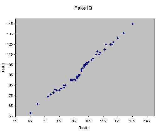
So, let’s take a look at how this might play out in the real world. Suppose we test 50 people on two distinct IQ tests and create a scatter-plot of an individual’s score on Test 1 and Test 2. It might look something like this (again, this is fake data for illustration):


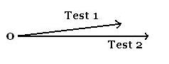
Let’s just focus on two aspects of the data, the correlation between scores and the variance in scores for each test. Clearly, there is a high correlation between scores, as we’d expect if IQ tests measure pretty much the same underlying construct (general intelligence). As a correlation always lies in [-1, 1], eyeballing the correlation from a scatter-plot forces you to judge angles that range from 0 to 45 degrees in magnitude. When we redraw the two variables as vectors, however, the angle between them (which again indicates the correlation) can range from 0 to 90 degrees in magnitude, which places less stringent demands on our visual acuity to get the gist of the picture. Judge for yourself (this shows the centered variables, but the correlation between them and their variances are unaffected by translating the mean to 0):


Even as a more visually oriented person, I find the small ang
le between the vectors (~6.9 degrees) easier to grok than the discrepancy of the trend-line’s slope from +/- 1. Turning now to the variance in scores, it’s not so clear from the scatter-plot which test has greater variance — to my eye, it looks wider than taller, suggesting Test 1 has greater variance, but this is wrong. In fact, the standard deviations for Test 1 and 2 are 14.6 and 18.3, respectively. I suspect my misjudging the spread of the two variables on the scatter-plot is due to a bias of the human visual system that finds horizontal lines longer than vertical lines of equal length, but who knows? Returning to the vector picture above, it is immediately clear that the Test 2 vector is longer than that of Test 1, indicating greater variability. Since Test 2’s SD is 18.3 / 14.6 = 1.25 times larger than that of Test 1, the corresponding vector is 1.25 times longer. Admittedly, if the variables were close to uncorrelated — and so, if the vectors were nearly orthogonal — the task of judging their respective lengths would be a bit more difficult than when they’re more closely related, but most of the interesting results that people have to share are when there is at least a weak or modest correlation between variables.

So that’s it, really — not a difficult viewpoint to understand, but I find it much more illuminating than a raw algebraic derivation of formulas. Remember that this way of thinking is no less formal or rigorous, but just taps into a different modality of thinking, which some find more natural. There is a lot more in the book (regression, ANOVA, and more), so I hope this brief post has piqued your curiosity enough to at least browse through it in your library. It’s not very long either, so why not add it to your list of must-reads?

*I started studying stats way back in high school when I took AP Statistics, so I’m no stranger to the subject. Still, the (to me) novel appeal to geometric reasoning makes a lot of it pretty intuitive now. One of the reviews at the Amazon entry claims that a lot of early work in statistics was guided by geometry, which, not being a statistician, I was unaware of — though given that the inveterate geometer R.A. Fisher pioneered a lot of modern statistics, it’s not surprising to hear.

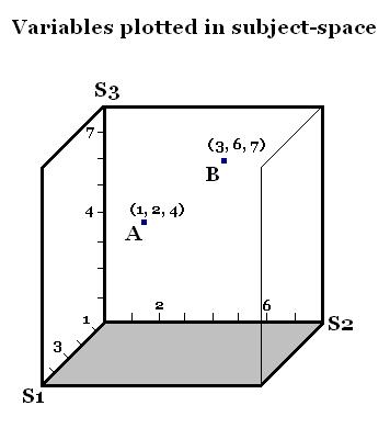
Addendum: By request, here are pictures that show the difference between plotting subjects as points in variable-space (a familiar scatter-plot) and plotting the variables as vectors in subject-space. Subject 1 scores 1 on Variable A and 3 on Variable B, so his data-point is (1, 3), and likewise for the other two Subjects.


To plot the Variables themselves, we gather their values across all three Subjects — so Variable A “scores” 1 on Subject 1 (since that is S1’s value on A), 2 on Subject 2, and 4 on Subject 3; likewise for Variable B.


The idea is to draw a vector a from the origin to (1, 2, 4) and b to (3, 6, 7). I omitted these lines since it would clutter the picture, but you can see that they point in pretty similar directions, which here means that they’re highly correlated. In fact, the cosine between them is 0.968 — their correlation.

If you measured the same 2 Variables but included data from 100 Subjects, it’s obviously impractical to try to draw a 100-dimensional coordinate grid just to plot the two vectors representing the variables. But since you can draw the length of a vector according to its SD, and draw an angle between them to indicate their correlation, you don’t really need 100 dimensions to see how the Variables relate. The simpler 3-D picture above is to illustrate the rationale: represent a Variable as a vector whose components are the scores on that Variable across all the Subjects tested.

Day 1 of hot sauce – Dave’s Insanity Hot Sauce

davepasta.jpgSo, I tried out Dave’s Insanity Hot Sauce with some Tuna pasta yesterday. Here’s a comment from Amazon: “I am a real fan of hot sauce, hot peppers and anything that makes my eyes water, and I have to honestly say that Dave’s Insanity Sauce is absolutely the hottest thing I’ve ever tasted. I use one drop in about 25 ounces of home-made tomato sauce and it makes the sauce noticibly hot. This is NOT a sauce to dash into your soup or to liven up some salsa.” Hm. So I was warned. I tried a drop…and well, it was spicy, but not that spicy. So I tried a dash. Definitely made me sweat, but it wasn’t like I was eating raw habanero or anything. So I tried another dash, and another. I had several servings of pasta and had about 7-8 small dashes in all. And I wasn’t dousing my tongue with water at all. It was spicy, but not world shattering. Additionally, I don’t think I got anything else out of the flavor (i.e., I love the non-spicy flavor in fresh green Thai Peppers). As some reviewers have noted it is a quite one dimensional sauce, the heat is cranked up, but I tasted no concomitant elevation in other flavors (e.g., sour). If fresh habanero is the standard I’d give this sauce a 7 out of 10. It wasn’t a waste of money, but I’m not getting a tub of this.

7 days of hot sauce

Regular readers know that I’m really into smokin’ hot sauces. I mean real hot. I’m the guy who the chefs at the local Thai restaurant know well enough to get their habanero paste ready for the medium rare steak flank. I’m the guy who checks out the local organic or Mexican grocery store for habanero sauce that’s not very debased with tomato extract and other vegetable additives to make it palatable for mortals. Well, I got tired of this. I’ve decided I’m going to try and obtain a wholesale quantity of really spicy hot sauce to last me for years, I’m tired of running out, I’m tired of having to run to the store to restock on my cayenne powder. So a few weeks ago I ordered 7 hot sauces from Hot Sauce.com. They just arrived, and the image is below. In the near future I plan to use each of these hot sauces during a meal, and I’ll blog it as “7 days of hot sauce.” I’m going to select from these brands my hot sauce for the years. I am looking for suggestions on what to eat to maximize my discernment powers.
hotsauce.jpg

Swappable DNA Module in Bacteria Gives Light Harnessing Ability

Engineering Bacteria to Harvest Light


Some bacteria, such as cyanobacteria, use photosynthesis to make sugars, just as plants do. But others have a newly discovered ability to harvest light through a different mechanism: using light-activated proteins known as proteorhodopsins, which are similar to proteins found in our retinas. When the protein is bound to a light-sensitive molecule called retinal and hit with light, it pumps positively charged protons across the cell membrane. That creates an electrical gradient that acts as a source of energy, much like the voltage, or electromotive force, supplied by batteries.

First discovered in marine organisms in 2000, scientists recently found that the genes for the proteorhodopsin system – essentially a genetic module that includes the genes that code for both the protein and the enzymes required to produce retinal – are frequently swapped among different microorganisms in the ocean.

Intrigued by the prospect that a single piece of DNA is really all an organism needs to harvest energy from light, the researchers inserted it into E. coli. They found that the microorganisms synthesized all the necessary components and assembled them in the cell membrane, using the system to generate energy.

The findings have implications for both marine ecology and for synthetic biology, an emerging field that aims to design and build new life forms that can perform useful functions. Giant genomic studies of the ocean have found that the rhodopsin system is surprisingly widespread. The fact that a single gene transfer can result in an entirely new functionality helps explain how this genetic module traveled so widely. In fact for microbes, this kind of module swapping may be the rule rather than the exception.

European population substructure

The American Journal of Human Genetics has an article up examining population substructure within Europe (or, more precisely, the varation of genes), Measuring European Population Stratification with Microarray Genotype Data. From the discussion:

PC1 [the largest principle component of variance] largely separates northern from southeastern individuals…and is consistent with the clines observed in classic gene-frequency…Y-chromosome…mtDNA…and whole-genome…studies of European diversity. PC2 [the second largest principle component of variance] reflects mainly east-west geographic separation and, particularly, identifies the two Iberian populations (Spanish and Basques) in our analysis as distinct…Furthermore, PC3 and PC4 emphasize the separation of the Basques and Finns, respectively, from other Europeans…The Basques are known to have unusual allele frequencies for several marker systems…and speak a unique non-Indo-European language. In line with their non-Indo-European Uralic language and previous study of their Y-chromosomesthe Finns show evidence of an increased affinity to the Central Asian populations when placed in an intercontinental context (fig. 1A and 1B)…STRUCTURE analysis of the European populations is highly consistent with PCoA; for example, when the number of populations (K) is 3, the major divisions correspond to the northern, southeastern, and Iberian populations (fig. 4B). In cases of higher K values, first the Finns (K = 4) and then the Basques (K = 5) emerge as distinctive….

The southeast-north cline that they speak of is straight out of L.L.Cavalli-Sforza’s History and Geography of Human Genes. Cavalli-Sforza argued in that book that this reflected the “demic diffusion” of agriculture and was a residue from a genetic wave of advance generated by population expansion initiated in the region of the Levant-Anatolia. By its nature a wave of advance is exhibits a weaker genetic signal in relation to the source because of dilution via intermarriage, so it is no surprise that the British, for example, are predominantly descended from the Paleolithic hunter-gatherers of northern Europe. The detection of east-west gradients, as well as the diversity of the Iberian sample, also points to the demographic expansions out of the Ice Age refugia when the glaciers retreated and northern Europe was repopulated. Note that the sample sizes for some of the local populations were very small. From the paper, “western Irish (n = 6), eastern English (n = 8), French (n = 1), German (n = 8), Valencian Spanish (n = 20), Basque Spanish (n = 8), Italian (n = 9), Polish (n = 8), Greek (n = 8), Finnish (n = 7), Armenian (n = 8), and Ashkenazi Jewish (n = 5)….”This is the most informative figure.

Population substructure in Europe – Northwest to Southeast cline?

The American Journal of Human Genetics has an article up examining population substructure within Europe (or, more precisely, the varation of genes), Measuring European Population Stratification with Microarray Genotype Data. From the discussion:

PC1 [the largest principle component of variance] largely separates northern from southeastern individuals…and is consistent with the clines observed in classic gene-frequency…Y-chromosome…mtDNA…and whole-genome…studies of European diversity. PC2 [the second largest principle component of variance] reflects mainly east-west geographic separation and, particularly, identifies the two Iberian populations (Spanish and Basques) in our analysis as distinct…Furthermore, PC3 and PC4 emphasize the separation of the Basques and Finns, respectively, from other Europeans…The Basques are known to have unusual allele frequencies for several marker systems…and speak a unique non-Indo-European language. In line with their non–Indo-European Uralic language and previous study of their Y-chromosomesthe Finns show evidence of an increased affinity to the Central Asian populations when placed in an intercontinental context…STRUCTURE analysis of the European populations is highly consistent with PCoA; for example, when the number of populations (K) is 3, the major divisions correspond to the northern, southeastern, and Iberian populations…In cases of higher K values, first the Finns (K = 4) and then the Basques (K = 5) emerge as distinctive….

The southeast-north cline that they speak of is straight out of L.L.Cavalli-Sforza’s History and Geography of Human Genes. Cavalli-Sforza argued in that book that this reflected the “demic diffusion” of agriculture and was a residue from a genetic wave of advance generated by population expansion initiated in the region of the Levant-Anatolia. By its nature a wave of advance is exhibits a weaker genetic signal in relation to the source because of dilution via intermarriage, so it is no surprise that the British, for example, are predominantly descended from the Paleolithic hunter-gatherers of northern Europe. The detection of east-west gradients, as well as the diversity of the Iberian sample, also points to the demographic expansions out of the Ice Age refugia when the glaciers retreated and northern Europe was repopulated. Note that the sample sizes for some of the local populations were very small. From the paper, “western Irish (n = 6), eastern English (n = 8), French (n = 1), German (n = 8), Valencian Spanish (n = 20), Basque Spanish (n = 8), Italian (n = 9), Polish (n = 8), Greek (n = 8), Finnish (n = 7), Armenian (n = 8), and Ashkenazi Jewish (n = 5)….” I’ve placed the most informative figure below the fold as a high res image.

Related: Jaakkeli says….