A friend of mine who was looking at the distributions on obesity and diabetes wondered about their political correlations. To do that and add anything new it seems that it would be best to estimate the white vote for Barack Obama in 2008 by county. This is how I did it:
1) I looked at the exit polls for each state, which has breakdowns by race for each candidate.
2) Since the white vote probably varies more county-by-county than the minority vote, especially the back, I used the state level exit polls and assumed that the minority vote in every county could be predicted by the state level exit poll. So for example, in New York the exit poll suggest that 100% of blacks voted for Obama. So I would weight appropriately.
3) I also weighted by national turnout numbers. In other words, whites were a little overrepresented in the electorate, blacks equal to their demographic weight, and Asians and Latinos underrepresented. So:
% Obama in county = (White turnout)(White %)(White proportion) + (Black turnout)(White %)(Black proportion) + (Latino turnout)(Latino %)(Latino proportion) + (Asian turnout)(Asian %)(Asian proportion)
Many states did not have results for ethnic minorities in the exit polls, so the white vote estimate is identical to the real results in many counties (the correlation between my estimate and the real returns is on the order of 0.99-0.98 north of 85% or more non-Hispanic white). In places like Mississippi where most everyone is either black or white, we can probably be sure that blacks voted well in excess of 90% for Obama, I think the estimate for whites is probably pretty good. The main issue is with Latinos, who I suspect seem to vary quite a bit more than blacks (in fact, they probably tend to follow whites in voting except that they’re more Democratic all variables controlled (again, I had to discard some counties were negative proportions pop up because Latinos are more Republican locally than on the state level).
Fist some maps, then some correlations. Again, note that red is below and blue above whatever threshold I’m using (usually median).
For the correlations, “est” means my estimate. Reduce the confidence in those correlations accordingly, as my data analysis hasn’t gone through peer review! (until you comment)
Here are the summaries for Obama vote estimate:
1st quartile = 0.2240
median = 0.3591
mean = 0.3587
3rd quartile = 0.4754
Since Democratic votes are concentrated in a few highly populous counties the low proportions are not a surprise. Lots of counties with few people are anti-Obama.
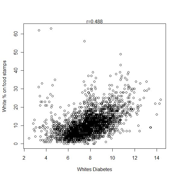
White Obama Vote (est)- White Diabetes Rate (est) = -0.26
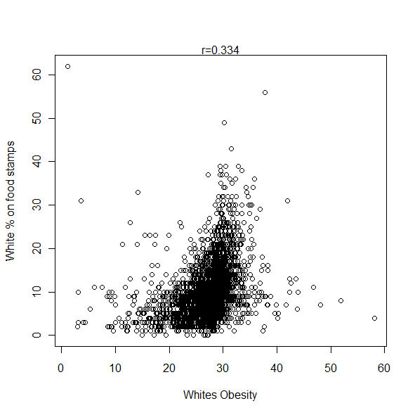
White Obama Vote (est)- White Obesity Rate (est) = -0.29
White Obama Vote (est)- White Birth Rate = -0.17
White Obama Vote (est)- College Degree = 0.42
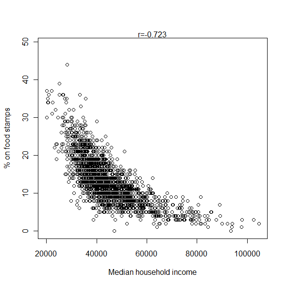
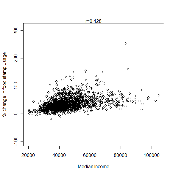
White Obama Vote (est)- Median Household Income = 0.28
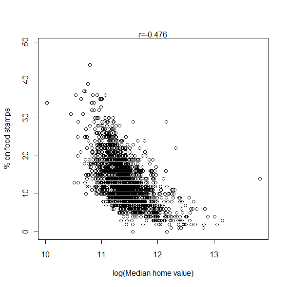
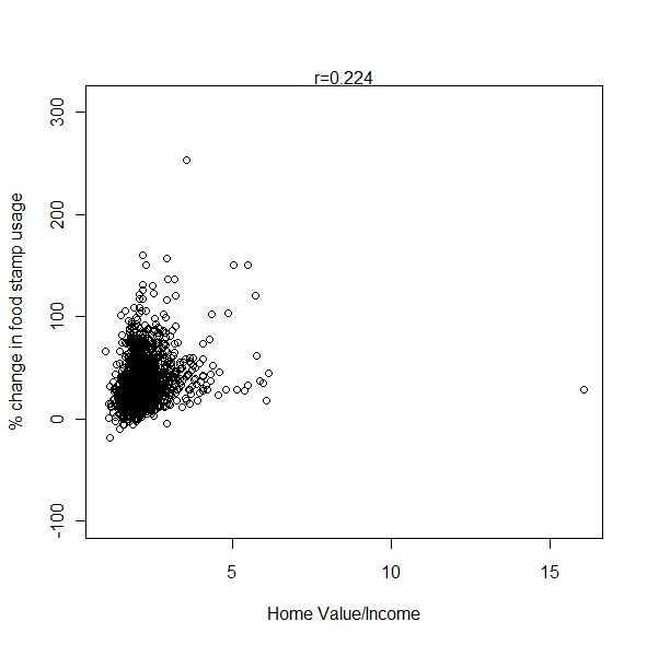
White Obama Vote (est)- Median Home Value = 0.40
(for whites ancestry are proportion of whites, i.e., Irish/White = Irish proportion)
White Obama Vote (est)- Origins in Britain & Ireland = -0.24
White Obama Vote (est)- English = 0.08
White Obama Vote (est)- Irish = 0.37
White Obama Vote (est)- Scots Irish = -0.13
White Obama Vote (est)- American = -0.50
White Obama Vote (est)- German = 0.38
White Obama Vote (est)- Scandinavian = 0.30
Partial correlations controlling for college degree rate:
White Obama Vote (est)- White Diabetes Rate (est) = -0.30
White Obama Vote (est)- White Obesity Rate (est) = -0.29
White Obama Vote (est)- White Birth Rate = -0.20
White Obama Vote (est)- Median Household Income = 0.00
White Obama Vote (est)- Median Home Value = 0.17
White Obama Vote (est)- American = -0.46
White Obama Vote (est)- German = 0.36
Partial correlations controlling for median household income:
White Obama Vote (est)- White Diabetes Rate (est) = -0.36
White Obama Vote (est)- White Obesity Rate (est) = -0.33
White Obama Vote (est)- White Birth Rate = -0.21
White Obama Vote (est)- Median Home Value = 0.30
White Obama Vote (est)- American = -0.52
White Obama Vote (est)- German = 0.35
The correlation between the white Obama vote and the proportion of blacks within a county is in the range of -0.30 to -0.40 (on the high end), even controlling for income and such (the blacker the county, the fewer whites voted for Obama). Interestingly when I control for black proportion the German correlation for voting for Obama drops a bit to 0.26, and the American correlation drops from the other direction, -0.39. Race can explain some, but definitely not all of these inter-ethnic differences in the white vote.
Poking through demographic data, a few things always seem to crop up:
1) Texas isn’t quite like the rest of the South. It is more Republican on the federal level than racial polarization into a white and black party would predict.
2) The Latino counties in Texas are hard to fit into a model which is derived from conditions in the rest of the country. They have lower morbidity and are somewhat more conservative than Latinos elsewhere (in fact, their morbidity is lower than whites in many regions of the country). I often have to discard these counties because estimates using state level parameters are weird (in the case of white voting patterns or diabetes rates, negative values).
3) There’s stuff going on in Appalachia which needs to be explored. I’m going to analyze Appalachian counties specifically in the near future. I had assumed that aside from outliers like Asheville Appalachia was relatively homogeneous. Not so.
