
|
Friday, January 01, 2010
Estimating black-white racial tension from 1850 to present
posted by
agnostic @ 1/01/2010 08:59:00 PM
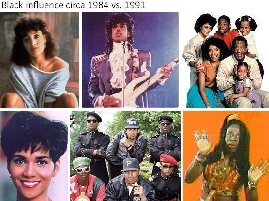 As a New Year's gift, here is a free copy of an entry I put up on my data blog (details on that here). It's a quantitative look at the history of race and culture in America, together with qualitative examples that illustrate the story that the numbers tell. Enjoy. As a New Year's gift, here is a free copy of an entry I put up on my data blog (details on that here). It's a quantitative look at the history of race and culture in America, together with qualitative examples that illustrate the story that the numbers tell. Enjoy.Previously I looked at how much attention elite whites have given to blacks since the 1870s by measuring the percent of all Harvard Crimson articles that contained the word "negro." That word stopped being used in any context after 1970, which doesn't allow us to see what's happened since then. Also, it is emotionally neutral, so while it tells us how much blacks were on the radar screen of whites, it doesn't suggest what emotions colored their conversations about race. When tensions flare, people will start using more charged words more frequently. The obvious counterpart to "negro" in this context is "nigger." It could be used by racists hurling slurs, non-racists who are quoting or decrying the slur, by tribalist blacks trying to open old wounds to recruit new members, by blacks trying to "re-claim" the term, by those debating whether or not the term should be used in any context, and so on. Basically, when racial tension is relatively low, these arguments don't come up as often, so the word won't appear as often. I've searched the NYT back to 1852 and plotted how prevalent "nigger" was in a given year, though smoothing the data out using 5-year moving averages (click to enlarge): 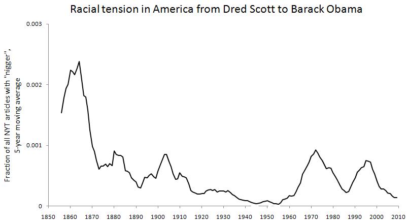 We see high values leading up and throughout the Civil War, a comparatively lower level during Reconstruction, followed by two peaks that mark "the nadir of American race relations." It doesn't change much going through the 1920s, even though this is the period of the Great Migration of blacks from the South to the West and Northeast. It falls and stays pretty low during the worst part of the Great Depression, WWII, and the first 10 years after the war. This was a period of increasing racial consciousness and integration, and the prevalence of "negro" in the Crimson was increasing during this time as well. That means that there was a greater conversation taking place, but that it wasn't nasty in tone. However, starting in the late 1950s it moves sharply upward, reaching a peak in 1971. This is the period of the Civil Rights movement, which on an objective level was merely continuing the previous trend of greater integration and dialogue. Yet just as we'd guess from what we've studied, the subjective quality of this phase of integration was much more acrimonious. Things start to calm down throughout the '70s and mid-'80s, which our study of history wouldn't lead us to suspect, but which a casual look at popular culture would support. Not only is this a period where pop music by blacks had little of a racial angle -- that was also true of most of the R&B music of most of the '60s -- but was explicitly about putting aside differences and moving on. This is most clearly shown in the disco music scene and its re-birth a few years later during the early '80s dance and pop music scene, when Rick James, Prince, and above all Michael Jackson tried to steer the culture onto a post-racial course. But then the late '80s usher in a resurgence of identity politics based on race, sex, and sexual orientation ("political correctness," colloquially). The peak year here is technically 1995, but that is only because of the unusual weight given to the O.J. Simpson trial and Mark Fuhrman that year. Ignoring that, the real peak year of the racial tension was 1993 according to this measure. By the late '90s, the level has started to plummet, and the 2000s have been -- or should I say were -- relatively free of racial tension, a point I've made for awhile but that bears repeating since it's not commonly discussed. Many people mention Obama's election, but that was pretty late in the stage. Think back to Hurricane Katrina and Kanye West trying but failing to foment another round of L.A. riots, or Al Sharpton trying but failing to turn the Jena Six into a civil rights cause celebre, or the mainstream media trying but failing to turn the Duke lacross hoax into a fact that would show how evil white people still are. We shouldn't be distracted by minor exceptions like right-thinking people casting out James Watson because that was an entirely elite and academic affair. It didn't set the entire country on fire. The same is true for the minor exception of Larry Summers being driven out of Harvard, which happened during a remarkably feminism-free time. Indeed, it's hard to recognize the good times when they're happening -- unless they're fantastically good -- because losses loom larger than gains in our minds. Clearly racial tensions continue to go through cycles, no matter how much objective progress is made in improving the status of blacks relative to whites. Thus, we cannot expect further objective improvements to prevent another wave of racial tension. Aside from the long mid-20th C hiatus, there are apparently 25 year distances between peaks, which is about one human generation. If the near future is like most of the past, we predict another peak around 2018, a prediction I've made before using similar reasoning about the length of time separating the general social hysterias that we've had -- although in those cases, just going back to perhaps the 1920s or 1900s, not all the way back to the 1850s. Still, right now we're in a fairly calm phase and we should enjoy it while it lasts. If you feel the urge to keep quiet on any sort of racial issues, you should err on the side of being more vocal for right now, since the mob isn't predicted to come out for another 5 years or so, and the peak not until 10 years from now. As a rough guide to which way the racial wind is blowing, simply ask yourself, "Does it feel like it did after Rodney King and the L.A. riots, or after the O.J. verdict?" If not, things aren't that bad. Looking at absolute levels may be somewhat inaccurate -- maybe all that counts is where the upswings and downswings are. So I've also plotted the year-over-year percent change in how prevalent "nigger" is, though this time using 10-year moving averages to smooth the data out because yearly flucuations up or down are even more volatile than the underlying signal. In this graph, positive values mean the trend was moving upward, negative values mean it was moving downward, and values close to 0 mean it was staying fairly steady:  Again we see sustained positive growth during the Civil War, the two bookends of the nadir of race relations, although we now see a small amount of growth during the Harlem Renaissance era. The Civil Rights period jumps out the most. Here, the growth begins in the mid-1940s, but remember that it was at its lowest absolute levels then, so even the modest increases that began then show up as large percent increases. The PC era of the late '80s through the mid '90s also clearly shows up. There are several periods of relative stasis, but I see three periods of decisively moving against a nasty and bitter tone in our racial conversations: Reconstruction after the Civil War (admittedly not very long or very deep), the late '30s through WWII, and the "these are the good times" / Prince / Michael Jackson era of the mid-late '70s through the mid '80s, which is the most pronounced of all. That trend also showed up television, when black-oriented sitcoms were incredibly popular. During the 1974-'75 season, 3 of the top 10 TV shows were Good Times, Sanford and Son, and The Jeffersons. The last of those that were national hits, at least as far as I recall, were The Cosby Show, A Different World, Family Matters, The Fresh Prince of Bel-Air, and In Living Color, which were most popular in the late '80s and early '90s. Diff'rent Strokes spans this period perfectly in theme and in time, featuring an integrated cast (and not in the form of a "token black guy") and lasting from 1978 to 1986. The PC movement and its aftermath pretty much killed off the widely appealing black sitcom, although after a quick search, I see that Disney had a top-rated show called That's So Raven in the middle of the tension-free 2000s. But it's hard to think of black-focused shows from the mid-'90s through the early 2000s that were as popular as Good Times or The Cosby Show. (In the top picture, the comparison between Jennifer Beals and Halle Berry shows that a black-white biracial babe actress who came of age during the late '70s and early '80s took a white husband twice, while her counterpart who became famous in the early '90s went instead for black men.) But enough about TV. The point is simply that the academic material we're taught in school usually doesn't take into account what's popular on the radio or TV -- the people's culture only counts if they wrote songs about walking the picket line, showed that women too can be mechanics, or that we shall overcome. Historians, and people generally, are biased to see things as bad and getting worse, so they rarely notice when things were pretty good. But some aspects of popular culture can shed light on what was really going on because its producers are not academics with an axe to grind but entrepreneurs who need to know their audience and stay in touch with the times. Labels: culture, data, History, Pop Culture, race
Tuesday, December 29, 2009
One year after the financial collapse, Gotham in a downward spiral
posted by
Razib @ 12/29/2009 12:59:00 AM
Actually, not really. New York on Track for Fewest Homicides on Record. I assume that those who project long term fiscal problems due to a contraction in the financial sector in New York City are probably correct (assuming that the financial sector actually doesn't expand back to its pre-2009 size). But the assumption that the economic fallout would lead to 1970s levels of anomie doesn't seem to be panning out. As I indicated earlier I found suggestions of such a reversion plausible at the time because I had a rather economistic mental model of the "root causes" of crime. But that seems less plausible when you look over the arc of the past century. Another model of course is that in fact it was financial sector workers who were driving much of the crime directly by subsidizing illicit activity through their enormous incomes generated by the efficiencies of capital allocation which they drove (I'm not being serious here).
Labels: data
Monday, December 21, 2009
Despite recession, crime keeps falling:
In times of recession, property crimes, in particular, are expected to rise. Who expected crime to increase? Did you? I did. But I didn't know anything about crime statistics over time so I was working off naive intuition. Did social scientists expect this? I recall a lot of worry in the media about a year ago that the crime drop which started in the 1990s would be reversed, and I shared the worry. Here's Matt Yglesias worrying last January: I think this is worth worrying about. One thing we know about crime is that when wages and employment levels for low-skill workers are high, crime goes down. Another is that mass incarceration works - increase the number of beds in prison and the number of sentence-years handed out and the crime rate drops. But the first of these is the reverse of what happens in a recession, and the second we've already pushed well past the limit of cost-effectiveness (see here) and it's inconceivable to me that you could actually push this far enough to compensate for the declining economy in the context of declining state budgets. It's easy to find national uniform crime reports data back to 1960, and unemployment rates. Quick correlations between 1960-2008 are: Violent Crime Aggregated 0.37 Murder 0.52 Rape 0.37 Robbery 0.53 Assault 0.24 Property Crime Aggregated 0.53 One seems to see a modest expectation for a rise in crime then over this time period. But poking around the ICPSR I came across Eric Monkkonen's data sets on homicide in New York City going back to the 19th century. Below are homicides per capita by year between 1900 and 2000. The second chart is log-transformed. 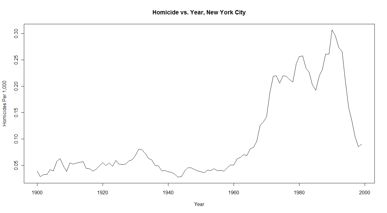 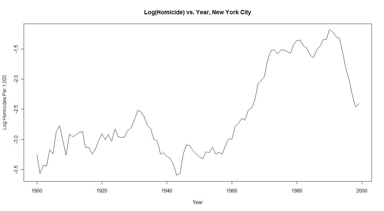 It seems that there's another "Depression Paradox" here. The economic distress of the Great Depression seems to have been associated with less crime, while the economic exuberance of the 1920s led to more crime. So if I constrained the time series from 1920-1940 the correlations might be quite different. All things equal the recent past is a better guide to the near future than the less recent past. But it's important to remember that history does sometimes work in cycles, and the deeper past can occasionally give us insights which the recent past can not. One could construct a tentative model whereby basal crime rates reflect cultural norms, and once norms and crime hit a particular "equilibrium" it may take a bit of a "shock" for it to shift out of the stable state.
Thursday, December 17, 2009
At the Inter-University Consortium for Political & Social Research. Registration is free.
Labels: data
Tuesday, December 08, 2009
Derek Thompson at The Atlantic has a post Are America's Fattest States Also the Most Jobless?. The county-level data on unemployment only goes back to 2008 (at least that I can find online). But I do have data on obesity at the county-level too. What's the correlation? 0.32. Pretty modest. If I correlate for white obesity it goes down a little, 0.23 (though remember that I estimated white obesity, so be cautious about this). Since I also have food stamp utilization data I looked at that. Correlation is 0.56. If you think of this as r-squared, how much of variance of Y can be explained by X by squaring the correlation, it's a much stronger association. I constructed a quick regression where % unemployed on the county-level was the dependent variable, and % black, obese, median household income and % on food stamps were the independents. Except for food stamps none of these variables generated statistically significant beta coefficients. In other words, regional level differences in unemployment in 2008 which tracked obesity are probably best explained as emerging out of a general poverty factor (though do note that median household income itself isn't very predictive once % on food stamps gets put into the equation).
I don't doubt that all things equal the obese would be fired first. That being said, all things are often not equal. Update: I realized I left something out. Looking at the correlation college degree holding on the county-level and unemployment in 2008, I found it to be -0.43. So I popped that into the regression, and here are the coefficients with standard errors (all statistically significant): Black 1.20987610 (0.33416977) College Degree -7.64273043 (0.62394667) Percent on Food Stamps 0.14095962 (0.00946762) Median Household Income 0.00002967 (0.00000523) Obesity -0.06840311 (0.01494881) I'll let readers wonder what's going on here, though I assume it has something to do with the changes in the education premium and such with globalization. Labels: data, Food stamps
Sunday, November 29, 2009
Are over-leveraged counties seeing an increase in food stamp usage?
posted by
Razib @ 11/29/2009 11:33:00 AM
Since The New York Times put up the csv file which they used to generate their maps of food stamp usage, I thought I'd look at the data a little closer. In particular, look at this graphic of change in food stamp usage by county (dark equals more usage):
 I was curious about this part from the story below:: While use is greatest where poverty runs deep, the growth has been especially swift in once-prosperous places hit by the housing bust. There are about 50 small counties and a dozen sizable ones where the rolls have doubled in the last two years. In another 205 counties, they have risen by at least two-thirds. These places with soaring rolls include populous Riverside County, Calif., most of greater Phoenix and Las Vegas, a ring of affluent Atlanta suburbs, and a 150-mile stretch of southwest Florida from Bradenton to the Everglades. Thanks to the Census I happen to have 2007 housing value and household income data. Also though it would be interesting to compare with obesity and diabetes rates. Scatterplots & correlations (r) below. 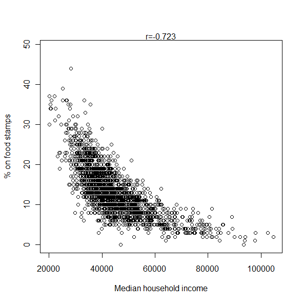 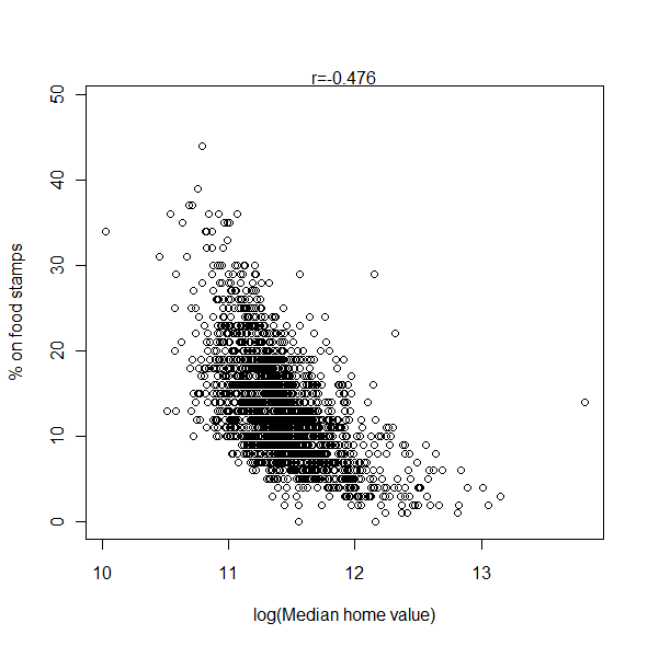  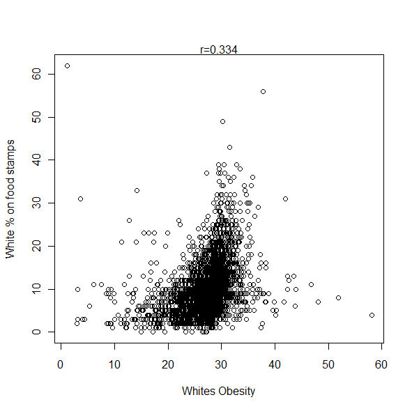 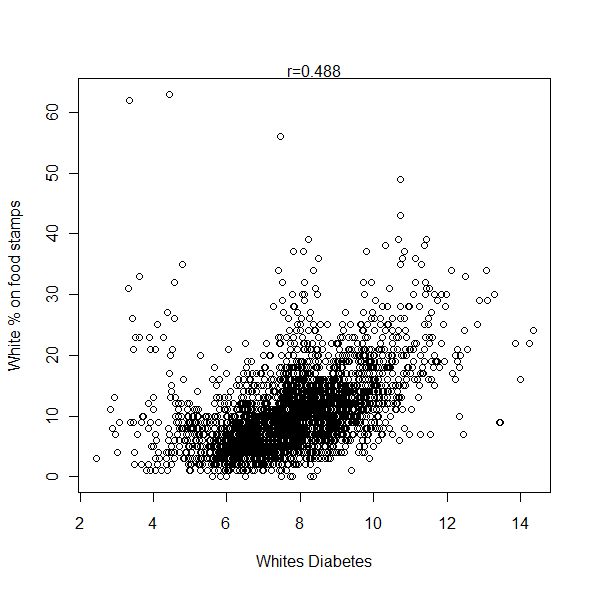 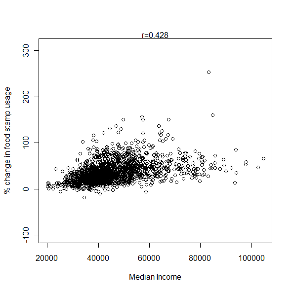  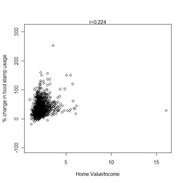 It does indeed seem that food stamp usage has been increasing in higher income and property value counties. The Census data I used above were collected between 2005-2007, during the height of the late great property bubble. But when I took the ratio of property value by income as a rough proxy for being over-leveraged it didn't seem to add much. When I took the partial correlation of home value and increase in food stamp usage controlling for income, it was only 0.11. Here are some other correlations controlling for income: % on food stamps - obesity = 0.33 % on food stamps - diabetes = 0.44 % of whites on food stamps - white diabetes rates = 0.36 % of whites on food stamps - white obesity rates = -0.05 There's an obvious correlation between black proportion in a county and food stamp utilization. r = 0.43. So using proportion of blacks as a control: % on food stamps - obesity = 0.43 % on food stamps - diabetes = 0.51 % on food stamps - white diabetes rates = 0.43 % on food stamps - white obesity rates = 0.06 % on food stamps - median household income = -0.71 It does seem to be correct though that food stamp utilization has been shooting up in more affluent communities. But if it is true that well over 90% of those eligible in places like Missouri are already using food stamps, while only 50% of those eligible in California are, it makes a bit more sense. In wealthier communities likely more people go in and out of eligibility and so never need to make recourse. In contrast, in regions where people are immobile and poverty is chronic there isn't as much scope to increase the program because most people who are eligible are already on it. That probably explains the triangular geometry of the scatterplot, very low on the affluence latter social services seem to have soaked up all eligible individuals, leaving little room for increase with the recession. Note: Estimates are white obesity are based on state level variation. Estimates of white diabetes rates are based on national level variation. These two variables need to be appropriately down-weighted in terms of confidence of their accuracy, especially the second. Update: By coincidence, a reader noted this similarity of maps this morning: 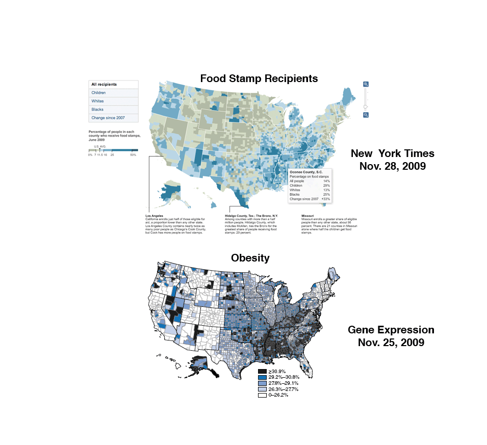 Labels: data, Diabetes, Food stamps, Obesity
Saturday, November 28, 2009
A friend of mine who was looking at the distributions on obesity and diabetes wondered about their political correlations. To do that and add anything new it seems that it would be best to estimate the white vote for Barack Obama in 2008 by county. This is how I did it:
1) I looked at the exit polls for each state, which has breakdowns by race for each candidate. 2) Since the white vote probably varies more county-by-county than the minority vote, especially the back, I used the state level exit polls and assumed that the minority vote in every county could be predicted by the state level exit poll. So for example, in New York the exit poll suggest that 100% of blacks voted for Obama. So I would weight appropriately. 3) I also weighted by national turnout numbers. In other words, whites were a little overrepresented in the electorate, blacks equal to their demographic weight, and Asians and Latinos underrepresented. So: % Obama in county = (White turnout)(White %)(White proportion) + (Black turnout)(White %)(Black proportion) + (Latino turnout)(Latino %)(Latino proportion) + (Asian turnout)(Asian %)(Asian proportion) Many states did not have results for ethnic minorities in the exit polls, so the white vote estimate is identical to the real results in many counties (the correlation between my estimate and the real returns is on the order of 0.99-0.98 north of 85% or more non-Hispanic white). In places like Mississippi where most everyone is either black or white, we can probably be sure that blacks voted well in excess of 90% for Obama, I think the estimate for whites is probably pretty good. The main issue is with Latinos, who I suspect seem to vary quite a bit more than blacks (in fact, they probably tend to follow whites in voting except that they're more Democratic all variables controlled (again, I had to discard some counties were negative proportions pop up because Latinos are more Republican locally than on the state level). Fist some maps, then some correlations. Again, note that red is below and blue above whatever threshold I'm using (usually median).    For the correlations, "est" means my estimate. Reduce the confidence in those correlations accordingly, as my data analysis hasn't gone through peer review! (until you comment) Here are the summaries for Obama vote estimate: 1st quartile = 0.2240 median = 0.3591 mean = 0.3587 3rd quartile = 0.4754 Since Democratic votes are concentrated in a few highly populous counties the low proportions are not a surprise. Lots of counties with few people are anti-Obama. White Obama Vote (est)- White Diabetes Rate (est) = -0.26 White Obama Vote (est)- White Obesity Rate (est) = -0.29 White Obama Vote (est)- White Birth Rate = -0.17 White Obama Vote (est)- College Degree = 0.42 White Obama Vote (est)- Median Household Income = 0.28 White Obama Vote (est)- Median Home Value = 0.40 (for whites ancestry are proportion of whites, i.e., Irish/White = Irish proportion) White Obama Vote (est)- Origins in Britain & Ireland = -0.24 White Obama Vote (est)- English = 0.08 White Obama Vote (est)- Irish = 0.37 White Obama Vote (est)- Scots Irish = -0.13 White Obama Vote (est)- American = -0.50 White Obama Vote (est)- German = 0.38 White Obama Vote (est)- Scandinavian = 0.30 Partial correlations controlling for college degree rate: White Obama Vote (est)- White Diabetes Rate (est) = -0.30 White Obama Vote (est)- White Obesity Rate (est) = -0.29 White Obama Vote (est)- White Birth Rate = -0.20 White Obama Vote (est)- Median Household Income = 0.00 White Obama Vote (est)- Median Home Value = 0.17 White Obama Vote (est)- American = -0.46 White Obama Vote (est)- German = 0.36 Partial correlations controlling for median household income: White Obama Vote (est)- White Diabetes Rate (est) = -0.36 White Obama Vote (est)- White Obesity Rate (est) = -0.33 White Obama Vote (est)- White Birth Rate = -0.21 White Obama Vote (est)- Median Home Value = 0.30 White Obama Vote (est)- American = -0.52 White Obama Vote (est)- German = 0.35 The correlation between the white Obama vote and the proportion of blacks within a county is in the range of -0.30 to -0.40 (on the high end), even controlling for income and such (the blacker the county, the fewer whites voted for Obama). Interestingly when I control for black proportion the German correlation for voting for Obama drops a bit to 0.26, and the American correlation drops from the other direction, -0.39. Race can explain some, but definitely not all of these inter-ethnic differences in the white vote. Poking through demographic data, a few things always seem to crop up: 1) Texas isn't quite like the rest of the South. It is more Republican on the federal level than racial polarization into a white and black party would predict. 2) The Latino counties in Texas are hard to fit into a model which is derived from conditions in the rest of the country. They have lower morbidity and are somewhat more conservative than Latinos elsewhere (in fact, their morbidity is lower than whites in many regions of the country). I often have to discard these counties because estimates using state level parameters are weird (in the case of white voting patterns or diabetes rates, negative values). 3) There's stuff going on in Appalachia which needs to be explored. I'm going to analyze Appalachian counties specifically in the near future. I had assumed that aside from outliers like Asheville Appalachia was relatively homogeneous. Not so.
Friday, November 27, 2009
Since it's after Thanksgiving and I'm feeling bloated, I figure a follow up to the post on obesity and diabetes might be apropos. I want to focus on obesity. I have the raw county-by-county data, but obviously it isn't broken down by race. But, I do have the proportions for reach race by county, and, the CDC provides state-by-state breakdowns of the proportion of obese by race. So I decided to "estimate" the proportion of whites obese by county.
1) By "white," I mean "Non-Hispanic white." I'm going to say "white" from now on exclusive of Hispanics. 2) Some states, such as Vermont, do not have a large enough sample to estimate the obesity proportion of blacks. I just used a neighboring state to fill in the numbers. This guesstimate is really not much of an issue because the proportion of blacks is so low in the states I had to estimate that the estimate of obesity for whites and estimate of obesity for all races is the same in these counties anyhow. 3) Simple algebra. Total Obesity Percent In County = (Obesity Percent Whites) X (Percent Whites) + (Obesity Percent Blacks) X (Percent Blacks) + (Obesity Percent Latinos) X (Percent Latinos) For the obesity percent of blacks and Latinos I only have state level data, so this is going to be a rough estimate. And it's going to result in the variation exhibiting state-to-state discontinuities, since the county variable is dependent on a state level variable. Also, I discarded some counties where the usage of state level data caused really big distortions. Along the Mexican border Latinos are not nearly as obese as they are further into the United States, so I end up with numbers where whites have negative obesity percentages to make the math work out. These are counties which are 90% or more Latino with relatively low obesity numbers. I did the map shading the way I normally do. Blue is above the median value, and red below the median value, with the scale being set to their max and mins respectively. Unfortunately this causes a problem in the scaling in terms of an asymmetry because one side of the distribution will tend to have a more extreme outlier (usually the above median is where the skew is). Here's the map with all the populations: 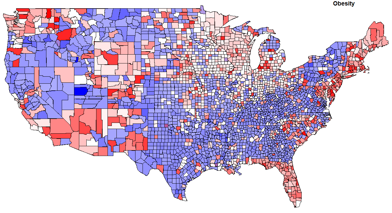 This is basically the earlier map except shaded differently. Here are the summary statistics for obesity by county: min = 12.40 1st quartile = 26.60 median = 28.40 mean = 28.25 3rd quartile = 30.20 max = 43.70 Now for my estimate of whites only: 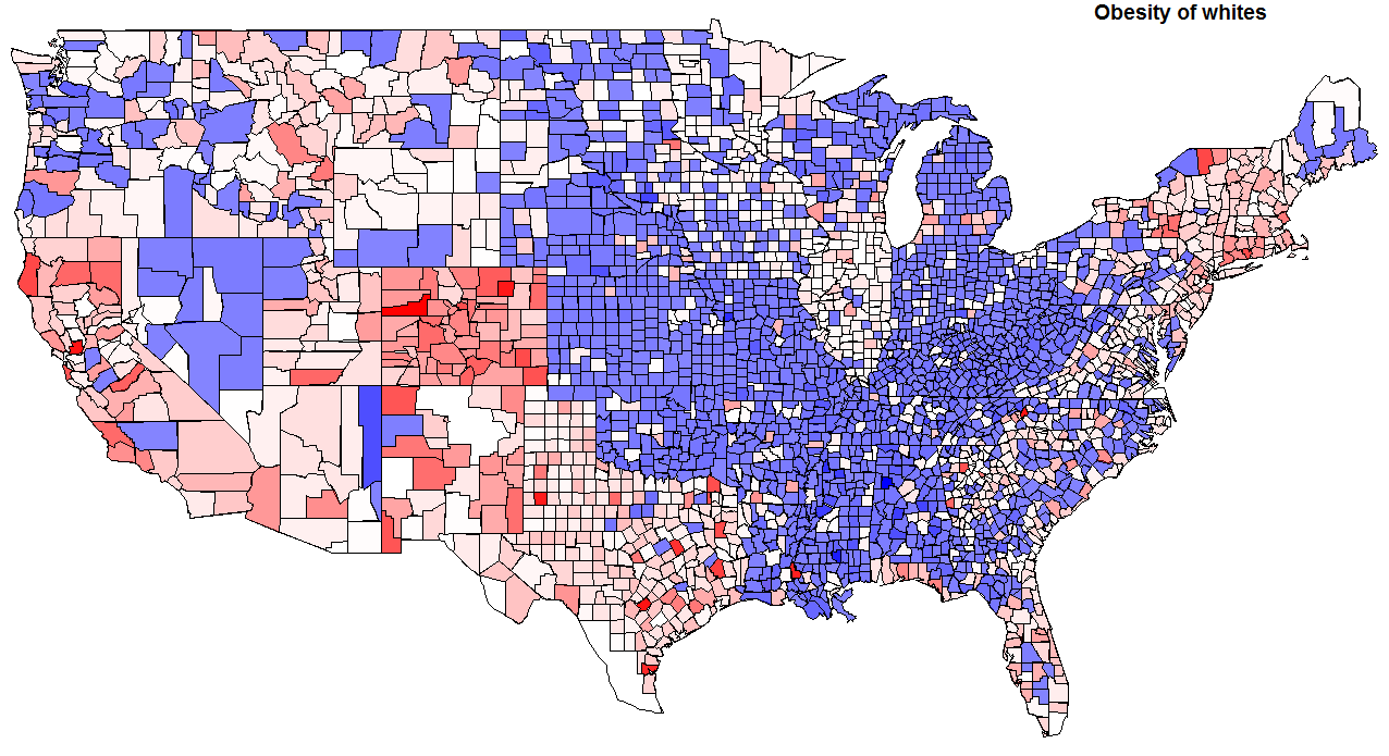 As you can see, the use of state level is causing some distortions. Also, you see something peculiar in the summary statistics: 1st quartile = 25.54 median = 27.62 mean = 26.71 3rd quartile = 29.47 max = 58.11 These averages don't align with the CDC values aggregated. But that's because I'm looking at county level data, and not weighting by population. Lots of low density counties with few people have many obese people. Instead of looking at national averages, we're looking at regional variations. On the estimates, Texas probably jumps out at you. To my surprise it turns out that whites in Texas are a touch lighter than the national average for whites! For me the big thing that sticks out is that Appalachia seems to be split in two, along the Appalachian Trail (I feel funny mentioning the Appalachian Trail....). Some areas, such as New England, Colorado and California do not surprise in terms of whites who are below the national median. But again there is a pattern of some pockets in the Upper Midwest being relatively under the norm in the proportion of obesity. Some of you might be surprised by the Pacific Northwest, but this region is characterized by urban-rural polarization. What are the correlations by ethnicity? Here are the correlations with white obesity in terms of ancestral proportion (the proportion of ethnicity X as a proportion of whites): English = -0.17 German = -0.02 American = 0.07 Scots Irish = -0.13 Irish = -0.19 These are very modest correlations. Probably mostly explained by geography. How about voting? Obama vote = -0.21 Again, modest. Median Family Income? Only -0.14! That surprised me. Interestingly, Median Home Value had a -0.26 correlation with obesity. Of course the "Dirt Gap" tracks this; in places where people are thinner property values are higher, and rose higher in the past decade. The proportion who have a college degree is like home value, a correlation of -0.25. None of this is really surprising, on the aggregate level you know that wealthier and more educated people are thinner. So I might as well do something that's not totally predictable. Most of the variance of obesity on the county level isn't predicated by educational levels, but a non-trivial fraction is. I decided to fit a loess curve to the plot of obesity (white) who are college educated. Then I simply took the residuals above and below the line and shaded them blue and red respectively. In other words, blue areas have a lot of fat people for the number of college graduates, while red areas have relatively few fat people for the number of college graduates.  Labels: data, Health, Medicine
Sunday, November 22, 2009
Does anyone know of a free source of county level presidential results going back to the 19th century? I want to compare correlations in voting across time. I did find some data from Pennsylvania, and noted that the Great Flip seems not to be evident in that state for the 1856 or 1860 election (that is, the correlation between Democrat and Republican voting patterns by county between 2008 and those years is around zero). Here's a map of the 1960 presidential election results by county, red for Nixon and blue for Kennedy:
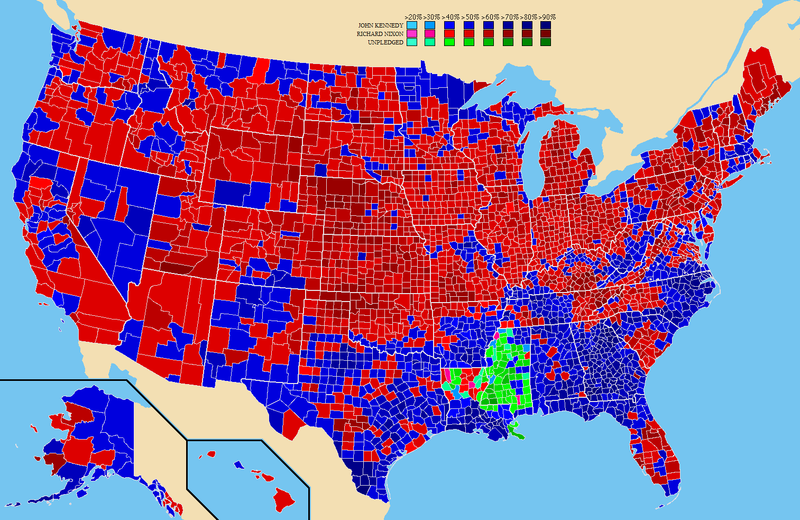 The Yankee dominated regions of northern New England remained Republican strongholds in 1960, just as they were during the ascendancy of Franklin Roosevelt. In Albion's Seed David Hackett Fischer argues for a "First Settler Effect" which echoes down across the centuries. This sort of paradigm would ask us what substantive similarities underpin the common support of Vermonters for Hoover in 1932 and liberal Democrats and Republicans in the 2000s (remember that northern New England still has a much larger fraction of Yankees). But I wonder if what is really maintaining regional coherency across time are social networks which share ideas and evolve together over time. It is peculiar to imagine it now, but during the early republic the Yankees were the segment of the population most fixated on Christian orthodoxy (evident by the fact that New England states were last to disestablish their churches), and were the driving forces of the Second Great Awakening (which did spread across the country). Today Yankees are the most secular segment of settler descended subcultures. Conversely, in 1800 the South was relatively lax in matters of religion, republican in politics, and pro-French in sympathy. John C. Calhoun was a Unitarian. So that's why I want to get county-by-county data sets. Labels: data
Wednesday, October 28, 2009
Many nations are getting more religious, but young people are still less religious
posted by
Razib @ 10/28/2009 12:13:00 AM
One thing that has bothered me, or at least piqued my interest, are two seemingly contradictory facts:
1) Many regions & nations have seen a resurgence of religion in the past generation (i.e., 1980s to 2010). The post-Communist and Islamic world most prominently. There is quantitative data for the post-Communist world, while for the Islamic world it is more impressionistic (e.g., the shift toward more stark outward "conservatism" in dress among the young). 2) But The World Values Survey does not show a skew toward religiosity among the young for most nations. Very few in fact. This is a bit curious in light of some plausible background assumptions. For example, religious people have more children the world over within each nation (though religiosity at the national level may have a more unpredictable relationship to fertility, as evident in Western Europe). I decided to present the data which I'm basing the second assertion on. The WVS has several "waves." I decided to look at wave 5, wave 4 and wave 2, which were done during the mid to late 2000s, around 2000 and 1990 respectively. I also looked at the question: How important is God in your life? Please use this scale to indicate- 10 means very important and 1 means not at all important. The WVS interface outputs mean values (as well as standard deviations). You can then drill-down and cross with age of the respondents in 3 classes:, 15-29, 30-49, and 50+. I was curious as to age related changes, so I simply put the mean values of the importance of God by age class into the linest function. So, if the mean values were 7, 8 and 9 for the age classes from youngest to oldest, the linest would output a slope of 1 as I omitted x values (so the classes would be recoded implicitly as 1, 2, 3, etc. for x's). If you reversed it, it would output -1. So, negative values indicate that the younger are more religious than the old. Here are some trends in the data..... Here are some charts ordered by the values generated by linest by wave. The countries at the top exhibit larger differences between the young and old. Observe the large asymmetry in the number with positive vs. negative values (that is, many more nations have more secular young than old). You need to click to see the larger version. 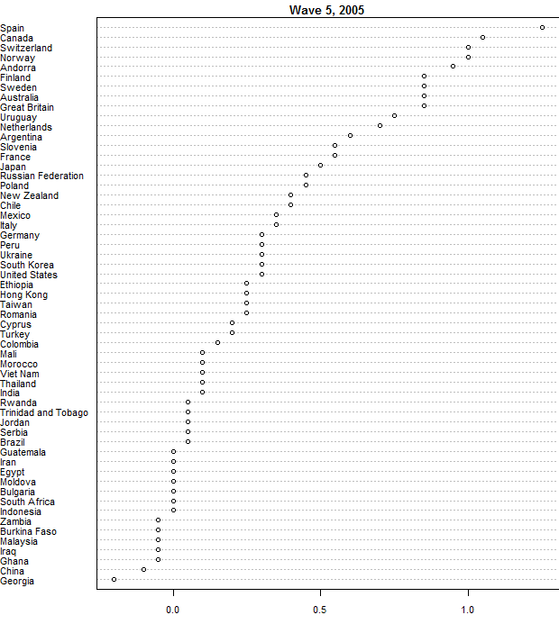 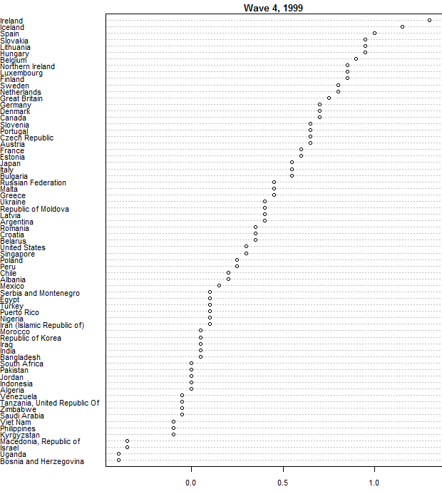 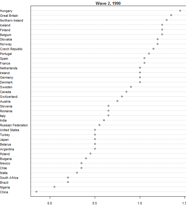 Some of the nations span the waves (many do not). 30 nations span wave 5 and wave 4. Here are the correlations between the same columns across waves: Mean religiosity = 0.98 Trend of religiosity by age = 0.84 I don't know if the samples are representative (though the developed world ones do seem to be, I've checked with independent surveys and they often match up well), but the two waves seem consistent with each other here. Now let's compare wave 2 and wave 5. So from from ~1990- to ~2005. Mean religiosity = 0.92 Trend of religiosity by age = 0.77 How about differences in mean religiosity from wave 2 to wave 5? Here we see a bias toward greater religiosity in the 26 countries found in both waves. 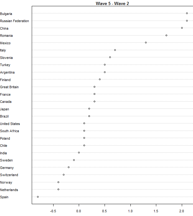 The results match expectation. The nations to the right, those which have seen the most increase in religiosity are post-Communist ones. No surprise there. The nation furthest to the left is Spain, it's gone through the most striking shift toward secularism since 1990. That is in line with what the news reports, the position of the Catholic Church at the center of Spanish life has been collapsing since the 1980s (more accurately, since the end of the Franco regime). One assumes that the difference in religiosity by age cohort is a feature of less religious societies. If everyone is religious, as is the case in some Muslim and African countries, then there can't be any variance. Merging all 3 waves together, here's a scatter plot which shows the trend: 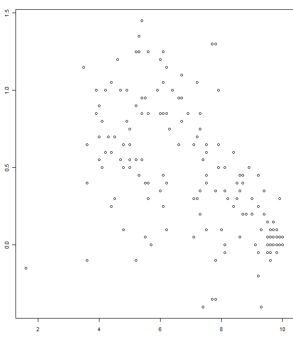 Now a labelled plot of wave 5.  An interesting point of contrast is China and Spain. In the 1970s Spain was still a pro-clerical right-wing authoritarian regime, while China was an atheist left-wing regime. Political pressures toward conforming to a particular attitude toward religion have abated in both nations over the past generation, and while Spain has become much more secular, China seems to more religious. The mean value of the importance of God in one's life in China is 3.7 in the youngest age group, and 3.5 in the oldest (survey taken in 2007). In 1990 it was 1.5 and 1.8 respectively. The big test would be to see how the 15-29 compared to 30-49 between wave 2 and wave 5. I'm a little worn out by this right now, so I'll look at that systematically tomorrow (or the next day), but spot checking Russia seems to show that the rank-order holds, but all age cohorts became more religious (not relevant for the youngest cohort in wave 5 because they weren't surveyed in 1990). In Spain the 15-29 year olds in wave 2 who became 30-49 year olds in wave 5 are invariant. If you want to get a jump ahead of me, here are some raw data file (excel): religwave2.xls religwave4.xls religwave5.xls Here are two preliminary comments: * All the post-Communist nations have seen a resurgence in religion (perhaps with the exception of the Czech Republic). But this is a phenomenon which has "lifted all boats," older people who were militant atheists who went on anti-religious rampages in their youth have been swept along, just as generations who barely remember Communism exhibit the nominal culturally grounded religious sensibilities normal in many societies. I've read a fair number of news stories over the years about the generational "God-gap" in the post-Communist states, but I suspect that it makes a punchier story-line than to suggest that there's been a broader societal shift. That it isn't a case of atheistic pensioners vs. youthful churchgoers. * The Muslim countries are really weird. On most of the religious data in the WVS the only nations which approach or surpass them consistently are the African ones, and these do not exhibit the uniformity of outlook of the Muslim ones, especially the "core" Muslim nations of the Middle East. In some of the surveys for Pakistan no Pakistanis in a sample of 2,000 will admit to not believing in God, and in one survey all the respondents gave the highest value for the importance of God in their life on a 1 to 10 scale. By all, I mean all 2,000. It isn't implausible to me that somehow someone who was really religious just recoded the survey data to make Pakistan seem more religious than it was, but if so that bespeaks a zealous conformity of outlook in the society. But overall many of the Muslim nations are so religious that there isn't variation in belief by age group because there isn't variation much of belief, period. Everyone's on the same page. When you see women donning the hijab or men growing beards I think perhaps we should reconceptualize what's going on, as it isn't renewed orthodoxy (belief) as opposed to a change in orthopraxy. Of course it may be that Muslim nations do exhibit variation in religiosity, but they're just off the scale here. I suspect of the funniest shock-documentary projects would be to have someone run into a public square in the Muslim world screaming that God is dead. Of course, it might be a suicide mission!
Tuesday, October 20, 2009
Obese regions do vote for McCain, but McCain voters may not be especially obese
posted by
Razib @ 10/20/2009 09:09:00 PM
A friend pointed me to this article in Slate which noted:
This size bias may ultimately play out along party lines. The last presidential election revealed a startling overlap between statewide obesity figures and support for the GOP. Despite losing in a landslide, John McCain carried all nine of the fattest states in the union and 16 of the top 20. (Obama prevailed in 17 of the 20 thinnest states, including New Jersey.) In the race for governor of a very blue state, Christie's girth marks him as an outsider-a member of the chunky-monkey Fox News demographic, the kind of guy who rides around in an SUV and eats Double Down sandwiches. If Christie stands in for America's boorish consumer culture, then Corzine-slender, bearded, and bespectacled-represents the cosmopolitan elite. The issue though is that black Americans are more obese, and extremely black states exhibit a lot of racial polarization whereby McCain actually those states. My friend wondered if I could look on a more granular level. If I could find obesity data on all the counties in the nation, that would be easy, but I didn't find that. But, I did find obesity data for race, so the proportion of each state which are classified as obese who are non-Hispanic white, as well as exit polls of the white vote for McCain. The scatterplot below shows the outcome. 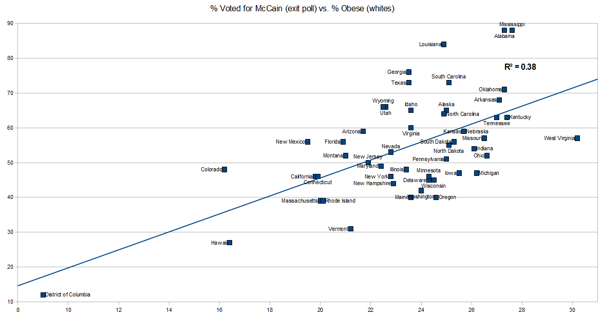 What about individual level data? In 2004 there was a variable which was interviewer perception of weight. Here's what the GSS says: 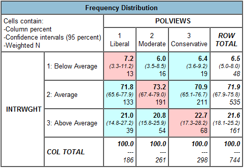  The 95% confidence intervals are their, including the N's. Not much difference. Perhaps the sample size is too small to tell, or perhaps how interviewers perceived people differed from region to region. I limited the sample to Non-Hispanic whites. Here's the variables: Row: INTRWGHT(r:1 "Below Average"; 2 "Average"; 3-4 "Above Average") Col: partyid(r:0-2 "Democrat";3 "Independent"; 4-6 "Republican") polviews(r:1-3 "Liberal";4 "Moderate" ;5-7 "Conservative") Oh, and about fat people voting for fat candidates. I think the issue is that many fat people imagine that one day they won't be fat, so it's hard to create an identity around something you want to escape, and think you can, with enough hard work, or a miracle drug, or gastric bypass.
Friday, October 09, 2009
The New York Times has a piece, The Divided States of Health Care:
Those who lack health insurance now are far more likely to live in states that usually vote Republican — the states whose senators and representatives are least likely to support a law to extend coverage.  This is not a surprising finding. Some of the most Democratic districts due to variables of race & income are in "Red States." The text alludes to more granular analysis, but it doesn't show up in the graphics, which is focused on the state level. But the county level data is freely available from the Census. To the left is a map of uninsured (those 18-64) by county. It does seem to me that state regulations or policies have some influence, look at the Pennsylvania-Ohio border with Kentucky and West Virginia, and Pennsylvania's border with New York. Culturally the Appalachian areas of Pennsylvania are extensions of West Virginia. Or look at the Missouri-Iowa border. But we can do more than just look at maps. Let's compare the county-by-county variation against other metrics. For example, how about voting for this year's Nobel Peace Prize recipient in the fall of 2008. What's the correlation? This is not a surprising finding. Some of the most Democratic districts due to variables of race & income are in "Red States." The text alludes to more granular analysis, but it doesn't show up in the graphics, which is focused on the state level. But the county level data is freely available from the Census. To the left is a map of uninsured (those 18-64) by county. It does seem to me that state regulations or policies have some influence, look at the Pennsylvania-Ohio border with Kentucky and West Virginia, and Pennsylvania's border with New York. Culturally the Appalachian areas of Pennsylvania are extensions of West Virginia. Or look at the Missouri-Iowa border. But we can do more than just look at maps. Let's compare the county-by-county variation against other metrics. For example, how about voting for this year's Nobel Peace Prize recipient in the fall of 2008. What's the correlation?I was a little surprised when I got a correlation of -0.33. That is, a negative correlation for voting for Barack Obama and proportion of uninsured on the county level. This assumes a level of linearity which really isn't there when you look more closely. You can see in the scatterplots at the bottom of this post, but let's just go with the linear for the moment so I can stick to correlations; you can correct by looking at the loess curves later on. Here are some other correlations with the proportion uninsured in each county (most of the dta are from the American Community Survey 2005-2007 of the Census, the "Foreign Born Males" data are for males over the age of 18): -.36 - White (not Latino) 0.07 - Black (not Latino) 0.48 - Latino 0.43 - Foreign Born Males -.29 - Age -.24 - Median Household Income (2006) -.15 - Median Home Value (2006) I was a little curious about the lack of correlation with health insurance for blacks, but this from the Census clears it up: At 89.4 percent, non-Hispanic Whites were more likely to have health insurance coverage than any other racial group. Those reporting 'some other race' were the least likely to have coverage, 66.0 percent [most of 'some other race' are probably Latino -Razib]. The health insurance coverage rates for the remaining single-race groups fell in that range - 85.5 percent for Asians, 83.8 percent for Native Hawaiians and Other Pacific Islanders, 82.0 for Blacks, and 68.4 percent for American Indians and Alaska Natives. The health insurance coverage rate for Hispanics was 68.5 percent. This includes both private health insurance and public health insurance (Medicaid) for those under 65. Look at the map for those at or below 200% of the poverty rate. It looks like Medicaid is covering many people in the Black Belt, while regions in Appalachia which aren't quite as destitute in northern Alabama and Mississippi are relatively underinsured. The Census also reports that those ages 18-24, and 25-34, have coverage rates of 71.4 and 73.3 respectively, before jumping up to nearly 81% in the 35-44 range. For non-citizens the rate is around 50%. How about limiting the data set to those counties where 90% of the population is white, not hispanic. That leaves 1477 counties in the data set. -.48 - Obama -.30 - Income -.12 - Home Value As you can see, in very white counties the inverse relationship between proportion uninsured and proportion voting for Barack Obama holds. I played around with limiting geographically. In New England and Tennessee there's no correlation between voting for Obama and insurance rates. But New England had really uniform voting. Tennessee might be a special case where lower insurance coverage rates among blacks are at play. In California and Texas the lack of insurance among Latinos positive correlations between voting for Obama and underinsurance, but only on the order of ~0.10. I'm a little confused by these results. You can get the original data as a csv and see if I switched the sign or did something wrong. I wouldn't be surprised. My general model though is that this is a case of: 1) The Dems tending to get high and low socioeconomic status groups (not necessarily the super-rich, but the middle and upper-middle class college-educated). 2) The poor get insurance through Medicaid. And public sector workers and small business people of approximately same incomes are likely to differ in their insurance rates (public sector workers are overwhelmingly insured from what I know). 3) Democratic leaning states have more robust insurance systems for the poor. Take a close look at some of the inter-state differences on the borders; rather stark. In a lot of data county level variation doesn't give you a sense of state borders, especially those dictated by latitude or longitude. Not so here. Here are the some plots. 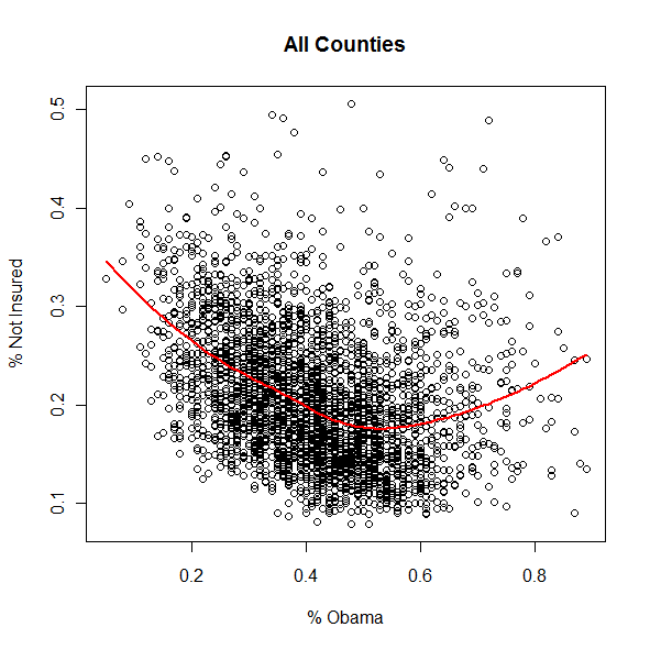 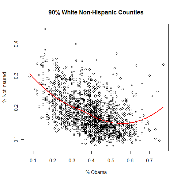 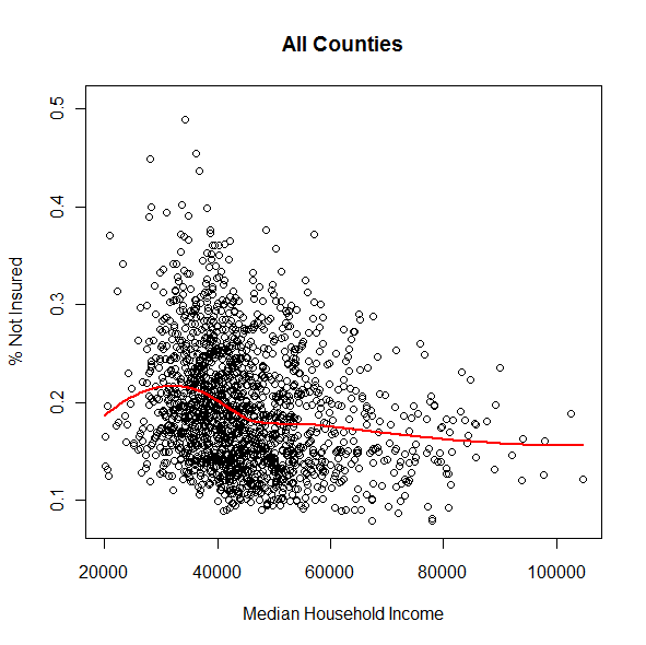  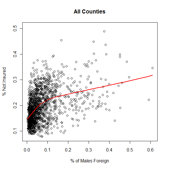 
Friday, October 02, 2009
A few weeks ago I pointed to a paper which suggested a state-level relationship between teen births and religiosity. I did the calculation, and added in race as a control, as well as breaking out birthrate of the 15-17 age bracket. My results differ a little because 1) I didn't impute states like Rhode Island, 2) I think I used 2000 Census household income numbers, not later American Community Survey numbers (my bad).
Race didn't make that big of a difference. Here's a map with the states:  Click it for the big version. But Utah is an outlier now because its 15-17 teen birthrate is way lower than when you include 18-19. The social reason for this is obvious; young marriage among Mormon women. I'm skeptical of the conclusions or at least the explanatory framework in the model in the paper. I will do an analysis of Hispanics, as there's something there. The states well above the trendline have large Hispanic populations, and Hispanics aren't that much more religious than whites (so they would push a state in the vertical direction, but not to the right). But I think if I can get county level data I might see some interesting correlation with Scotch-Irish ancestry. Some of the states with high teen birthrates, like Oklahoma, have a higher proportion of Non-Hispanic whites than nationally, so there's some other story to be told here. Addendum: I suspect that a lot of the time when it come to religion and social data the causality is inverted. Both the anti and pro-religious tend to take the efficacy of religion for granted (though their value judgments would be inverted). But in many cases it may be that particular religious "styles" (e.g., low church vs. high church) reflect the state of a given society. There is a body of social science data which shows the strong relationship between socioeconomic status and particular Protestant denominations, and the strongly biased "switching" of those who move up or down the socioeconomic ladder in their lifetimes. A similar effect might be at work on the aggregate social level. Labels: data
Monday, September 07, 2009
Readers of this weblog might find GALLUP Worldview of interest. It's free, but you have to register. Here's a screenshot:
 Update: A lot of the variables are for subscribers only :-( Labels: data
Sunday, August 16, 2009
In the post from a few days ago showing areas where Non-Hispanic white proportions over & under predicted the % for Obama there were some interesting comments. One of the issues is that lumping different regions together obscures some information. Some readers wondered about regional differences, and I did too. So I thought it might be interesting to look at the South as distinct from the non-South. For the purposes of this post the "South" means: Virginia, West Virginia, North & South Carolina, Georgia, Tennessee, Alabama, Mississippi, Louisiana, Texas, Oklahoma, Kentucky and Arkansas. I excluded Maryland, Delaware and Missouri because I don't think these can be considered culturally Southern, especially the first two. In any case, first, scatterplots and loess best fit lines for the South & the non-South. The South is red/black, the non-South is blue/green.
 For me the interesting point is that the "upturn" where the % for Obama increases is notable in the South, but not the non-South. That surprised me. What counties are these? Click for the larger image.  Some of the counties are not surprising in terms of being above the trendline, such as the "Research Triangle" region of North Carolina. But Elliott County, Kentucky? Who knew that this was the second-whitest county in the country to vote for Barack Obama. A map illustrating the trendline might be interesting. Blue is above the trendline, red below the trendline. I limited the data to the South here. Click for the larger image. 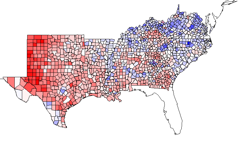 Labels: data, Election 2008
Wednesday, July 29, 2009
One of the major issues when you discuss topics with people with whom you disagree is conflicts as to the acceptability of a particular chain of reason or line of analysis. There are usually implicit assumptions within any given analyses which need to be fleshed out, and to do so is usually time consuming. To give an example, I do not agree with the assertion that "IQ has nothing to do with intelligence." This is a very common background assumption for many people, so many analyses simply make no sense when you do, or don't, accept the viability of a concept like IQ. Talking about the issues at hand is a waste of time when there are such differences in the axioms and background structure of the models one holds, and I can understand why the temptation of extreme subjectivism emerges so often. Looking through the glass darkly can obscure the reality that beyond the glass there is a clear and distinct world.
That is why I think it is important to expose and avoid falsity of fact, however trivial. It is often much easier to agree on basic facts, especially quantitative ones. I do not say that it is alway easy, but it is certainly much easier. This is why weblogs such as The Audacious Epigone are so useful, their bread & butter is fact-checking. When blogs first began to make a splash in 2002 the whole idea of "fact checking your ass" was in vogue, but it doesn't seem like it's really worked out. What's really happened is a proliferation of Google Pundits, who know the answers they want, and know how to get those answers out of the slush pile of answers via an appropriate query. Google Punditry is not exploratory data analysis, it's fishing around for data to match your preconceptions. Many GNXP readers may not agree with the conservative politics of The Inductivist or The Audacious Epigone, but their data-driven blog posts are often formatted such that you don't even need to read the commentary after their tables. Eight months ago Kevin Drum of Mother Jones promised to do more digging through the GSS after I'd pointed him to the resources, but it doesn't seem like it has happened. My GSS and WVS related posts at Secular Right often get picked up by mainstream pundits like Andrew Sullivan, but the utilization of the GSS or WVS interface hasn't spread. Why? One friend suggested that perhaps people fear what they might find out. I do agree that the GSS (or WVS) aren't oracles which are infallible. There are obvious issues with representativeness in the WVS, and the small N's for some categories in the GSS mean there's a lot of noise. But with that caution aside, these objections are clear and distinct when one begins with these tools and data sets. In fact, with something like the GSS or WVS you can check your intuitions about representativeness by digging a little deeper. Addendum: When I do GSS posts people often object in the form of "your data doesn't prove that!" Interestingly, this objection comes up even when there's a minimum of commentary. Of course the sort of surface scratches that I do don't definitively disprove or prove much, at least in general. Rather, they should be starting off points for further digging. Labels: data
The paper Eight Americas: Investigating Mortality Disparities across Races, Counties, and Race-Counties in the United States, has this fascinating map (reformatted a bit):
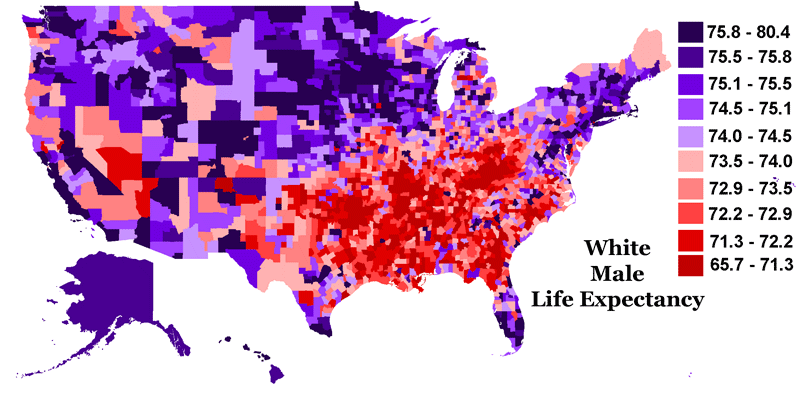 As you can see there is a great deal of variance in white male life expectancy in the United Sates. Compare to this map:  "American" is probably just Scotch-Irish in this case. It is noticeable it seems on this map that the countries in central Texas where Anglo ancestry is dominated by those of German origin exhibit high life expectancy. "American" is probably just Scotch-Irish in this case. It is noticeable it seems on this map that the countries in central Texas where Anglo ancestry is dominated by those of German origin exhibit high life expectancy. In any case, you can actually look at the county-by-county data set from the above paper in regards to life expectancies. The minimum male life expectancy in any county is 62, with the maximum being 80.30. The median is 73.60 and the mean 73.38 (these data are ~2000). There's a "long tail" of sparsely populated counties with low male life expectancies as evidenced by the lower mean value than the median. The standard deviation across the counties is 2.35 years. As can be seen on the first map there is a strong geographic component to the interregional differences. Below is a chart which reports the proportion of counties in the 50 states which have a life expectancy at, or above, the Canadian national value as of the year 2000 (again, both these values are for males). 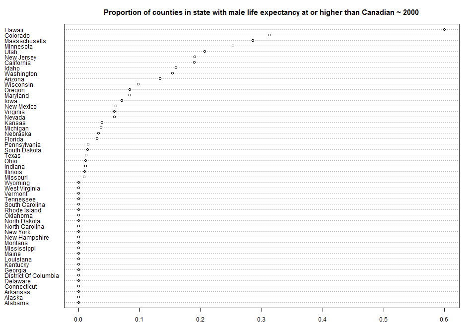 Some states obviously have very few counties. But Kentucky has 120. None of them are at the Canadian level. Labels: data
Sunday, July 19, 2009
One of the "theories" I've had for a long time is that the smaller a proportion of a society's population atheists are, the stranger and more deviant they are going to be. A reason I came to this position is that read an account by an atheist American scientist who had some interactions with Soviet religious dissidents during the Cold War. His position was that in many ways American atheists and Soviet religious dissidents exhibited similarities in terms of personality, likely because they were generally not conformists. One of the peculiarities of the massive re-confessionalization of Russian society after the fall of the Soviet Union is the reality that these Communist era dissidents are now being marginalized in many congregations by recent converts who had a background as apparatchiks in the old regime, and were sometimes even actively involved in persecuting their current coreligionists! In any case, what about my hypothesis? Do I have any evidence for it? Not in any substantive manner. So I thought it might be interesting to look in the World Values Survey, naturally. How do attitudes of atheists and religious people vary within a society as a function of the proportion of each group?
I limited the sample to males, because men are more secular on average and exhibit more variance between nations. Additionally, because so many nations have very few atheists I put a lower bound of N = 20 for "convinced atheists." I mollified my own concerns about such a low N with the hope that if an N in a society is that low, the atheists may be strange enough indeed that their deviation from the social median may still swamp the noise. As before, the means for a class were calculated. So, the mean political self position of atheists and the religious is on a 1-10 scale. Below are are the charts for the results of a set of questions which exhibit a 1-10 level of agreement along a spectrum. The position is less important than the difference. First is a simple scatterplot which shows the attitudes of both the religious and atheists by nation. The expectation is a strong correlation between the religious and atheists, because most of the variation is naturally between nations. The second chart shows the difference between the two groups, "Religious persons" and "Convinced Atheists." I excluded those who were "Not religious" from the sample (so those who don't consider themselves religious, but neither are they professed atheists). Lastly, I plotted the difference between atheists and the religious as function of the ratio of religious to atheists. So, for example, the ratio of religious to atheists for Iraq is very high, atheists are a small minority (though to my surprise the N was large enough to stay above the threshold I put). In China the number of convinced atheists and religious are at parity, though those who are without religion and are not atheists are a plural majority. Looking at these results I'm going to withdraw my model. * For the "justifiable" questions 1 = never, 10 = always. * Competition is good = 1, competition is harmful = 10. * 1 = everything determined by fate, 10 = people shape their fates. * 1 = gov. more responsibility, 10 = individual more responsibility. * 1 = incomes more equal, 10 = we need larger differences for incentives. * 1 = private ownership should be increased, gov. ownership should be increased. * 1 = science makes world worse off, 10 = better off. * 1 = Left, 10 = Right.                                                    Labels: data, World Values Survey
Wednesday, May 13, 2009
I was in the bookstore and decided to look through God Is Back: How the Global Revival of Faith Is Changing the World. The authors work at The Economist, so I assumed it was going to be more reportage than a popular distillation of scholarship. I haven't read the whole thing, but that seems about right, skimming through I kept picking up errors or tendentious assertions. The very title is, in my opinion, only tenuously rooted in any factual secular trend. Secularization theory's overreach has given rise to a huge counter-literature which argues for the progressively more fervent religiosity of the world. But much of this has little to do with scholarship. Just as George Lakoff knows his audience, and so tailors his "scientific" message in the interests of getting his ideas out there through book sales, so the popular press knows very well that articles and books about the resurgence of religion will sell well. After all, there are many religious people out there. A few years ago David Aikman published Jesus in Beijing: How Christianity is Transforming China and Changing the Global Balance of Power. The book had a natural base when it came to potential sales. No matter that he tended to push highbound estimates for the number of Christians in China, the business is demand side driven.
We don't need to talk about China. There's a nation where the mainstream media has been hyping religious revival for the past generation that hasn't been happening: the United States. As far back as the 2000 Religious Identification Survey it was clear that the 1990s were a period of major decline in denominational affiliation. Those data have been confirmed over the past decade. The religious revival in the United States was simply in the minds of hopeful evangelicals, and terrified secular liberals who wanted to hype the power of the religious Right so as to elicit a counterresponse from the Left. And of course cover stories on the rise of evangelical America sell copy (again, scared secularists and enthusiastic evangelicals). So what's the data around the world? Let's look at the World Vaues Survey. There are five "waves" to the WVS, and of these the last four have had a question of the form: For each of the following aspects, indicate how important it is in your life. Religion. The answers are: 1 Very important 2 Important 3 Not at all important Below the fold I've the data from waves 2, 3, 4 and 5 for all the nations. Some obviously don't have data for a particular wave. Wave 2 is from around 1990 (some are as early 1989, with a few as late as 1993). Wave 3 is from around 1995-1998. Wave 4 around 2000. And wave 5 is from 2005-2008. The numbers represent the proportion who agreed that religion was "very important."
Yes, there are almost certainly issues about representativeness across these samples over the years. And the data are spotty. But in any case, there a few cases where we have other sources which confirm the trend line. Spain has become notably more secular over the past 20 years. China has seen an increase in religion over the past 20 years. But I don't see a very strong trend in either direction on a worldwide basis, and I assume a lot of the jumping around individually probably has to do with the nature of the sample . The point is that there hasn't been a massive secular trend in increased religiosity. But who cares? John Micklethwait and Adrian Wooldridge will sell a lot of copies of their book predicated on a likely moronic axiom (judging by the elementary errors that I quickly spotted they don't know much about the topic besides what they read in newspapers). Here's a line graph where I placed all the nations with at least 3 data points. See if you can discern anything from the noise.... 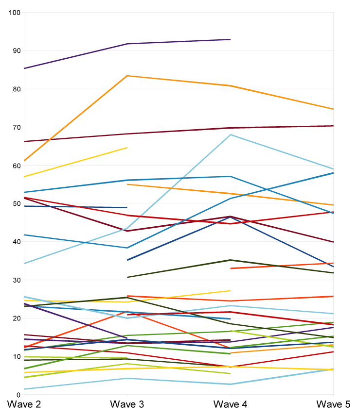 I invite readers to weight the data by the populations of these nations and see if, for example, the likely enormous relative increase in religiosity in China from hardly anyone being religious to a small minority being religious is making a worldwide difference. Doing a scatter of wave 2 on wave 5 for those nations which had those two gave an incredible slope of 1.01! Labels: data, Demographics, Religion
Sunday, May 03, 2009
Below when I compared the Nordic countries and Italy on a host of variables, I noted in the comments that it was rather amusing that 99% of the people in Bangladesh asserted that bribery was never justifiable, while only 69% of Swedes did. More specifically, the World Values Survey simply asked if bribery was ever justifiable, and there 10 options, with 0 = never justifiable and 10 = always justifiable. So 99% of the Bangladeshis chose 0, while only 69% of Swedes did. Plotting the 2008 Corruptions Perceptions Index scores from Transparency International against the proportion who chose 0, bribery is never justifiable, resulted in this:
 Here's the raw data:
Eastern Europeans and Filipinos are at least honest about their "pragmatism." Labels: culture, data, World Values Survey
Sunday, April 15, 2007
In the spirit of Gapminder, I've noticed three data visualization sites which present user-generated content:
* Many Eyes (does maps!!!) * Swivel * Data360 Labels: data, graph, map, visualization, web |
  Razib's Home Page GNXP Archives Interviews Blogroll Principles of Population Genetics Genetics of Populations Molecular Evolution Quantitative Genetics Evolutionary Quantitative Genetics Evolutionary Genetics Evolution Molecular Markers, Natural History, and Evolution The Genetics of Human Populations Genetics and Analysis of Quantitative Traits Epistasis and Evolutionary Process Evolutionary Human Genetics Biometry Mathematical Models in Biology Speciation Evolutionary Genetics: Case Studies and Concepts Narrow Roads of Gene Land 1 Narrow Roads of Gene Land 2 Narrow Roads of Gene Land 3 Statistical Methods in Molecular Evolution The History and Geography of Human Genes Population Genetics and Microevolutionary Theory Population Genetics, Molecular Evolution, and the Neutral Theory Genetical Theory of Natural Selection Evolution and the Genetics of Populations Genetics and Origins of Species Tempo and Mode in Evolution Causes of Evolution Evolution The Great Human Diasporas Bones, Stones and Molecules Natural Selection and Social Theory Journey of Man Mapping Human History The Seven Daughters of Eve Evolution for Everyone Why Sex Matters Mother Nature Grooming, Gossip, and the Evolution of Language Genome R.A. Fisher, the Life of a Scientist Sewall Wright and Evolutionary Biology Origins of Theoretical Population Genetics A Reason for Everything The Ancestor's Tale Dragon Bone Hill Endless Forms Most Beautiful The Selfish Gene Adaptation and Natural Selection Nature via Nurture The Symbolic Species The Imitation Factor The Red Queen Out of Thin Air Mutants Evolutionary Dynamics The Origin of Species The Descent of Man Age of Abundance The Darwin Wars The Evolutionists The Creationists Of Moths and Men The Language Instinct How We Decide Predictably Irrational The Black Swan Fooled By Randomness Descartes' Baby Religion Explained In Gods We Trust Darwin's Cathedral A Theory of Religion The Meme Machine Synaptic Self The Mating Mind A Separate Creation The Number Sense The 10,000 Year Explosion The Math Gene Explaining Culture Origin and Evolution of Cultures Dawn of Human Culture The Origins of Virtue Prehistory of the Mind The Nurture Assumption The Moral Animal Born That Way No Two Alike Sociobiology Survival of the Prettiest The Blank Slate The g Factor The Origin Of The Mind Unto Others Defenders of the Truth The Cultural Origins of Human Cognition Before the Dawn Behavioral Genetics in the Postgenomic Era The Essential Difference Geography of Thought The Classical World The Fall of the Roman Empire The Fall of Rome History of Rome How Rome Fell The Making of a Christian Aristoracy The Rise of Western Christendom Keepers of the Keys of Heaven A History of the Byzantine State and Society Europe After Rome The Germanization of Early Medieval Christianity The Barbarian Conversion A History of Christianity God's War Infidels Fourth Crusade and the Sack of Constantinople The Sacred Chain Divided by the Faith Europe The Reformation Pursuit of Glory Albion's Seed 1848 Postwar From Plato to Nato China: A New History China in World History Genghis Khan and the Making of the Modern World Children of the Revolution When Baghdad Ruled the Muslim World The Great Arab Conquests After Tamerlane A History of Iran The Horse, the Wheel, and Language A World History Guns, Germs, and Steel The Human Web Plagues and Peoples 1491 A Concise Economic History of the World Power and Plenty A Splendid Exchange Contours of the World Economy 1-2030 AD Knowledge and the Wealth of Nations A Farewell to Alms The Ascent of Money The Great Divergence Clash of Extremes War and Peace and War Historical Dynamics The Age of Lincoln The Great Upheaval What Hath God Wrought Freedom Just Around the Corner Throes of Democracy Grand New Party A Beautiful Math When Genius Failed Catholicism and Freedom American Judaism
Archives
July 2005 August 2005 September 2005 October 2005 November 2005 December 2005 January 2006 February 2006 March 2006 April 2006 May 2006 June 2006 July 2006 August 2006 September 2006 October 2006 November 2006 December 2006 January 2007 February 2007 March 2007 April 2007 May 2007 June 2007 July 2007 August 2007 September 2007 October 2007 November 2007 December 2007 January 2008 February 2008 March 2008 April 2008 May 2008 June 2008 July 2008 August 2008 September 2008 October 2008 November 2008 December 2008 January 2009 February 2009 March 2009 April 2009 May 2009 June 2009 July 2009 August 2009 September 2009 October 2009 November 2009 December 2009 January 2010 February 2010 Hello Movable Type archives August 11,2002 August 18,2002 August 25,2002 September 01,2002 September 15,2002 October 20,2002 December 08,2002 December 22,2002 December 29,2002 January 05,2003 January 12,2003 January 19,2003 January 26,2003 February 02,2003 February 09,2003 February 16,2003 February 23,2003 March 02,2003 March 09,2003 March 16,2003 March 23,2003 March 30,2003 April 06,2003 April 13,2003 April 20,2003 April 27,2003 May 04,2003 May 11,2003 May 18,2003 May 25,2003 June 01,2003 June 08,2003 June 15,2003 June 22,2003 June 29,2003 July 06,2003 July 13,2003 July 20,2003 July 27,2003 August 03,2003 August 10,2003 August 17,2003 August 24,2003 August 31,2003 September 07,2003 September 14,2003 September 21,2003 September 28,2003 October 05,2003 October 12,2003 October 19,2003 October 26,2003 November 02,2003 November 09,2003 November 16,2003 November 23,2003 November 30,2003 December 07,2003 December 14,2003 December 21,2003 December 28,2003 January 04,2004 January 11,2004 January 18,2004 January 25,2004 February 01,2004 February 08,2004 February 15,2004 February 22,2004 February 29,2004 March 07,2004 March 14,2004 March 21,2004 March 28,2004 April 04,2004 April 11,2004 April 18,2004 April 25,2004 May 02,2004 May 09,2004 May 16,2004 May 23,2004 May 30,2004 June 06,2004 June 13,2004 June 20,2004 June 27,2004 July 04,2004 July 11,2004 July 18,2004 July 25,2004 August 01,2004 August 08,2004 August 15,2004 August 22,2004 August 29,2004 September 05,2004 September 12,2004 September 19,2004 September 26,2004 October 03,2004 October 10,2004 October 17,2004 October 24,2004 October 31,2004 November 07,2004 November 14,2004 November 21,2004 November 28,2004 December 05,2004 December 12,2004 December 19,2004 December 26,2004 January 02,2005 January 09,2005 January 16,2005 January 23,2005 January 30,2005 February 06,2005 February 13,2005 February 20,2005 February 27,2005 March 06,2005 March 13,2005 March 20,2005 March 27,2005 April 03,2005 April 10,2005 April 17,2005 April 24,2005 May 01,2005 May 08,2005 May 15,2005 May 22,2005 May 29,2005 June 05,2005 June 12,2005 June 19,2005 June 26,2005 July 03,2005 July 17,2005 August 07,2005 Blogspot archives June 2002 July 2002 August 2002 September 2002 October 2002 November 2002 December 2002
10 questions for....
Parag Khanna James Flynn Jon Entine Gregory Clark György Buzsáki Heather Mac Donald Bruce Lahn A.W.F. Edwards Luigi Luca Cavalli-Sforza Joseph LeDoux Matthew Stewart Charles Murray James F. Crow Adam K. Webb Justin L. Barrett David Haig Judith Rich Harris Ken Miller Dan Sperber Warren Treadgold Armand M. Leroi John Derbyshire
Blogs
The GiveWell Blog Your Religion Is False Colby Cosh Steve Hsu Audacious Epigone Catallaxy Files Inductivist 2 Blowhards Genetic Future Agnostic Steve Sailer Dienekes Derek Lowe Razib Khan Razib at Comment is Free Secular Right Glenn Reynolds Jim Miller Kevin McGrew John Hawks Peter Fost Randall Parker Less Wrong Charles Murray Carl Zimmer EconLog Marginal Revolution
Principles of Population Genetics
Genetics of Populations Molecular Evolution Quantitative Genetics Evolutionary Quantitative Genetics Evolutionary Genetics Evolution Molecular Markers, Natural History, and Evolution The Genetics of Human Populations Genetics and Analysis of Quantitative Traits Epistasis and Evolutionary Process Evolutionary Human Genetics Biometry Mathematical Models in Biology Speciation Evolutionary Genetics: Case Studies and Concepts Narrow Roads of Gene Land 1 Narrow Roads of Gene Land 2 Narrow Roads of Gene Land 3 Statistical Methods in Molecular Evolution The History and Geography of Human Genes Population Genetics and Microevolutionary Theory Population Genetics, Molecular Evolution, and the Neutral Theory Genetical Theory of Natural Selection Evolution and the Genetics of Populations Genetics and Origins of Species Tempo and Mode in Evolution Causes of Evolution Evolution The Great Human Diasporas Bones, Stones and Molecules Natural Selection and Social Theory Journey of Man Mapping Human History The Seven Daughters of Eve Evolution for Everyone Why Sex Matters Mother Nature Grooming, Gossip, and the Evolution of Language Genome R.A. Fisher, the Life of a Scientist Sewall Wright and Evolutionary Biology Origins of Theoretical Population Genetics A Reason for Everything The Ancestor's Tale Dragon Bone Hill Endless Forms Most Beautiful The Selfish Gene Adaptation and Natural Selection Nature via Nurture The Symbolic Species The Imitation Factor The Red Queen Out of Thin Air Mutants Evolutionary Dynamics The Origin of Species The Descent of Man Age of Abundance The Darwin Wars The Evolutionists The Creationists Of Moths and Men The Language Instinct How We Decide Predictably Irrational The Black Swan Fooled By Randomness Descartes' Baby Religion Explained In Gods We Trust Darwin's Cathedral A Theory of Religion The Meme Machine Synaptic Self The Mating Mind A Separate Creation The Number Sense The 10,000 Year Explosion The Math Gene Explaining Culture Origin and Evolution of Cultures Dawn of Human Culture The Origins of Virtue Prehistory of the Mind The Nurture Assumption The Moral Animal Born That Way No Two Alike Sociobiology Survival of the Prettiest The Blank Slate The g Factor The Origin Of The Mind Unto Others Defenders of the Truth The Cultural Origins of Human Cognition Before the Dawn Behavioral Genetics in the Postgenomic Era The Essential Difference Geography of Thought The Classical World The Fall of the Roman Empire The Fall of Rome History of Rome How Rome Fell The Making of a Christian Aristoracy The Rise of Western Christendom Keepers of the Keys of Heaven A History of the Byzantine State and Society Europe After Rome The Germanization of Early Medieval Christianity The Barbarian Conversion A History of Christianity God's War Infidels Fourth Crusade and the Sack of Constantinople The Sacred Chain Divided by the Faith Europe The Reformation Pursuit of Glory Albion's Seed 1848 Postwar From Plato to Nato China: A New History China in World History Genghis Khan and the Making of the Modern World Children of the Revolution When Baghdad Ruled the Muslim World The Great Arab Conquests After Tamerlane A History of Iran The Horse, the Wheel, and Language A World History Guns, Germs, and Steel The Human Web Plagues and Peoples 1491 A Concise Economic History of the World Power and Plenty A Splendid Exchange Contours of the World Economy 1-2030 AD Knowledge and the Wealth of Nations A Farewell to Alms The Ascent of Money The Great Divergence Clash of Extremes War and Peace and War Historical Dynamics The Age of Lincoln The Great Upheaval What Hath God Wrought Freedom Just Around the Corner Throes of Democracy Grand New Party A Beautiful Math When Genius Failed Catholicism and Freedom American Judaism   Policies Terms of use © http://www.gnxp.com Razib's total feed: |
|||||||||||||||||||||||||||||||||||||||||||||||||||||||||||||||||||||||||||||||||||||||||||||||||||||||||||||||||||||||||||||||||||||||||||||||||||||||||||||||||||||||||||||||||||||||||||||||||||||||||||||||||||||||||||||||||||||||||||||||||||||||||||||||||||||||||||||||||||||||||||||||||||||||||||||||||||||||||||||||||||||||||||||||||||||||||||||||||||||||||||||||||||||||||||||||||||||||||||||||||||||||||||||||||||||||||||||||||||||||||||||||||||||||||||||||||||||||||||||||||||||||||||||||||||||||||||||||||||||||||||||||||||||||||||||||||||||||||||||||||||||||||||||||||||||||||||||||||||||||||||||||||||||||||||||||||||||||||||||||||||||||||||||||||||||||||||||||||||||||||||||||||||||||||||||||||||