Since the death of L. L. Cavalli-Sforza I’ve been thinking about the great scientists who have passed on. Last fall, I mentioned that Mel Green had died. There was a marginal personal connection there. I had the privilege to talk to Green at length about sundry issues, often nonscientific. He was someone who been doing science so long he had talked to Charles Davenport in the flesh (he was not complimentary of Davenport’s understanding of Mendelian principles). It was like engaging with a history book!
A few months before I emailed Cavalli-Sforza, I had sent a message on a lark to James F. Crow. It was really a rather random thing, I never thought that Crow would respond. But in fact he emailed me right back! And he answered 10 questions from me, as you can see below the fold. The truth is I probably wouldn’t have thought to try and get in touch with Cavalli-Sforza if it hadn’t been so easy with Crow.
If you are involved in population genetics you know who Crow is. No introduction needed. Some of the people he supervised, such as Joe Felsenstein, have gone on to transform evolutionary biology in their own turn.
Born in 1916, Crow’s scientific career spanned the emergence of population genetics as a mature field, to the discovery of the importance of DNA, to molecular evolution & genomics. He had a long collaboration with Motoo Kimura, the Japanese geneticist instrumental in pushing forward the development of “neutral theory.”
Below are the questions I asked 12 years ago. My interests have changed somewhat, so it’s interesting to see what I was curious about back then. And of course fascinating to read Crow’s responses. Read More
We present an algorithm for inferring ancestry segments and characterizing admixture events, which involve an arbitrary number of genetically differentiated groups coming together. This allows inference of the demographic history of the species, properties of admixing groups, identification of signatures of natural selection, and may aid disease gene mapping. The algorithm employs nested hidden Markov models to obtain local ancestry estimation along the genome for each admixed individual. In a range of simulations, the accuracy of these estimates equals or exceeds leading existing methods that return local ancestry. Moreover, and unlike these approaches, we do not require any prior knowledge of the relationship between sub-groups of donor reference haplotypes and the unseen mixing ancestral populations. Instead, our approach infers these in terms of conditional “copying probabilities”. In application to the Human Genome Diversity Panel we corroborate many previously inferred admixture events (e.g. an ancient admixture event in the Kalash). We further identify novel events such as complex 4-way admixture in San-Khomani individuals, and show that Eastern European populations possess 1-5% ancestry from a group resembling modern-day central Asians. We also identify evidence of recent natural selection favouring sub-Saharan ancestry at the HLA region, across North African individuals. We make available an R and C ++ software library, which we term MOSAIC (which stands for MOSAIC Organises Segments of Ancestry In Chromosomes).
The truth is I’ve only done a quick skim of the preprint and not run the method myself to see how it works. But to be honest I can’t see where the part about Eastern Europeans is in the manuscript (I checked the supporting text)? That being said, if you run a PCA many Northern and most Eastern Europeans are clearly shifted toward East Asians compared to Southern Europeans. So I accept it.
In any case, always remember, all models are wrong. But some of them have insight.
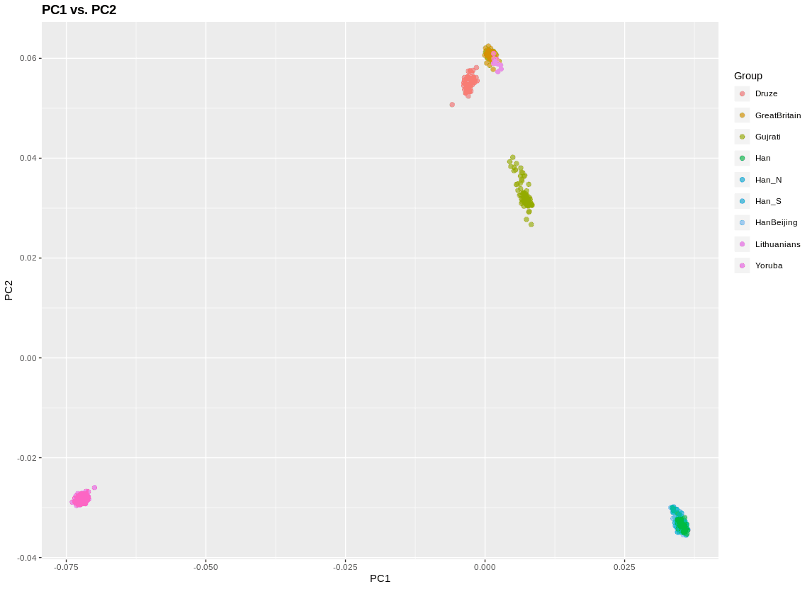
Today on Twitter I stated that “if the average person knew how to run PCA with plink and visualize with R they wouldn’t need to ask me anything.” What I meant by this is that the average person often asks me “Razib, is population X closer to population Y than Z?” To answer this sort of question I dig through my datasets and run a few exploratory analyses, and get back to them.
I’ve been meaning to write up and distribute a “quickstart” for a while to help people do their own analyses. So here I go.
The audience of this post is probably two-fold:
“Trainees” who are starting graduate school and want to dig in quickly into empirical data sets while they’re really getting a handle on things. This tutorial will probably suffice for a week. You should quickly move on to three population and four population tests, and Eigensoft and AdmixTools. As well fineStructure
The larger audience is technically oriented readers who are not, and never will be, geneticists professionally.
What do you need? First, you need to be able to work in a Linux orLinux-environment. I work both in Ubuntu and on a Mac, but this tutorial and these scripts were tested on Ubuntu. They should work OK on a Mac, but there may need to be some modifications on the bash scripts and such.
Assuming you have a Linux environment, you need to download this zip or tar.xz file. Once you open this file it should decompress a folderancestry/.
There are a bunch of files in there. Some of them are scripts I wrote. Some of them are output files that aren’t cleaned up. Some of them are packages that you’ve heard of. Of the latter:
admixture
plink
treemix
You can find these online too, though these versions should work out of the box on Ubuntu. If you have a Mac, you need the Mac versions. Just replace the Mac versions into the folderancestry/. You may need some libraries installed into Ubuntu too if you recompile yourselves. Check the errors and make search engines your friends.
You will need to install R (or R Studio). If you are running Mac or Ubuntu on the command line you know how to get R. If not, Google it.
I also put some data in the file. In particular, a plink set of files Est1000HGDP. These are merged from the Estonian Biocentre, HGDP, and 1000 Genomes. There are 4,899 individuals in the data, with 135,000 high-quality SNPs (very low missingness).
If you look in the “family” file you will see an important part of the structure. So do:
There are 4,899 rows corresponding to each individual. I have used the first column to label the ethnic/group identity. The second column is the individual ID. You can ignore the last 4 columns.
There is no way you want to analyze all the different ethnic groups. Usually, you want to look at a few. For that, you can use lots of commands, but what you need is a subset of the rows above. The grep command matches and returns rows with particular patterns. It’s handy. Let’s say I want just Yoruba, British (who are in the group GreatBritain), Gujurati, Han Chinese, and Druze. The command below will work (note that Han matches HanBeijing, Han_S, Han_N, etc.).
This new file has only 634 individuals. That’s more manageable. But more important is that there are far fewer groups for visualization and analysis.
As for that analysis, I have a Perl script with a bash script within it (and some system commands). Here is what they do:
1) they perform PCA to 10 dimensions 2) then they run admixture on the number of K clusters you want (unsupervised), and generate a .csv file you can look at 3) then I wrote a script to do pairwise Fst between populations, and output the data into a text file 4) finally, I create the input file necessary for the treemix package and then run treemix with the number of migrations you want
There are lots of parameters and specifications for these packages. You don’t get those unless you to edit the scripts or make them more extensible (I have versions that are more flexible but I think newbies will just get confused so I’m keeping it simple).
Assuming I create the plink file above, running the following commands mean that admixture does K = 2 and treemix does 1 migration edge (that is, -m 1). The PCA and pairwise Fst automatically runs.
perl pairwise.perl EstSubset 2 1
Just walk away from your box for a while. The admixture will take the longest. If you want to speed it up, figure out how many cores you have, and edit the file makecluster.sh, go to line 16 where you see admixture. If you have 4 cores, then type -j4 as a parameter. It will speed admixture up and hog all your cores.
There is as .csv that has the admixture output. EstSubset.admix.csv. If you open it you see something like this: Druze HGDP00603 0.550210 0.449790 Druze HGDP00604 0.569070 0.430930 Druze HGDP00605 0.562854 0.437146 Druze HGDP00606 0.555205 0.444795 GreatBritain HG00096 0.598871 0.401129 GreatBritain HG00097 0.590040 0.409960 GreatBritain HG00099 0.592654 0.407346 GreatBritain HG00100 0.590847 0.409153
Column 1 will always be the group, column 2 the individual, and all subsequent columns will be the K’s. Since K = 2, there are two columns. Space separated. You should be able to open the .csv or process it however you want to process it.
You’ll also see two other files: plink.eigenval plink.eigenvec. These are generic output files for the PCA. The .eigenvec file has the individuals along with the values for each PC. The .eigenval file shows the magnitude of the dimension. It looks like this: 68.7974 38.4125 7.16859 3.3837 2.05858 1.85725 1.73196 1.63946 1.56449 1.53666
Basically, this means that PC 1 explains twice as much of the variance as PC 2. Beyond PC 4 it looks like they’re really bunched together. You can open up this file as a .csv and visualize it however you like. But I gave you an R script. It’s RPCA.R.
You need to install some packages. First, open R or R studio. If you want to go command line at the terminal, type R. Then type: install.packages("ggplot2") install.packages("reshape2") install.packages("plyr") install.packages("ape") install.packages("igraph") install.packages("ggplot2")
Once those packages are loaded you can use the script: source("RPCA.R")
Then, to generate the plot at the top of this post: plinkPCA()
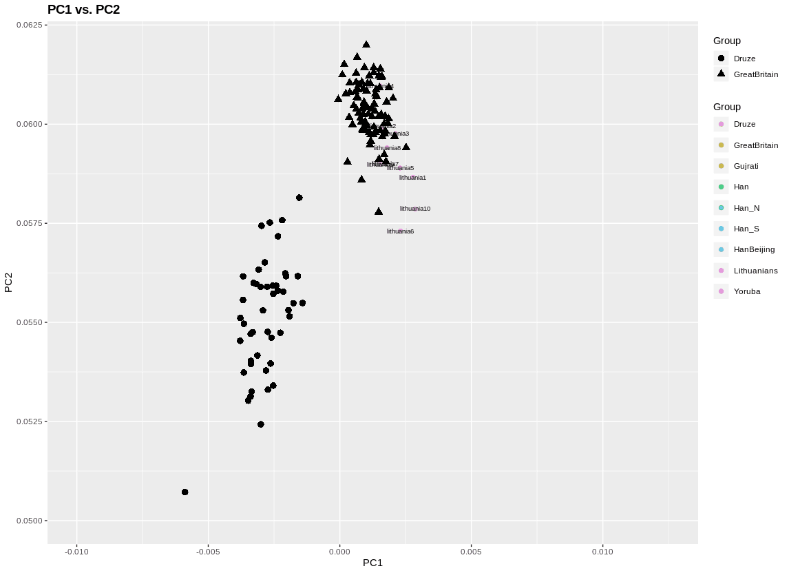
There are some useful parameters in this function. The plot to the left adds some shape labels to highlight two populations. A third population I label by individual ID. This second is important if you want to do outlier pruning, since there are mislabels, or just plain outlier individuals, in a lot of data (including in this). I also zoomed in.
Here’s how I did that: plinkPCA(subVec = c("Druze","GreatBritain"),labelPlot = c("Lithuanians"),xLim=c(-0.01,0.0125),yLim=c(0.05,0.062))
To look at stuff besides PC 1 and PC 2 you can do plinkPCA(PC=c("PC3","PC6")).
I put the PCA function in the script, but to remove individuals you will want to run the PCA manually:
./plink --bfile EstSubset --pca 10
You can remove individuals manually by creating a remove file. What I like to do though is something like this: grep "randomID27 " EstSubset.fam >> remove.txt
The double-carat appends to the remove.txt file, so you can add individuals in the terminal in one window while running PCA and visualizing with R in the other (Eigensoft has an automatic outlier removal feature). Once you have the individuals you want to remove, then: ./plink --bfile EstSubset --remove remove.txt --make-bed --out EstSubset ./plink --bfile EstSubset --pca 10
Then visualize!
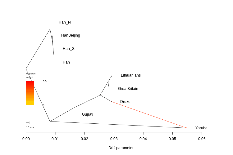
To make use of the pairwise Fst you need the fst.R script. If everything is set up right, all you need to do is type: source("fst.R")
It will load the file and generate the tree. You can modify the script so you have an unrooted tree too.
The R script is what generates the FstMatrix.csv file, which has the matrix you know and love.
So now you have the PCA, Fst and admixture. What else? Well, there’s treemix.
I set the number of SNPs for the blocks to be 1000. So -k 1000. As well as global rearrangement. You can change the details in the perl script itself. Look to the bottom. I think the main utility of my script is that it generates the input files. The treemix package isn’t hard to run once you have those input files.
Also, as you know treemix comes with R plotting functions. So run treemix with however many migration edges (you can have 0), and then when the script is done, load R.
But actually, you don’t need to do the above. I added a script to generate a .png file with the treemix plot in pairwise.perl. It’s called TreeMix.TreeMix.Tree.png.
OK, so that’s it.
To review:
Download zip or tar.xz file. Decompress. All the packages and scripts should be in there, along with a pretty big dataset of modern populations. If you are on a non-Mac Linux you are good to go. If you are on a Mac, you need the Mac versions of admixture, plink, and treemix. I’m going to warn you compiling treemix can be kind of a pain. I’ve done it on Linux and Mac machines, and gotten it to work, but sometimes it took time.
You need R and/or R Studio (or something like R Studio). Make sure to install the packages or the scripts for visualizing results from PCA and pairwiseFst won’t work.*
There is already a .csv output from admixture. The PCA also generates expected output files. You may want to sort, so open it in a spreadsheet.
This is potentially just the start. But if you are a layperson with a nagging question and can’t wait for me, this could be you where you need to go!
* I wrote a lot of these things piecemeal and often a long time ago. It may be that not all the packages are even used. Don’t bother to tell me.
Of the books I own, Elements of Evolutionary Genetics is one I consult frequently because of its range and comprehensiveness. The authors, Brian Charlesworth and Deborah Charlesworth’s encyclopedic knowledge of the literature. To truly understand the evolutionary process in all its texture and nuance it is important to absorb a fair amount of theory, and Elements of Evolutionary Genetics does do that (though it’s not as abstruse as something like An Introduction to Population Genetics Theory).
When I see a paper by one of the Charlesworths, I try to read it. Not because I have a love of Drosophila or Daphnia, but because to develop strong population-genetics intuitions it always helps to stand on the shoulders of giants. So with that, I pass on this preprint, Mutational load, inbreeding depression and heterosis in subdivided populations:
This paper examines the extent to which empirical estimates of inbreeding depression and inter-population heterosis in subdivided populations, as well as the effects of local population size on mean fitness, can be explained in terms of estimates of mutation rates, and the distribution of selection coefficients against deleterious mutations provided by population genomics data. Using results from population genetics models, numerical predictions of the genetic load, inbreeding depression and heterosis were obtained for a broad range of selection coefficients and mutation rates. The models allowed for the possibility of very high mutation rates per nucleotide site, as is sometimes observed for epiallelic mutations. There was fairly good quantitative agreement between the theoretical predictions and empirical estimates of heterosis and the effects of population size on genetic load, on the assumption that the deleterious mutation rate per individual per generation is approximately one, but there was less good agreement for inbreeding depression. Weak selection, of the order of magnitude suggested by population genomic analyses, is required to explain the observed patterns. Possible caveats concerning the applicability of the models are discussed.
About ten years ago I read the book The River of Lost Footsteps: Histories of Burma. Though I have read books where Burma figures prominently (e.g., Strange Parallels), this is the only history of Burma I have read. The author is Burmese, and provide something much more than a travelogue, as might have been the case if he was of Western background. By chance over the past month or so I’ve been in contact with the author, who made a few inquiries as to the genetics of his own family (he came with genotypes in hand). But this brought us to the issue of the genetics of the Burmese people, and their position in the historical-genetic landscape.
The author of The River of Lost Footsteps reminded me of something that’s curious about Southeast Asia: its Indic influences tend to be from the south of the subcontinent. In particular, the native scripts derive from a South Indian parent. Could genetics confirm this connection as well? Also, could genetics give some insights as to the timing of admixture/gene-flow?
In theory, yes.
I had a lot of Southeast Asian datasets to play with, and did a lot of pruning to remove outliers (e.g., people with obvious recent Chinese ancestry). First, comparing them to Bangladeshis it seems that even without local ancestry tract analysis that Burmese and Malays have more varied, and so likely recent, exogenous ancestry than Bangladeshis. At least this is evidence on the PCA plot, where these two groups exhibit strong admixture clines toward South Asians.
But what about the question of Southeast Asian affinities? This needs deeper analysis. Three-population tests, which measure admixture with outgroups when compared to a dyad of populations which are modeled as a clade, can be informative.
Outgroup
Pop1
Pop2
f3
z
Bangladeshi
Telugu
Cambodians
-0.00183999
-46.3322
Bangladeshi
Telugu
Han
-0.00220121
-46.046
Burma
Telugu
Han
-0.00406071
-51.0018
Burma
Han
Bangladeshi
-0.00348186
-49.1398
Burma
Han
Punjabi_ANI_2
-0.00418193
-47.2351
Cambodians
Telugu
Viet
-0.00126923
-16.91
Cambodians
Punjabi_ANI_2
Viet
-0.00129881
-15.6039
Cambodians
Bangladeshi
Viet
-0.000970022
-14.5642
Malay
Igorot
Telugu
-0.00249795
-18.758
Malay
Igorot
Bangladeshi
-0.00223454
-18.5212
Malay
Igorot
Punjabi_ANI_2
-0.00250732
-18.3027
Malay
Igorot
Cambodians
-0.00107817
-16.6214
Viet
Han
Cambodians
-0.000569337
-13.1139
Bangladeshis show strong signatures with both Cambodians and Han. This is in accordance with earlier analysis which suggests Austro-Asiatic and Tibeto-Burman contributions to the “East Asian” element of Bengali ancestry. The Burmese always have Han ancestry, with a South Asian donor as well. This aligns with other PCA analysis which shows the Burmese samples skewed toward Han Chinese. Burma is a compound of different ethnic groups. Some are Austro-Asiatic. The Bamar, the core “Burman” group, have some affinities to Tibetans. And the Shan are a Thai people who are relatively late arrivals.
Cambodians have a weaker admixture signature and are paired with a South Asian group and their geographic neighbors the Vietnamese. The Malays are similar to Cambodians but have the Igorot people from the Philippines as one of their donors. And finally, not surprisingly the Vietnamese show some mixture between Han-like and Cambodian-like ancestors.
Further PCA analysis shows that while Cambodians and Malays tend to skew somewhat neutrally to South Asians (the recent Indian migration to Malaysia is mostly Tamil), the Burmese are shifted toward Bangladeshis:
Click to enlarge
Finally, I ran some admixture analyses.
First, I partitioned the samples with an unsupervised set of runs (K = 4 and K = 5). In this way I obtained reified reference groups as follows:
“Austronesians” (Igorot tribesmen from the Philippines) “Austro-Asiatic” (a subset of Cambodians with the least exogeneous admixture) “North Indians” (Punjabis) “South Indians” (A subset of middle-caste Telugus highest on the modal element in South Indians) “Han” (a proxy for “northern” East Asian)
The results are mostly as you’d expect. In line with three-population tests, the Vietnamese are Han and Austro-Asiatic. More of the former than latter. There is a minor Austronesian component. Notice there is no South Asian ancestry in this group.
In contrast, Cambodians have low levels of both North and South Indian. These out sample Cambodians are still highly modal for Austro-Asiatic though.
Malays are more Austro-Asiatic than Austronesian, which might surprise. But the Igorot samples are highly drifted and distinct. I think these runs are underestimating Austronesian in the Malays. Notice that some of the Malays have South Asian ancestry, but a substantial number do not. This large range in admixture is what you see in PCA as well. I think this strongly points to the fact that Malays have been receiving gene-flow from India recently, as it is not a well mixed into the population.
The Bangladeshi outgroup is mostly a mix of North and South Indian, with a slight bias toward the latter. No surprise. As I suggested earlier you can see that the Bangladeshi samples are hard to model as just a mix of Burmese with South Asians. The Austro-Asiatic component is higher in them than the Burmese. This could be because Burma had recent waves of northern migration (true), and, eastern India prior to the Indo-Aryan expansion was mostly inhabited by Austro-Asiatic Munda (probably true). That being said, the earlier analysis suggested that the Munda cannot be the sole source of East Asian ancestry in Bengalis.
Finally, every single Burmese sample has South Asian ancestry. Much higher than Cambodians. And, there is variance. I think that leads us to the likely conclusion that Burma has been subject to continuous gene-flow as well as recent pulses of admixture from South Asia. The variation in South Asian ancestry in the Burmese is greater than East Asian ancestry in Bengalis. I believe this is due to more recent admixture in Burmese due to British colonial Indian settlement in that country.
The cultural and historical context of this discussion is the nature of South Asian, Indic, influence, on Southeast Asia. One can not deny that there has been some gene-flow between Southeast Asia and South Asia. In prehistoric times it seems that Austro-Asiatic languages moved from mainland Southeast Asia to India. More recently there is historically attested, and genetically confirmed, instances of colonial Indian migration. But, the evidence from Cambodia suggests that this is likely also ancient, as unlike Malaysia or Burma, Cambodia did not have any major flow of Indian migrants during the colonial period. One could posit that perhaps the Cambodian Indian affinity is a function of “Ancestral South Indian.” But the Cambodians are not skewed toward ASI-enriched groups in particular. And, I know for a fact that appreciable frequencies of R1a1a exist within the male Khmer population (this lineage is common in South Asia, especially the north and upper castes).
As far as Burma goes, I think an older period of South Indian cultural influence, and some gene-flow seems likely. But, with the expansion of Bengali settlement to the east over the past 2,000 years, more recent South Asian ancestry is probably enriched for that ethnolinguistic group.
I’m going to try and follow-up with some ancestry tract analysis….
When I was talking to Matt Hahn I made a pretty stupid semantic flub, confusing “soft selection” with “soft sweeps.” Matt pointed out that soft/hard selection were terms more appropriate to quantitative genetics rather than population genomics. His viewpoint is defensible, though going back into the literature on soft/selection, e.g., Soft and hard selection revisited, the main thinkers pushing the idea were population geneticists who were also considering ecological questions.*
The strange thing is that I had already known the definitions of hard and soft selection on some level because I had read about them as I was getting confused with hard and soft sweeps! But this was more than ten years ago now, and since then I haven’t given the matter enough thought obviously, as I defaulted back to confusing the two classes of terms, just as I used to.
Matt pointed out that truncation selection is a form of hard selection. All individuals below (or above) a certain phenotype value have a fitness of zero, as they don’t reproduce. In a single locus context, hard selection would involve deleterious lethal alleles, whose impact on the genotype was the same irrespective of ecological context. So in a hard selection, it operates by reducing the fitness of individuals/genotypes to zero.
For soft selection, context matters much more, and you would focus more on relative fitness differences across individuals/genotypes. Some definitions of soft vs. hard selection emphasize that in the former case fitness is defined relative to the local ecological patch, while the latter is a universal estimate. Soft selection does not necessarily operate through the zero fitness value for a genotype, but rather differential fitness. Hard selection can crash your population size. Soft selection does not necessarily do that.
Though I won’t outline the details, one of the originators of the soft/hard selection concept analogized them to density-dependent/independent dynamics in ecology. If you know the ecological models, the correspondence probably is obvious to you.
As for hard and soft sweeps, these are particular terms of relevance to genomics, because genome-wide data has allowed for their detection through the impact they have on the variation in the genome. A “sweep” is a strong selective event that tends to sweep away variation around the focus of selection. A hard sweep begins with a single mutant, and positive selection tends to drive it toward fixation.
A classical example is lactase persistence in Northern Europeans and Northwest South Asians (e.g., Punjabis). The mutation in the LCT gene is the same across a huge swath of Eurasia. And, the region around the genome is also the same, because regions of the genome adjacent to that single mutation increased in frequency as well (they “hitchhiked”). This produces a genetic block of highly reduced diversity since the hard selective sweep increases the frequency of so many variants which are associated with the advantageous one, and may drive to extinction most other competitive variants.
Someone is free to correct me in the comments, but it strikes me that many hard selective sweeps are driven by soft selection. Fitness differentials between those with the advantageous alleles and those without it are not so extreme, and obviously context dependent, even in cases of hard sweeps on a single locus.
The key to understanding soft sweeps is that there isn’t a focus on a singular mutation. Rather, selection can target multiple mutations, which may have the same genetic position, but be embedded within different original gene copies. In fact, soft selection often operates on standing variation, preexistent alleles which were segregating in the population at low frequencies or were totally neutral. Genetic signatures of these events are less striking than those for hard sweeps because there is far less diminishment of diversity, since it’s not the increase in the frequency of a singular mutation and the hitchhiking of its associated flanking genomic region.
Soft sweeps can clearly occur with soft selection. But truncation selection can occur on polygenic traits, so depending on the architecture of the trait (i.e., effect size distribution across the loci) one can imagine them associated with hard selection as well.
Going back to the conversation I had with Matt the reason semantics is important is that terms in population genetics are informationally rich, and lead you down a rabbit-hole of inferences. If population genetics is a toolkit for decomposing reality, then you need to have your tools well categorized and organized. On occasion it is important to rectify the names.
* There are two somewhat related definitions of soft/hard selection. I’ll follow Wallace’s original line here, though I’m not sure they differ that much.
Every few years I check to see if the great mutation accumulation controversy has resolved itself. I don’t know if anyone calls it that, but that’s what I think of it as. There are two major issues that matter here: mutation rates are a critical parameter in evolutionary models, and, mutation accumulation over time matters for parental age effects when it comes to disease (speaking as an older father!).
In the latter case, I’m talking about the reasons that people freeze their eggs or sperm. In the former case, I’m talking about whether we can easily extrapolate mutation rates over evolutionary time as semi-fixed, so we can infer dates of last common ancestry and such. To give a concrete example of what I’m talking about, if mutation rates varied a lot over the evolutionary history of our hominin lineage, then we might need to rethink some of the inferred timings.
Additionally, the last author on the second preprint, Matt Hahn, is someone I’ll be doing a podcast with this week. So aside from talking about neutral theory, and his book Molecular Population Genetics, I’m going to have to bring up this mutation business.
The figure above from the first preprint shows that the proportion of mutations derived from the father don’t increase over time, as textbooks generally state. Why would we expect this? Sperm keeps replicating after puberty so you should be gaining more mutations. In contrast, the eggs are arrested in meiosis. There are various mechanistic reasons that the authors of the first preprint give for why the ratio does not change between paternal and maternal mutations (e.g., non-replicative mutations seem to be the primary one). The authors are using a very “pedigree” strategy, rather than an “evolutionary” one. They’re looking at sequenced trios, and noticing patterns. I think in the near future they’ll be far more sure of what’s going on because they’ll have bigger sample sizes. They admit the effects are subtle (also, some of the p-values are getting close to 0.05).
Instead of focusing on a human pedigree, the second preprint does some sequencing on owl monkeys (I had no idea there were “owl monkeys” before this paper). They find that the mutation rate is ~32% lower in owl monkeys than in humans. Why is this?
The plot to the left shows that mutations increase across age with species (though the number of data points is pretty small). The authors contend that:
The association between mutation rates and reproductive longevity implies that changes in life history traits rather than changes to the mutational machinery are responsible for the evolution of these rates. Species that have evolved greater reproductive longevity will have a higher mutation rate per generation without any underlying change to the replication, repair, or proofreading proteins.
If I read this right: owl monkeys reproduce fast and don’t have as much reproductive longevity. Ergo, lower mutation rates (less mutational build-up from paternal side).
After all these years I’m still not convinced about anything. I assume that eventually bigger data sets will come online and we’ll resolve this. Someone has to be right!
(not too many people on Twitter get what’s going on either)
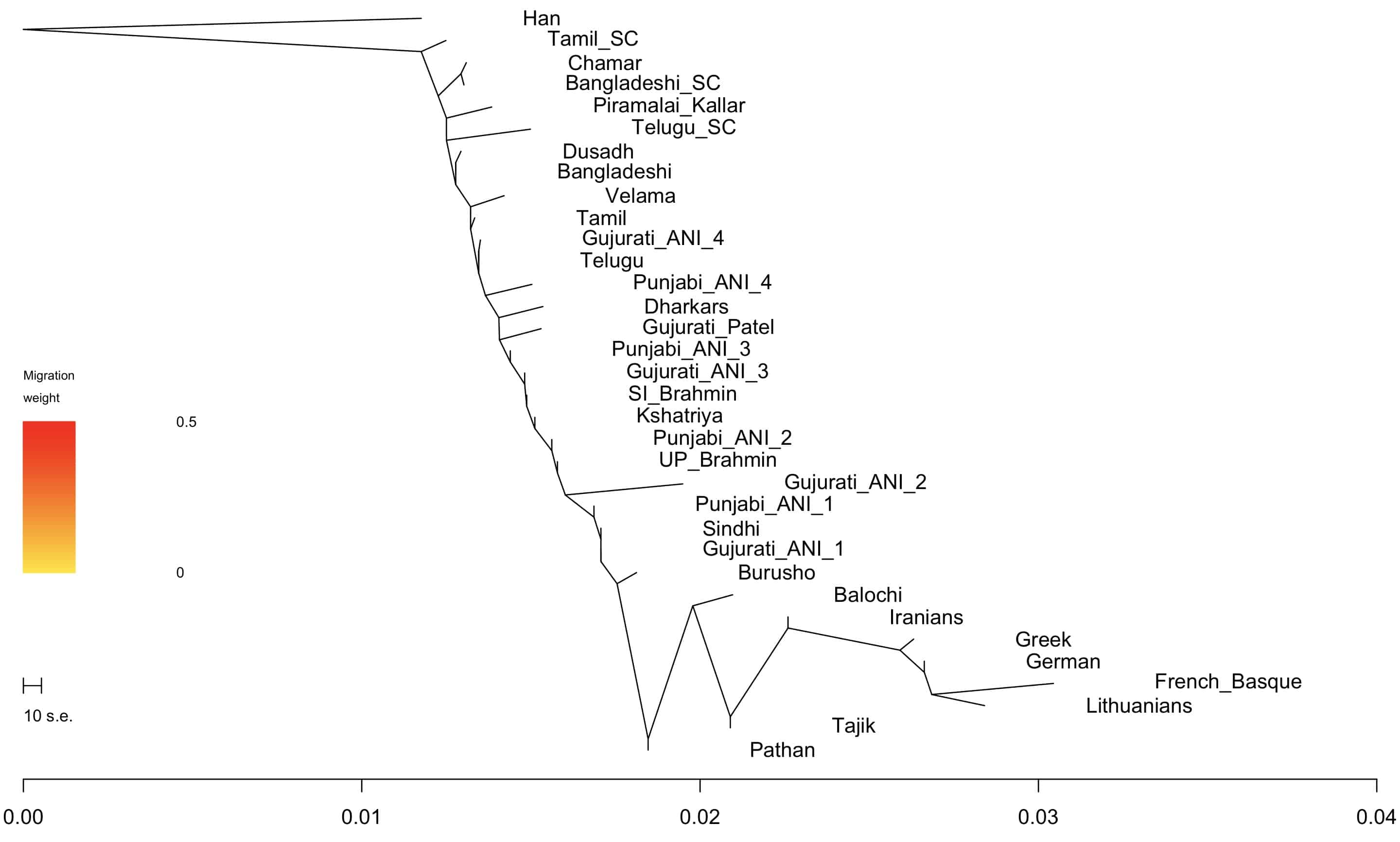
Since people asking me about this, and I’m running the South Asian Genotype Project, I thought I would post two non-PCA visualizations of how various South Asian groups relate to each other (along with a few outgroups).
The radial plot above is a neighbor-joining tree visualized from pairwise Fst statistics (basically a proxy for genetic distance).
I also used Treemix to generate a plot. You see the similar patterns as the one above, though the two methods are different. Treemix tests a bunch of models and sees how the data fit those models. The visualization of Fst is just a way of representing the summary statistic.
I added 5 migration edges to the plot to the right. Not sure if they add anything, but you can see that some of the nodes move around because they are so mixed.
As you probably know a new ancient genome paper was published last week in Nature, Terminal Pleistocene Alaskan genome reveals first founding population of Native Americans. There is at least one other involving Willerslev in the works for what it’s worth. Carl Zimmer has a good write-up in The New York Times, while Greg Cochran picked up the fact that the latest results show no evidence of “Australo-Melanesian” affinities that have been found in Amazonians.
The key issue here is that they found 11,500 year old remains from Alaska, one of which they sequenced at 17x coverage, which is rather good (not medical grade good, but really sufficient for a lot of population genomic work). It’s clear that the lineage represented by these remains is “basal” to that of other Native American peoples, whom David Reich’s group labeled “First Americans.” Later, the First Americans diverged into different populations, with the two in modern focus being a northern cluster, including the Aboriginal peoples of Canada and parts of the United States, and a southern one including everyone else. This does not mean that the Beringians were isolated outliers. There may have been many other peoples related to the Beringians who diversified, who went extinct as well. The settlement of Alaska by other peoples suggests to me that extreme conditions in the Arctic made it likely that there would be population turnover there. Also, the fact that these samples were located close to the source of settlement in the New World by modern humans makes their distant relation to all other New World populations unsurprising.
The big thing that the press is highlighting is the confirmation of the Beringian Standstill model, where modern humans percolated into the area between Siberia and Alaska, Beringia, and did not move east for thousands of years. Basically, the conditions were inclement toward human habitation on both sides of Beringia, while a relict modern human group likely occupied a pocket of more moderate climes for thousands of years, with minimal gene flow from the west, and blocked from migration to the east. Genetically the Beringia Standstill made sense for a long time…the divergence between Amerindian lineages and those of eastern Eurasia seemed too old to be accounted for by recent migration a bit more than 10,000 years ago (the old “Clovis first” hypothesis).
How old? This paper suggests that the portion of Native American ancestry which indicates an affinity to East Asians stopped exhibiting gene flow from that source around ~25,000 years ago, after diverging around ~36,000 years ago. This points to the fact that after modern humans came to dominate eastern Eurasia they began to diversify rapidly after 40,000 years ago, but gene flow between different populations did not always allow them to drift apart…at least initially. The ancestors of Native Americans and East Asians may have been in extremely separate locations by ~25,000 years ago, whether it be on the fringes of eastern Siberia, or somewhere in southern China (there is no reason that the modern Chinese have to have had ancestors resident on the North China plain before the Last Glacial Maximum).*
One aspect here I want to emphasize is that our image of a world thickly populated with humans may mislead us in our intuition about how patchy occupation was ~25,000 years ago. Yes, humans may have left artifacts all over the world, but that doesn’t mean that there weren’t centuries or millennia of no occupation, or, that meta-population dynamics were such that extinctions were common. For decades in population genetics there has been talk of “clines vs. clusters,” but if human population densities were far lower, or occupation patchier, then clines may have become much more important recently with high density than in the past.
Finally, back to the Australo-Melanesian issue. Either there is a lot of population structure in ancient Beringia to be explored, with diverse quasi-Asiatic groups, or there was an Australo-Melanesian group already in South America.
* Ancient North Eurasian ancestry came into Beringians ~20,000 years ago. Two groups which merged during the middle of the Last Glacial Maximum.
The above figure is from Evidence of directional and stabilizing selection in contemporary humans. I’ll be entirely honest with you: I don’t read every UK Biobank paper, but I do read those where Peter Visscher is a co-author. It’s in PNAS, and a draft which is not open access. But it’s a pretty interesting read. Nothing too revolutionary, but confirms some intuitions one might have.
The abstract:
Modern molecular genetic datasets, primarily collected to study the biology of human health and disease, can be used to directly measure the action of natural selection and reveal important features of contemporary human evolution. Here we leverage the UK Biobank data to test for the presence of linear and nonlinear natural selection in a contemporary population of the United Kingdom. We obtain phenotypic and genetic evidence consistent with the action of linear/directional selection. Phenotypic evidence suggests that stabilizing selection, which acts to reduce variance in the population without necessarily modifying the population mean, is widespread and relatively weak in comparison with estimates from other species.
The stabilizing selection part is probably the most interesting part for me. But let’s hold up for a moment, and review some of the major findings. The authors focused on ~375,000 samples which matched their criteria (white British individuals old enough that they are well past their reproductive peak), and the genotyping platforms had 500,000 markers. The dependent variable they’re looking at is reproductive fitness. In this case specifically, “rRLS”, or relative reproductive lifetime success.
With these huge data sets and the large number of measured phenotypes they first used the classical Lande and Arnold method to detect selection gradients, which leveraged regression to measure directional and stabilizing dynamics. Basically, how does change in the phenotype impact reproductive fitness? So, it is notable that shorter women have higher reproductive fitness than taller women (shorter than the median). This seems like a robust result. We’ve seen it before on much smaller sample sizes.
The results using phenotypic correlations for direction (β) and stabilizing (γ) selection are shown below separated by sex. The abbreviations are the same as above.
There are many cases where directional selection seems to operate in females, but not in males. But they note that that is often due to near zero non-significant results in males, not because there were opposing directions in selection. Height was the exception, with regression coefficients in opposite directions. For stabilizing selection there was no antagonistic trait.
A major finding was that compared to other organisms stabilizing selection was very weak in humans. There’s just not that that much pressure against extreme phenotypes. This isn’t entirely surprising. First, you have the issue of the weirdness of a lot of studies in animal models, with inbred lines, or wild populations selected for their salience. Second, prior theory suggests that a trait with lots of heritable quantitative variation, like height, shouldn’t be subject to that much selection. If it had, the genetic variation which was the raw material of the trait’s distribution wouldn’t be there.
Using more complex regression methods that take into account confounds, they pruned the list of significant hits. But, it is important to note that even at ~375,000, this sample size might be underpowered to detect really subtle dynamics. Additionally, the beauty of this study is that it added modern genomic analysis to the mix. Detecting selection through phenotypic analysis goes back decades, but interrogating the genetic basis of complex traits and their evolutionary dynamics is new.
To a first approximation, the results were broadly consonant across the two methods. But, there are interesting details where they differ. There is selection on height in females, but not in males. This implies that though empirically you see taller males with higher rLSR, the genetic variance that is affecting height isn’t correlated with rLSR, so selection isn’t occurring in this sex.
~375,000 may seem like a lot, but from talking to people who work in polygenic selection there is still statistical power to be gained by going into the millions (perhaps tens of millions?). These sorts of results are very preliminary but show the power of synthesizing classical quantitative genetic models and ways of thinking with modern genomics. And, it does have me wondering about how these methods will align with the sort of stuff I wrote about last year which detects recent selection on time depths of a few thousand years. The SDS method, for example, seems to be detecting selection for increasing height the world over…which I wonder is some artifact, because there’s a robust pattern of shorter women having higher fertility in studies going back decades.

 Since the death of L. L. Cavalli-Sforza I’ve been thinking about the great scientists who have passed on. Last fall, I mentioned that Mel Green had died. There was a marginal personal connection there. I had the privilege to talk to Green at length about sundry issues, often nonscientific. He was someone who been doing science so long he had talked to Charles Davenport in the flesh (he was not complimentary of Davenport’s understanding of Mendelian principles). It was like engaging with a history book!
 If you are involved in population genetics you know who Crow is. No introduction needed. Some of the people he supervised, such as Joe Felsenstein, have gone on to transform evolutionary biology in their own turn.


 Matt pointed out that truncation selection is a form of hard selection. All individuals below (or above) a certain phenotype value have a fitness of zero, as they don’t reproduce. In a single locus context, hard selection would involve deleterious lethal alleles, whose impact on the genotype was the same irrespective of ecological context. So in a hard selection, it operates by reducing the fitness of individuals/genotypes to zero.